Rebuilding the in-restaurant point of sale into one cohesive, scalable system for multiple payment types, third-party delivery, remote-order alerts and split tender.
Subway's POS had grown one screen at a time. Remote orders, third-party delivery, curbside and new payment types were added on top, and crews felt it at the counter during the busiest stretch of COVID.
The mandate was to optimize the POS into one cohesive, scalable design that could carry multiple payment functions, third-party delivery, remote-order notifications and split tender, all on the existing POS 1.5 tech stack.
I was the lead product designer, based at Subway's HQ in Milford, Connecticut, focused on wireframes, system flow and UI design across ring sale, payment and system status. One UX researcher supported the work, a team of developers in Subway's Miami office built it, and stakeholders ran QA.
COVID ruled out on-site studies, so a handful of store owners from the OPAT franchisee advisory group gave us feedback, and we met with engineering twice a week to keep design and build in step.
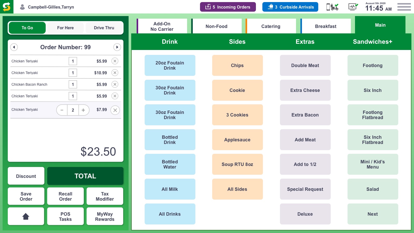
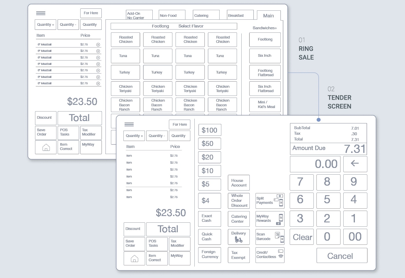
Once stakeholder requirements were defined and competitive research was done, wireframes and user stories built out the bones of the design. The proven layout stayed, the order on the left and the menu on the right, so crews would not have to relearn the counter.
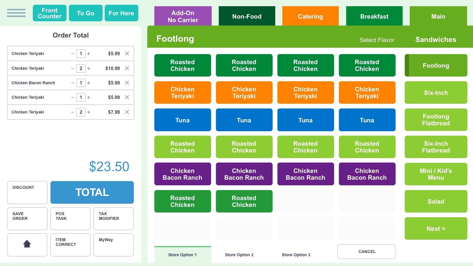
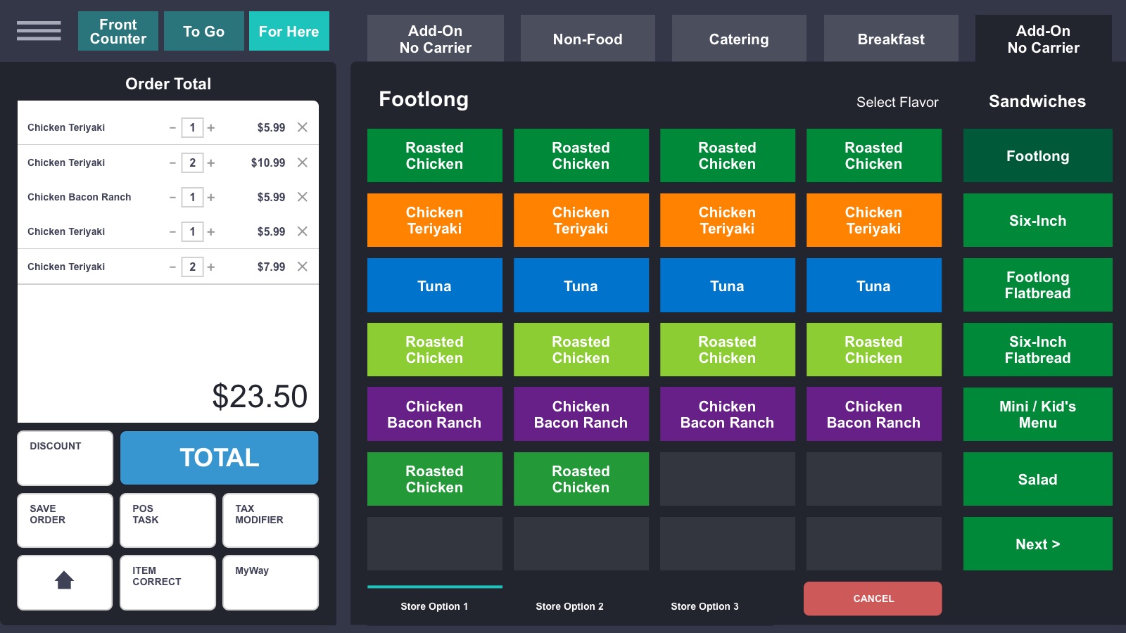
Two color theme variations were designed and presented to stakeholders to gauge preference and finalize the design direction.
Light work surfaces in Subway green, with bright category colors on the menu.


Charcoal panels that let orange and red actions stand out during a rush.


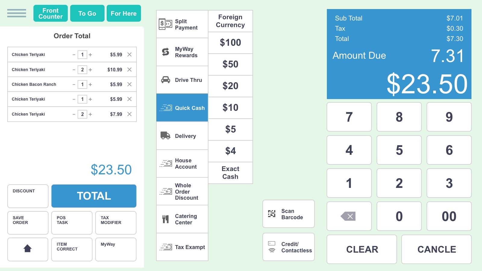
The final direction landed on a happy medium: light work surfaces framed in Subway green. On the ring sale, that meant trading a wall of identical buttons for color-coded columns.

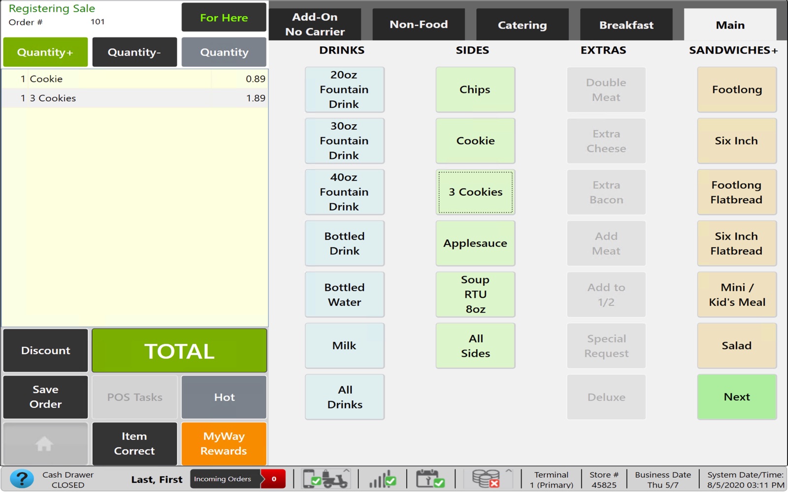
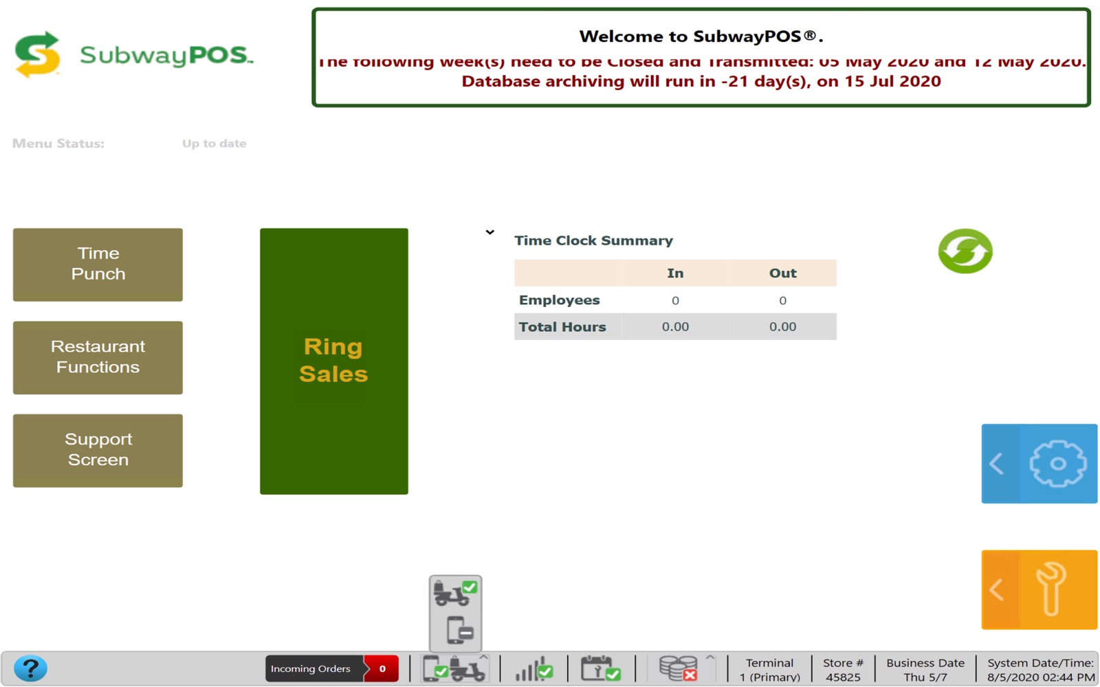
Every item looked the same. Dense gray buttons, tiny labels and payments buried a screen away.
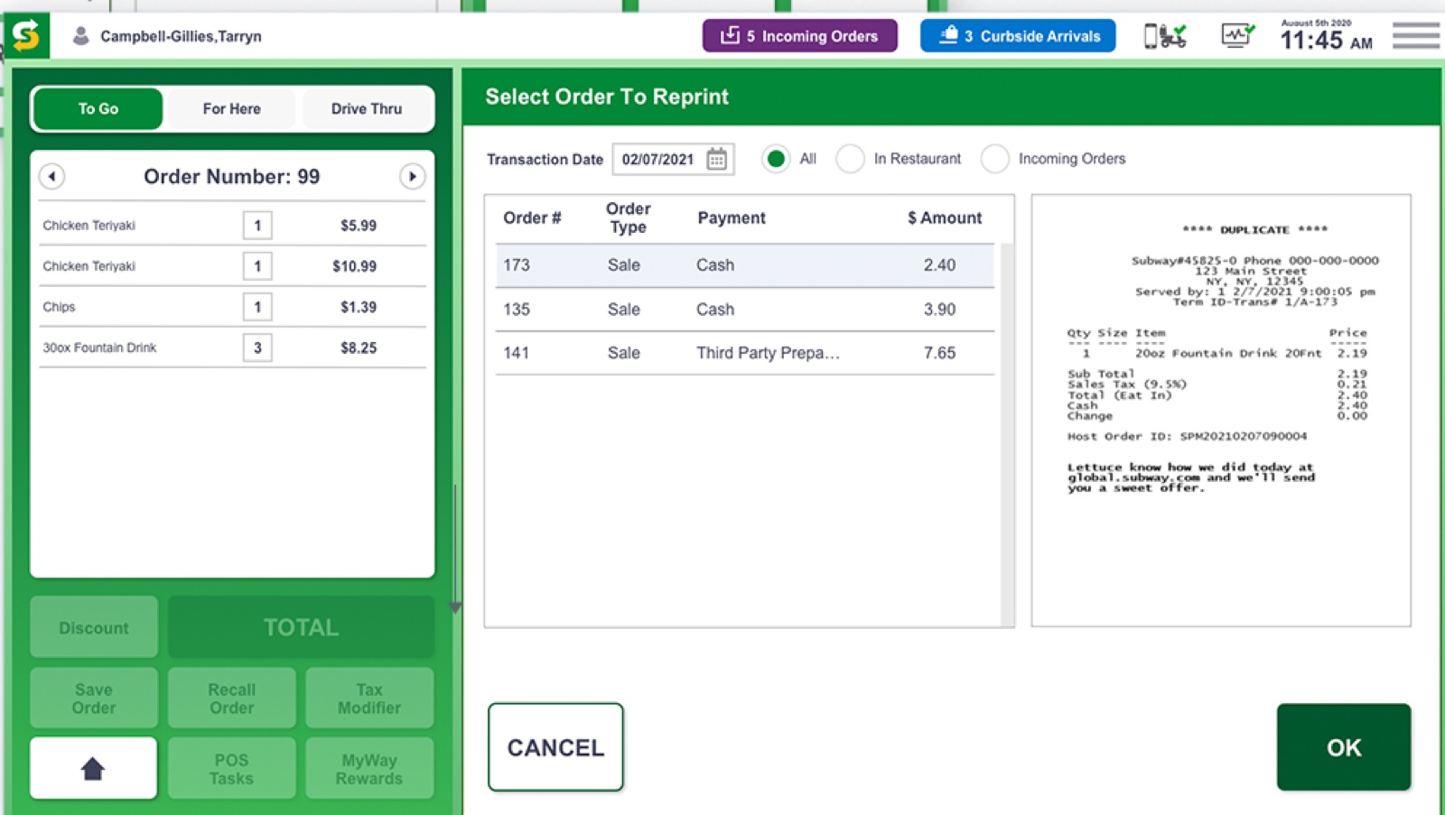
Color-coded categories for drinks, sides, extras and sandwiches, with order type up top and Total as the biggest target.

Final design complete with a component and pattern system for a cohesive, intuitive interface. The U.S. rollout plan covered over 22.3K locations, followed by an international rollout to more than 40K restaurants worldwide.

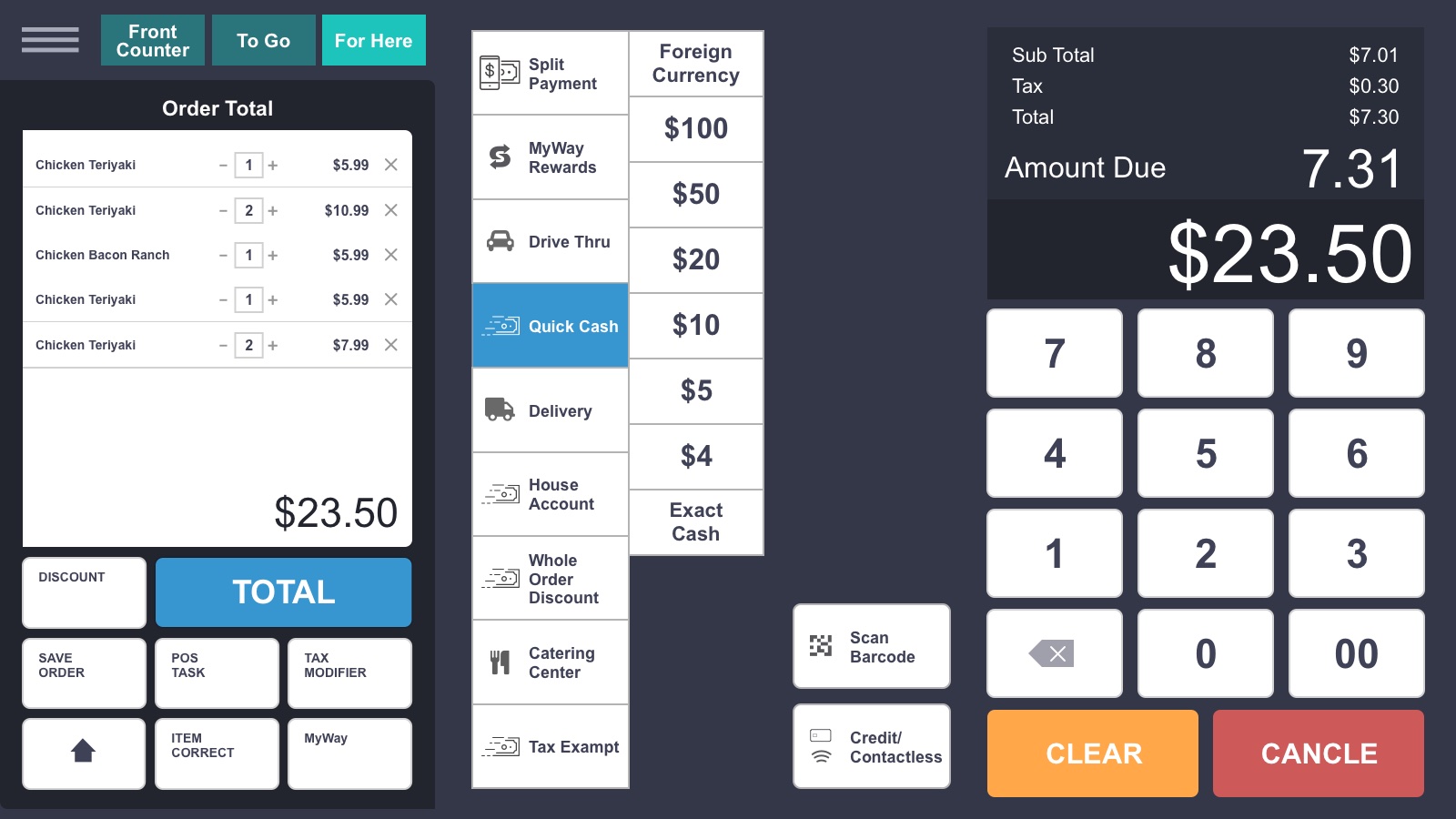
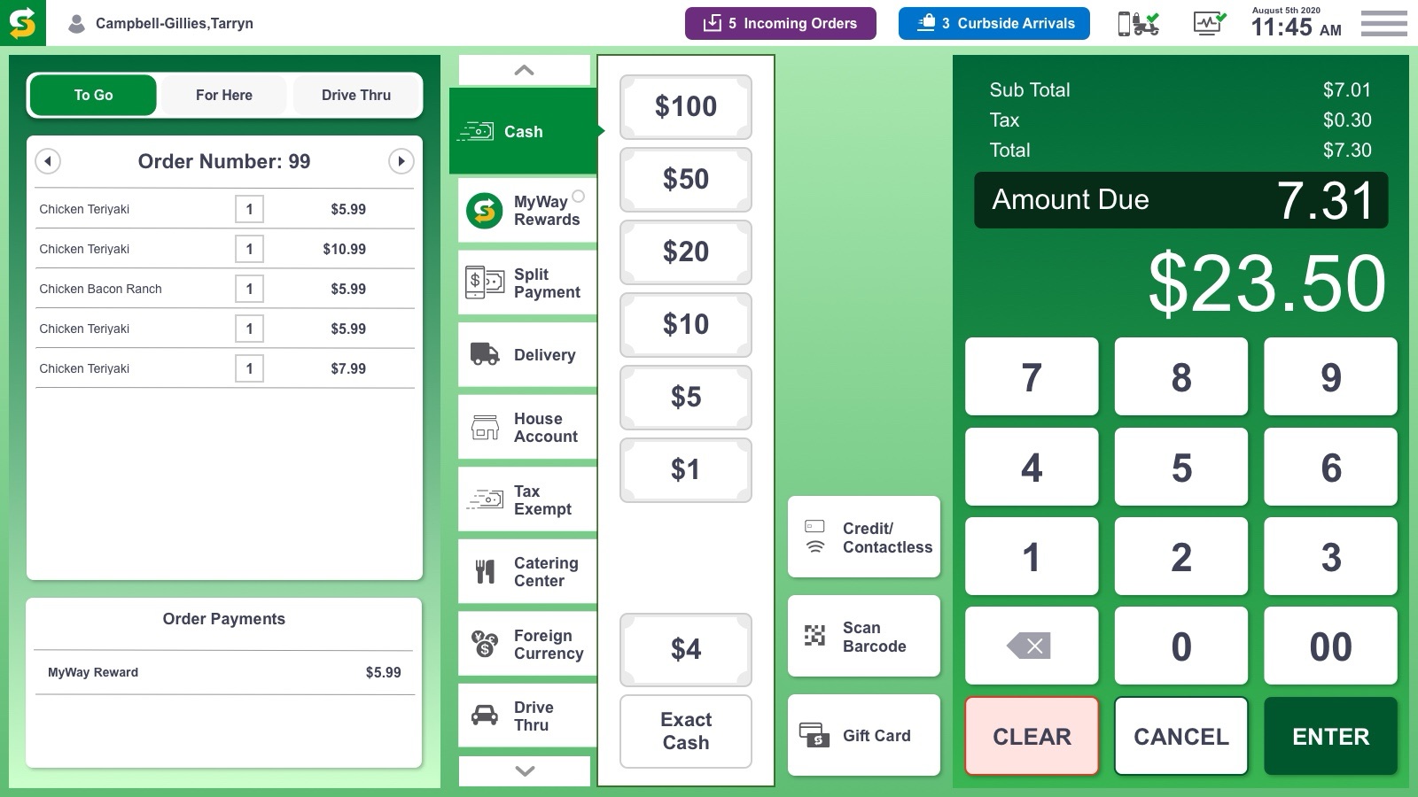
The new vertical nav-system makes the POS scalable for additional payment features.
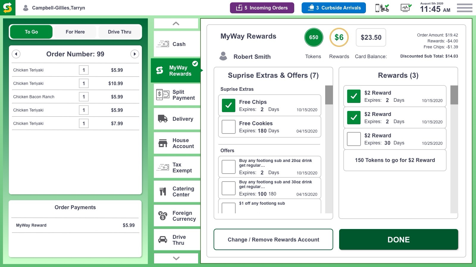
Customer reward info made prominent on screen, for a better surprise and delight checkout.


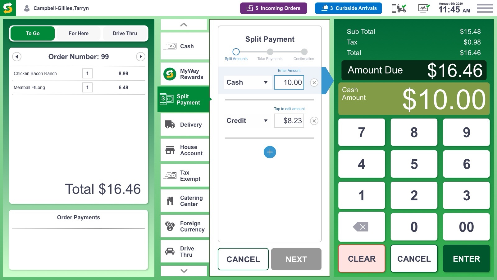
Split tender walks the crew through amounts, payments and confirmation in three clear steps.
The new design not only improved in-store checkout, it helped franchise owners keep pace with their digital remote ordering business.

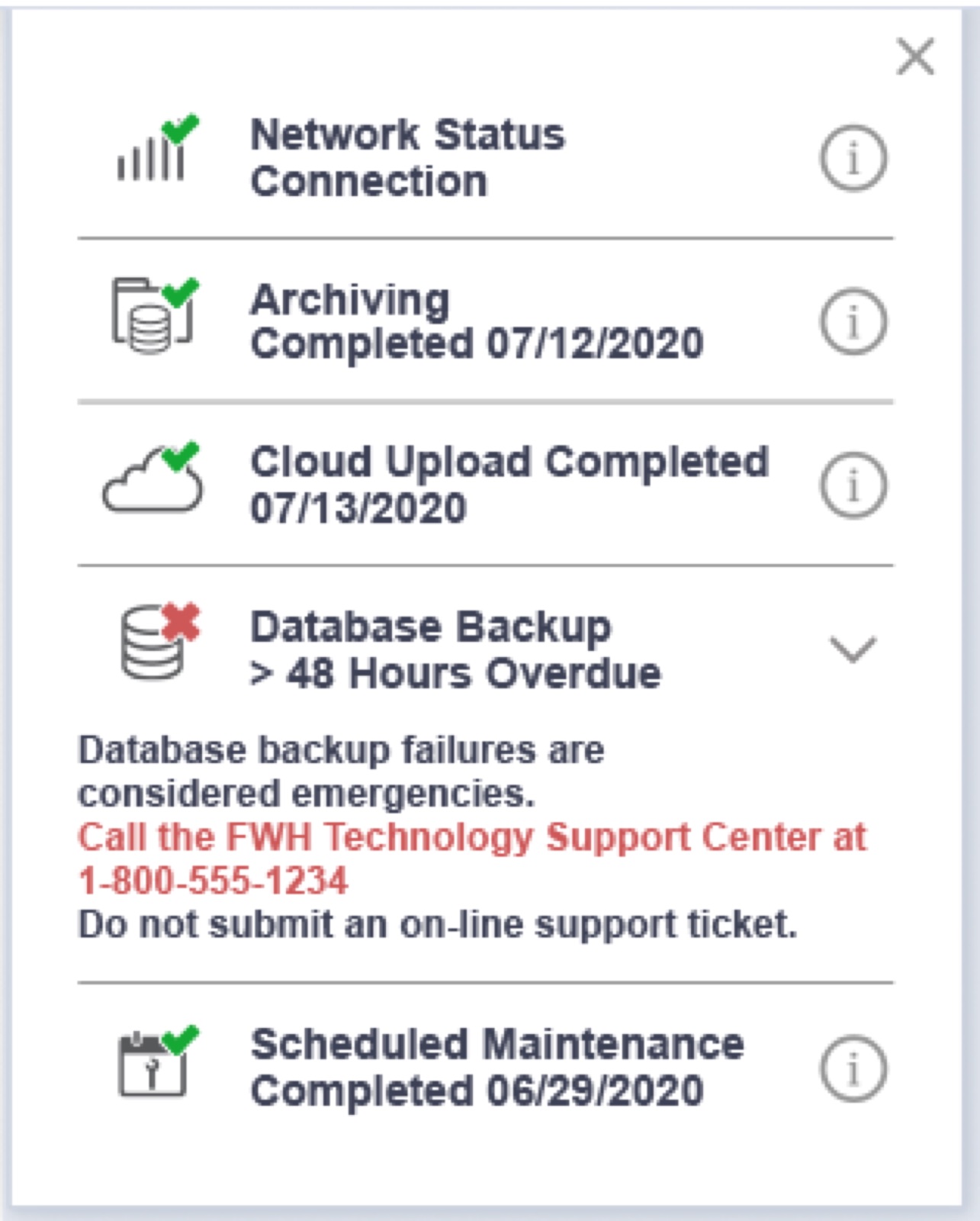
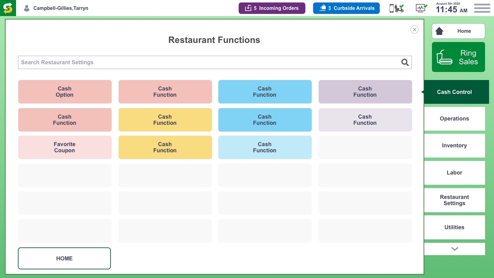
COVID turned remote orders and curbside into the main event, so the status bar had to put them front and center.
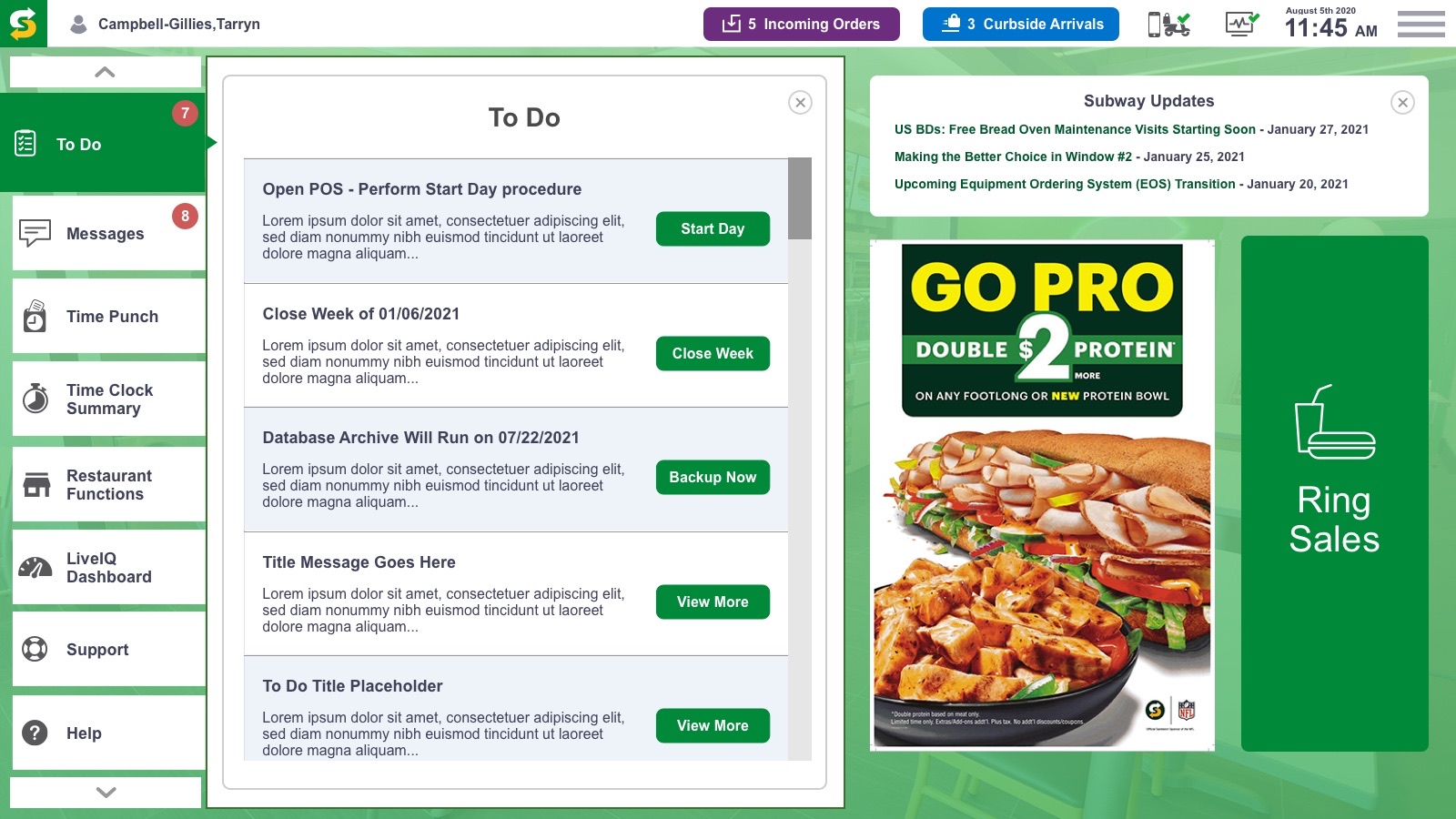
Optimized interface reduces information overload, nesting non-order components into accessible drop-down menus and moving the status bar from the bottom to the upper edge, placing Incoming Orders and Curbside Arrivals at eye level.

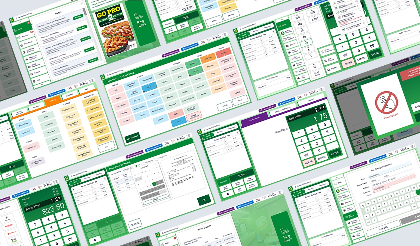
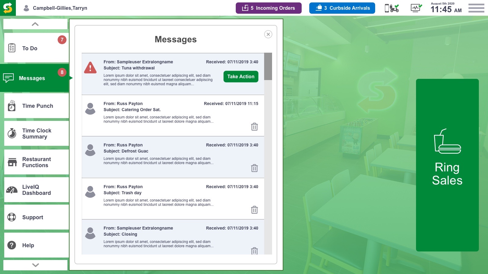
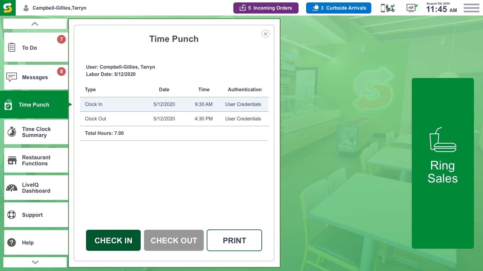
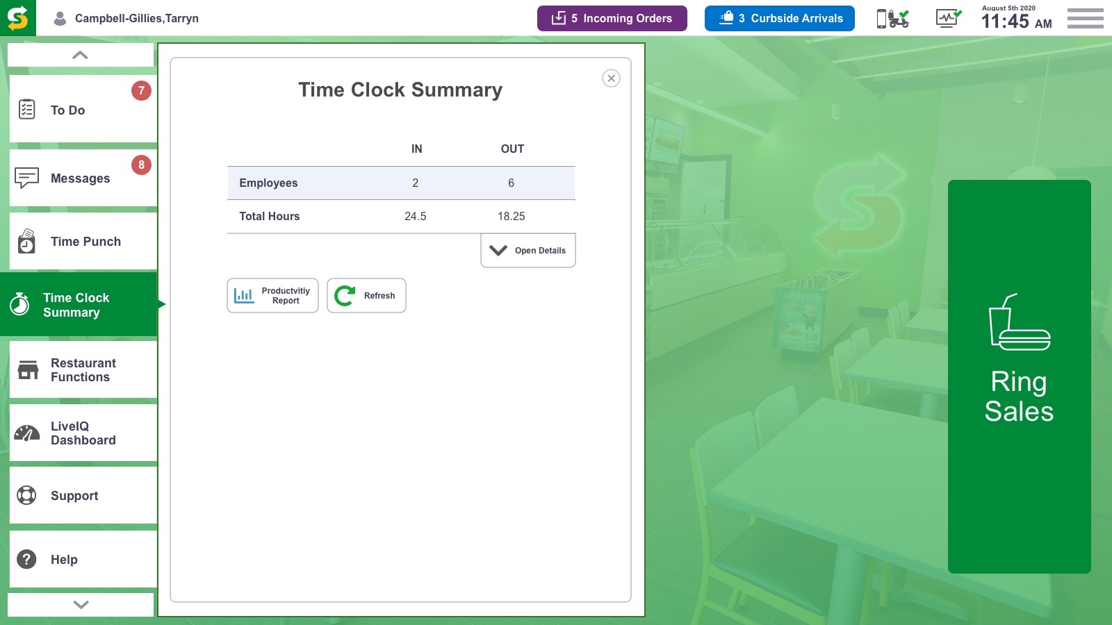
Phase 2 carried the system into the home screen. To Do, messages, time punch and restaurant functions live in one place, so owners and crews start every shift informed. Click any screen to page through them all.


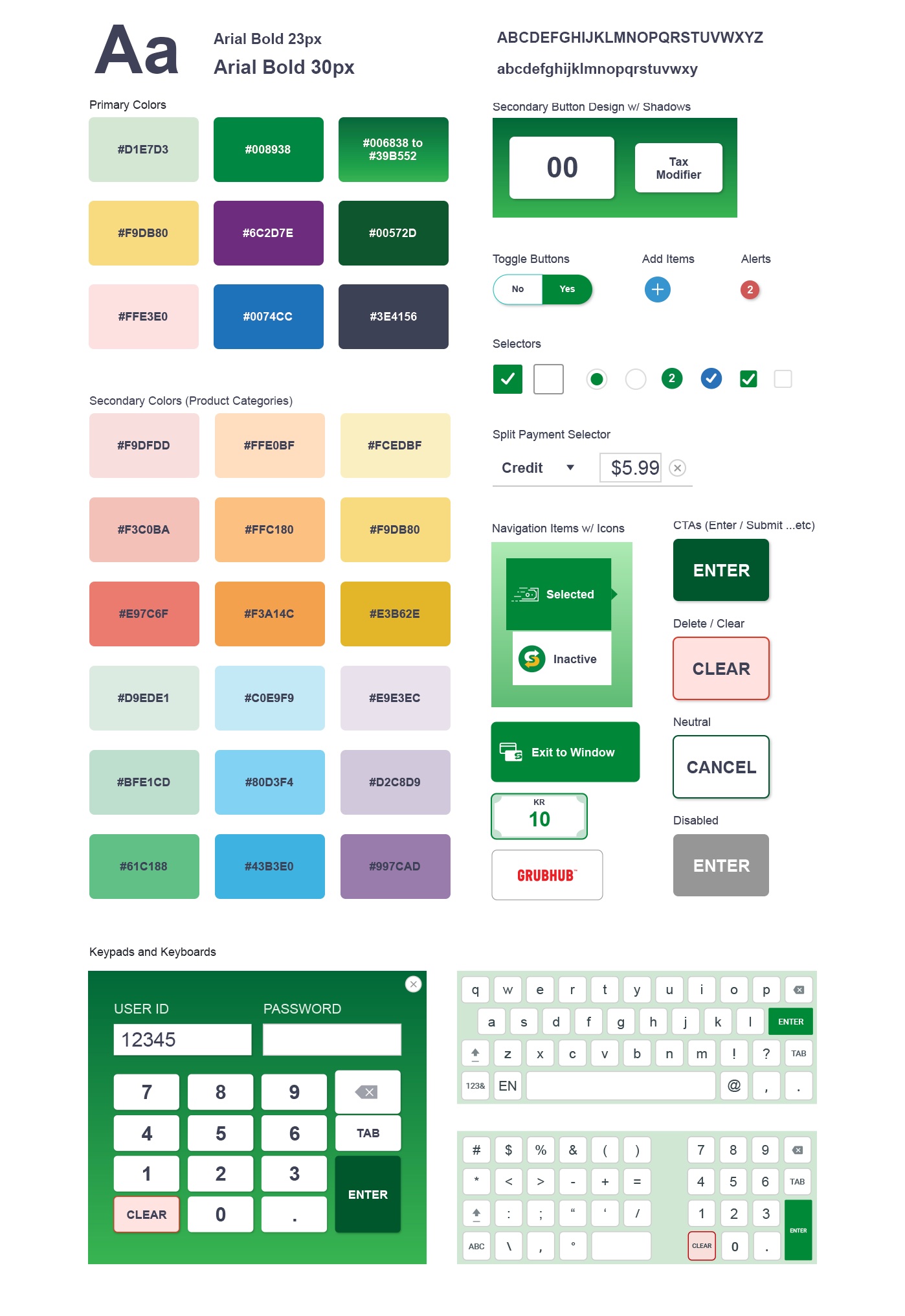
Type, primary and category colors, buttons, toggles, selectors, navigation items, CTAs, keypads and keyboards were built once as a shared library with touch-sized targets, so engineering could ship screens in phases without drift.

Phase 1 brought the redesigned ring sale, payment and status bar to pilot in OPAT franchisee stores. It launched alongside the old UI, so crews could switch over without retraining.
Phase 1 surfaces redesigned and shipped to pilot: Ring Sale, Payment and Status Bar
Vertical payment menu that absorbs new tender types, including split tender in Phase 2
U.S. restaurants in the rollout plan, starting with the OPAT pilot stores
Restaurants worldwide the system was built to scale to, 2018 to 2021
Store counts are from 2018 to 2021, when I worked at Subway. Rollout metrics are owned by Subway and are not shown here. Phase plan and pilot details from the project's phase approach and UX playbook.
At a busy counter every extra tap is a longer line. Fewer screens to checkout mattered more than any visual flourish.
Keeping the familiar layout let crews adopt the new UI without retraining, and let it launch side by side with the old one.
When remote and curbside orders surged, the most important information moved to where eyes already were.
A shared component kit let payment features ship in phases on the existing tech stack without the design drifting.