Subway · Web & Remote Ordering · UX/UI Design

Subway Locator Redesign

Rebuilding "Find a Subway" across Subway.com and Remote Ordering: saved Favorite and Recent stores, curbside pickup during COVID, and a one-tap path from finding a store to starting an order.

Alex McLean III · Sr. UX/UI Designer, Subway
Role
Sr. UX/UI Designer · research → hi-fi UI
Surfaces
Subway.com · Remote Ordering · Mobile web
Flows
Favorites · Recent · Curbside · Start Order
Goal
Grow digital orders over in-store
110%
lift in restaurant searches the month after the Nov 2018 launch
366%
lift in Order Online clicks, Dec 2018 vs. Nov (383% year over year)
22,324
U.S. restaurants, each one tap from an order
2
saved shortcuts for regulars: Favorite and Recent store
00

Turn the store locator into the fastest way to start a digital order

Returning guests searched for the same store every time they ordered. The goal was to let them save a Favorite store and recall their Recent one, then add Curbside pickup during COVID so more guests ordered online instead of at the counter.

In 2020, COVID pushed guests from the counter to their phones, and Subway's digital business boomed. U.S. third-party delivery sales doubled, from $115M in 2019 to $230M in 2020, growing from 1.2% to 3% of the whole business.

I led the locator redesign across Subway.com and Remote Ordering, launched in November 2018. Guests could favorite a store with a heart, see their Recent store pinned at the top, and filter by service before tapping Order. In 2020 I added curbside to the same locator.

FavoritesRecent storesCurbside ConversionMaps & resultsFilteringResponsive
What the locator had to do
Save a Favorite store
✓
Recall the Recent store
✓
Show curbside pickup hours
✓
Filter by service
✓
Start an order in one tap
✓
01

From a store list to a personal starting point

Three rounds show how the locator learned to remember the guest. Each step moved saved stores closer to the top and the Order button closer to the thumb.
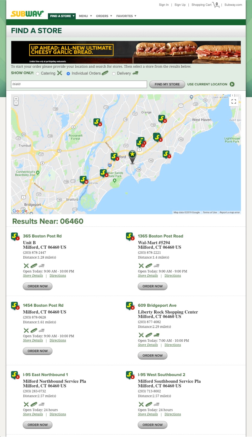
Before The original Find a Store page: a grid of results with small icons and gray Order Now buttons

Find a Store

A flat grid of results with tiny icons and a gray Order Now. Nothing remembered the guest, so regulars searched from scratch every visit.
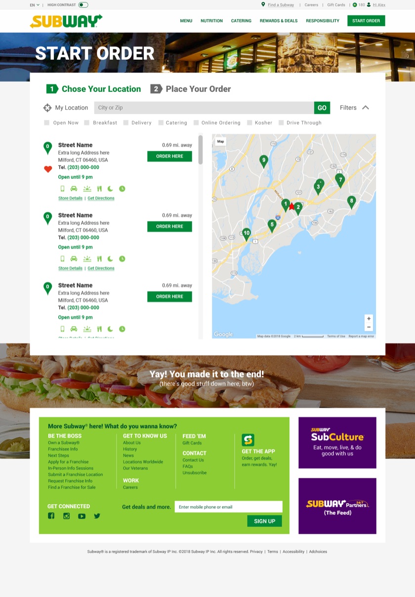
Initial concept Initial concept: Start Order step 1 with a store list, numbered map pins, and a heart to favorite each store

Start Order, step 1

Reframed as the first step of ordering: a list paired to a numbered map, a heart to favorite any store, and a green Order Here on every card.
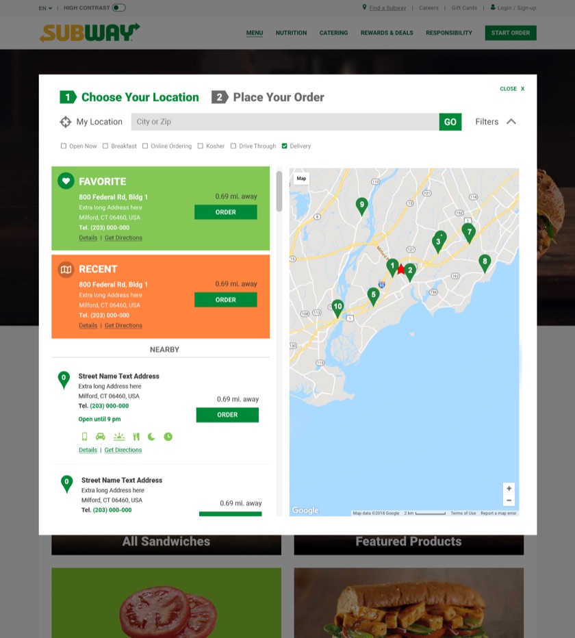
Final Final design: green Favorite and orange Recent store cards pinned above nearby results, each with an Order button

Favorite and Recent on top

Saved stores pinned above the results as color-coded cards, green for Favorite and orange for Recent, each with its own Order button. Nearby stores follow.
02

Favorites and Recent, one tap from an order

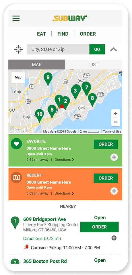
On mobile the locator collapses to a thumb-friendly Eat, Find, Order bar with a Map and List toggle. Logged-in guests see their Favorite and Recent stores first, then what's nearby.

Built around the returning guest

Each saved store card carries hours, distance, directions and a one-tap Order button. The map stays a swipe away for guests exploring a new area.

Map / List toggleFavoritesRecentNearbyOne-tap order
Mobile locator with a map of pinned stores above green Favorite and orange Recent store cards

Map, Faves & Recent Location

Logged-in state with the Favorite and Recent stores saved to the profile, above a map of pinned results from a manual search or geolocation.

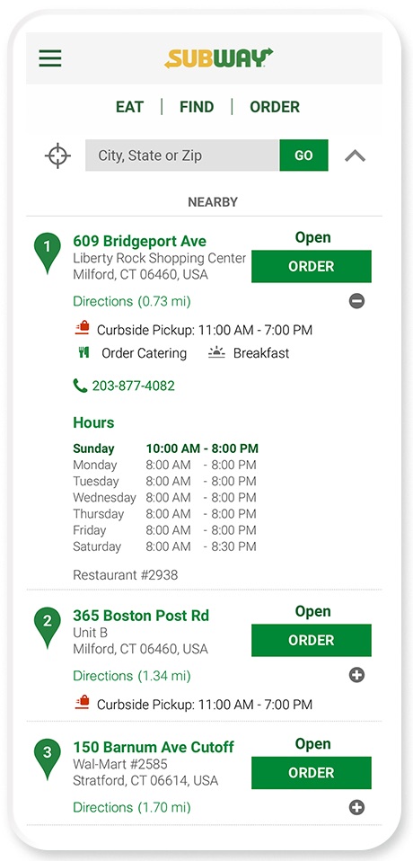
Mobile detailed store view with curbside pickup hours, catering, breakfast, phone number and weekly hours

Detailed View

An expanded view with store hours, contact info and amenities like breakfast and catering, with curbside highlighted to encourage orders from guests who were social distancing.

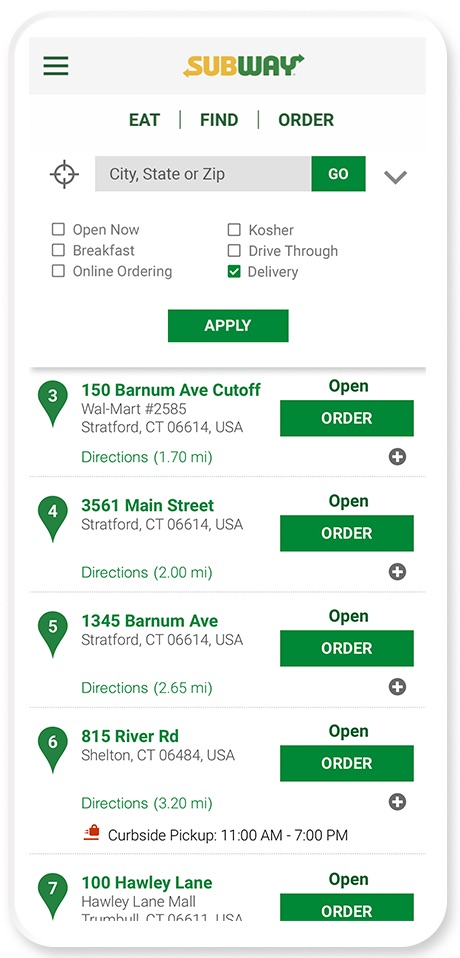
Mobile filter panel with options like open now, breakfast, drive through and delivery above filtered results

Filter Results

Narrow results by delivery, breakfast, drive-thru and more. Results update once the guest taps Apply.

03

Contactless pickup, shown right where guests choose a store

When dining rooms closed, curbside became the safest way to get a sub. In June 2020 I designed curbside into the locator so guests could see which restaurants offered it, and when, before they ordered.

01

Curbside icon wherever it is offered

Shown on Subway.com, order.subway.com and the app for every restaurant that supports curbside pickup.

02

Curbside hours on every card

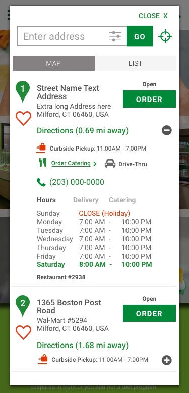
Pickup hours (11 AM to 7 PM) listed separately from store hours, so guests know before they order.

03

Expand for the full week

Tap More Info for every day of hours plus delivery, catering, drive-thru and breakfast.

04

A cart toggle with clear states

Curbside turns on only when the restaurant offers it and the order falls within curbside hours. Otherwise it explains why.

Why it mattered

Curbside moved orders that would have happened at the counter into the digital channel. The same locator patterns carried into Contactless Curbside, which Subway launched nationwide through the app in November 2020.

FROM THE BRIEF →Only curbside with hours shows in the first search; every service attribute appears in the expanded view.
Desktop locator with curbside pickup hours and catering on each store card, and full weekly hours expanded
Desktop: curbside hours and catering on the card, full week on expand
Mobile locator showing the same curbside hours and store details
Mobile: the same details, reflowed
04

From "Find a Subway" to "Start Order"

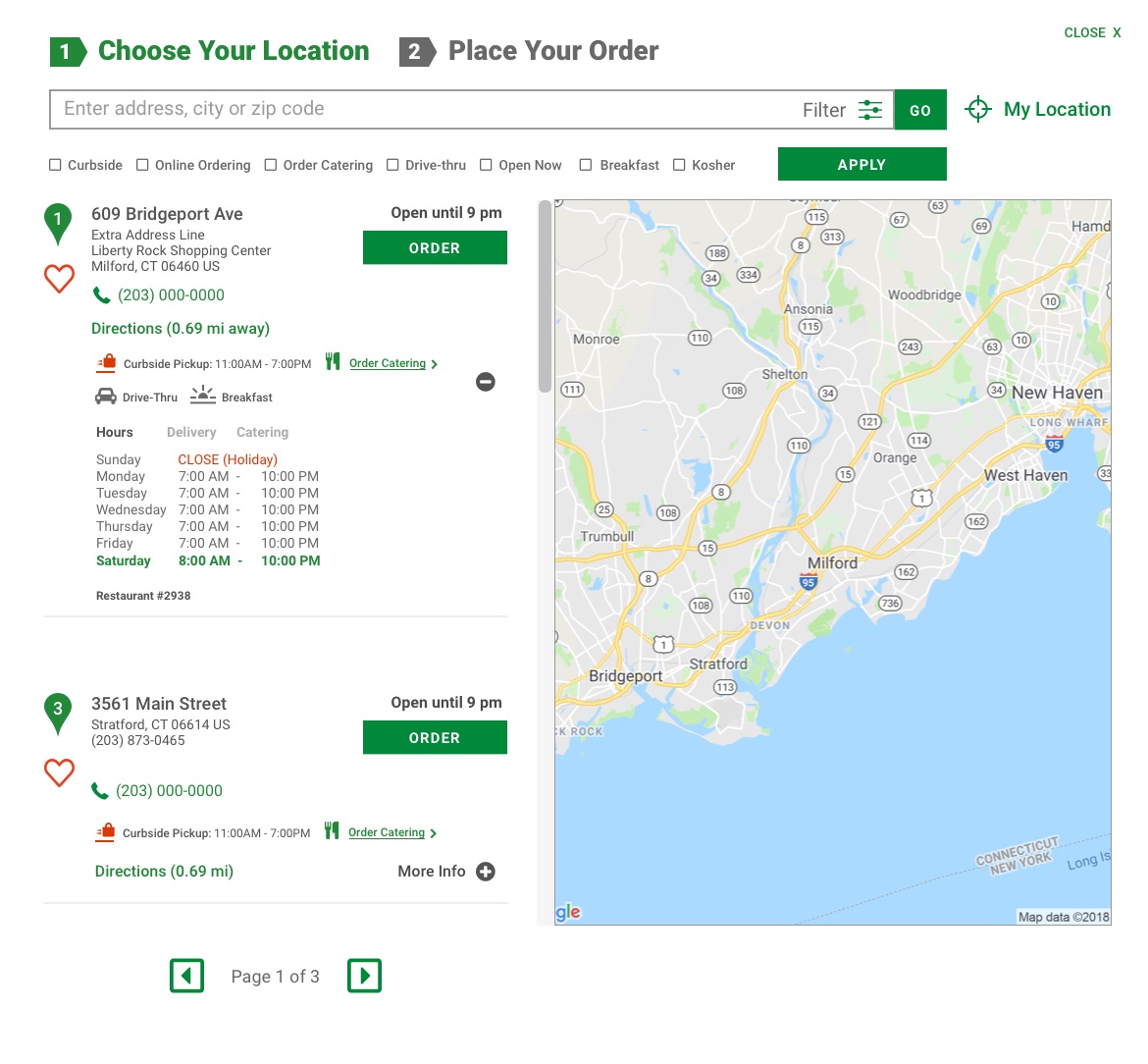
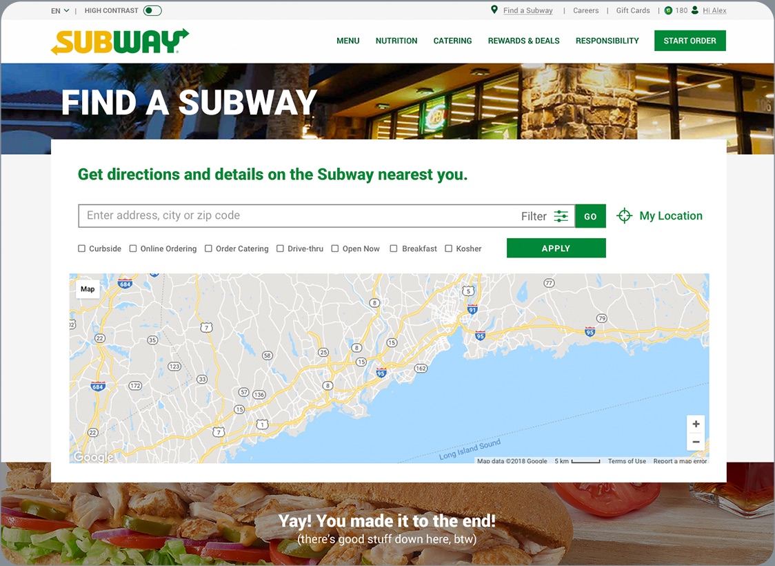
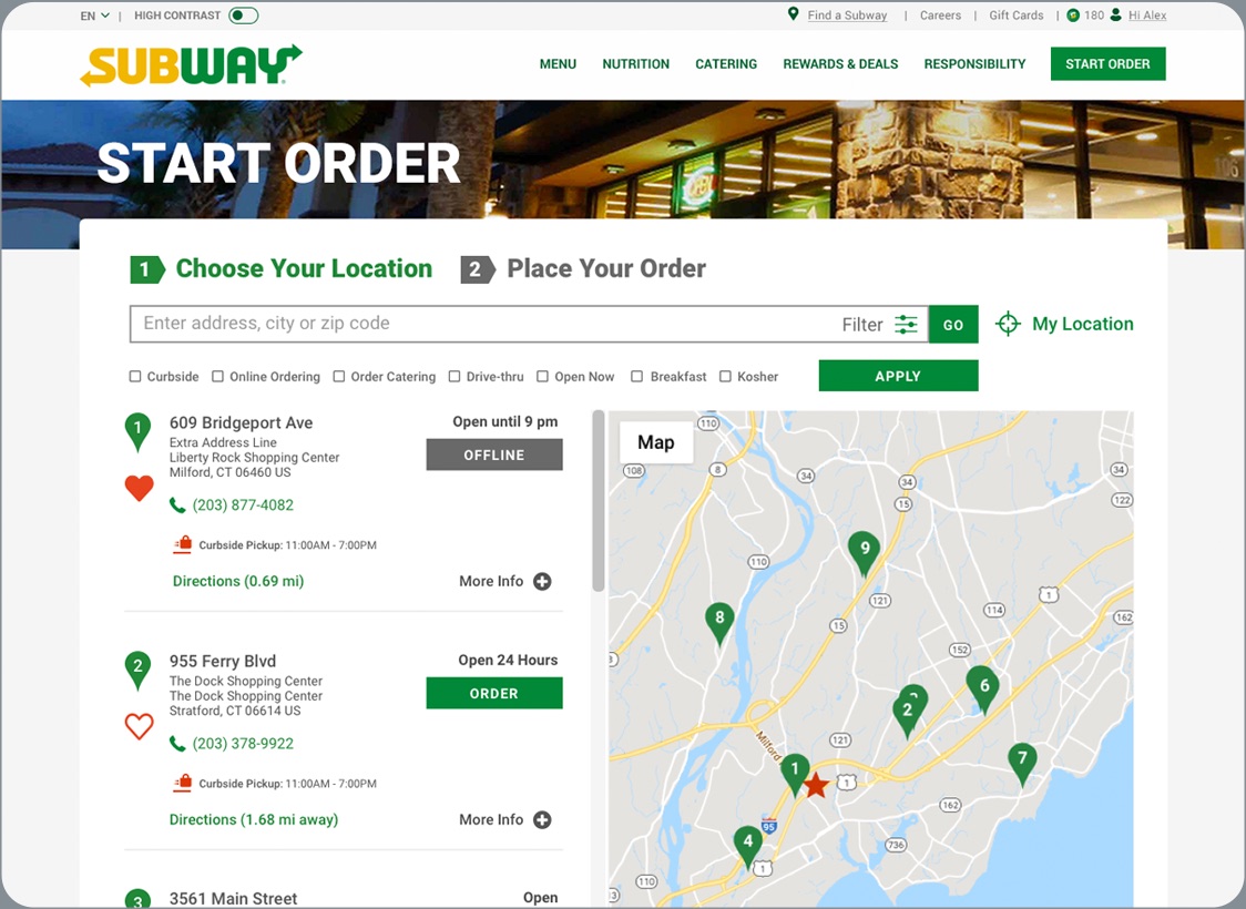
Two connected states carry the guest through: a landing screen that invites a search, and a results view with ten stores per page, each card paired to a numbered pin on the map.

A locator that sells

Each store card shows what drives the next step: open hours, curbside pickup windows, distance and directions, a heart for Rewards members, and a prominent Order button. Offline stores are clearly marked so no one hits a dead end.

The Start Order header reframes the page as step one of ordering: Choose Your Location, then Place Your Order.

Initial landing screen, no location provided
Desktop Find a Subway landing screen with search, filters and a map before a location is entered
Restaurant results, 10 per page
Desktop Start Order results with store cards, Order buttons and numbered pins on a map
05

Every state baked for a clean hand-off

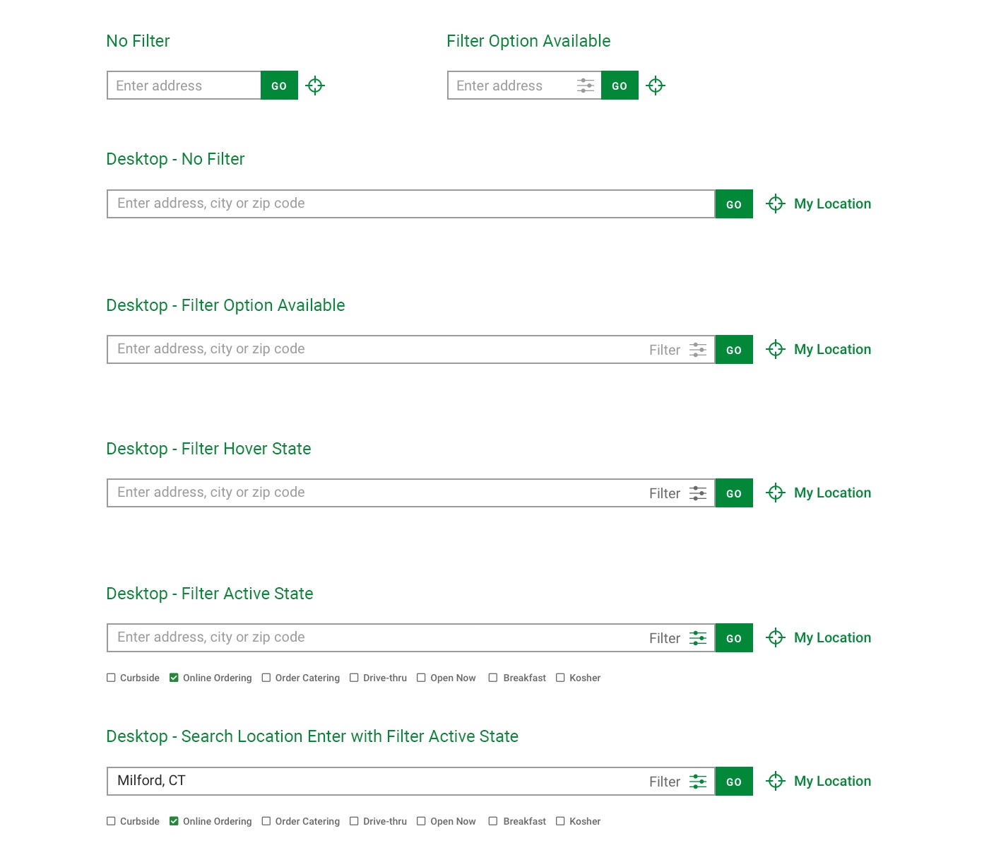
Design isn't done when the happy path looks good. I documented every element state so engineering had zero guesswork, reducing confusion and bottlenecks at build time.

01

No filter

The default search field, mobile and desktop.

02

Filter available

Filter affordance revealed inside the field.

03

Filter hover

Interactive feedback before the click.

04

Filter active

Expanded checkboxes for curbside, online ordering and more.

05

Search entered + filter active

A real query ("Milford, CT") with filters applied.

Design that engineers can build without asking

Each state was specified for both breakpoints and handed off as one clear reference. On a global site, that discipline means fewer questions, fewer rebuilds and a faster ship.

WHY IT MATTERS →"Each element state is fully baked to ensure a smooth tech hand-off, reducing confusion and bottlenecking."
UI states board: search field with no filter, filter available, hover, active, and a search entered with filters
06

One organized source of truth for engineering

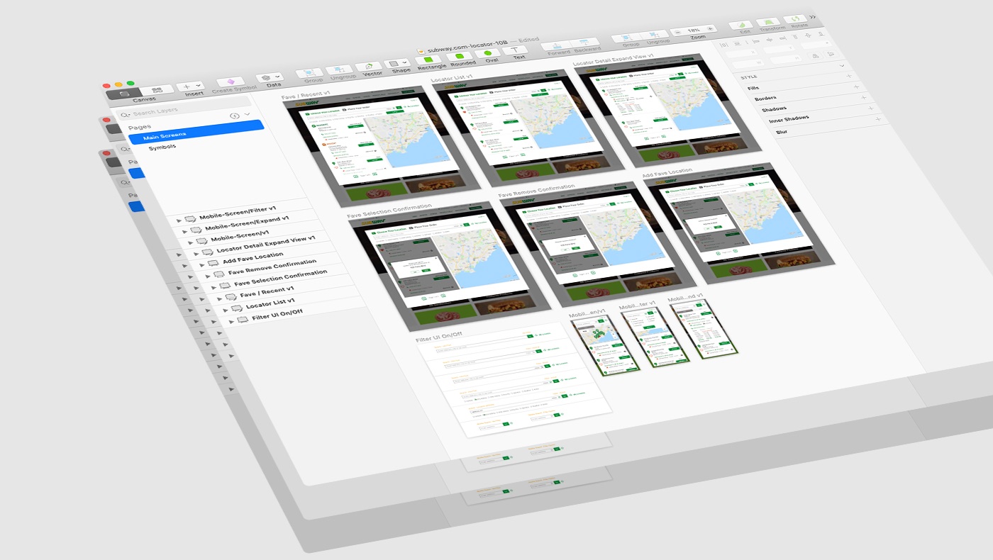
The final design lived in one organized file: every screen, state, component and icon, named and grouped so engineers could inspect specs and pull assets on their own. A clean hand-off meant fewer questions and faster builds.

The organized design file with locator screens for desktop and mobile states

Icons

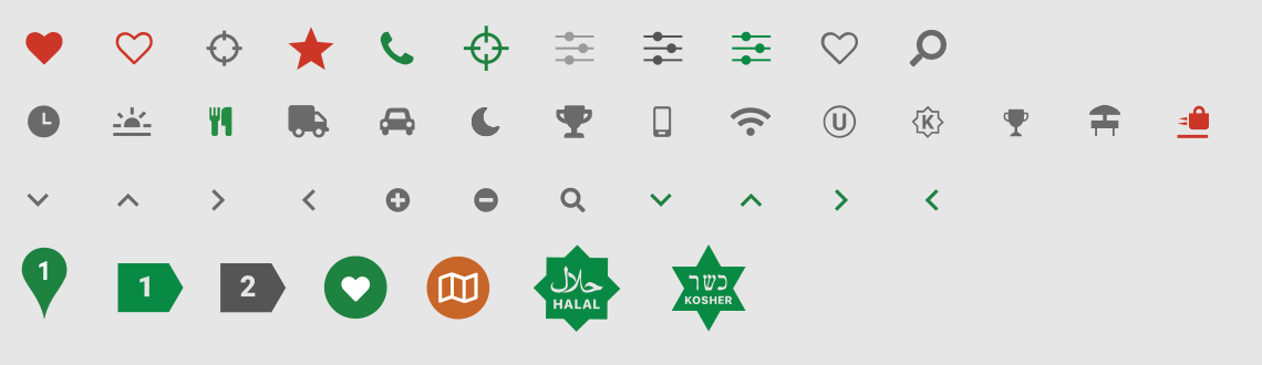
An evolving icon set that works as visual shorthand, including the heart for Favorite, the map badge for Recent and the curbside bag, lowering cognitive load on every store card.

Locator icon set: favorite hearts, location, curbside, amenities, arrows, numbered pins, and Halal and Kosher badges
07

More searches, many more orders started

The November 2018 redesign turned a passive map into the front door for digital ordering. When COVID hit in 2020, the same locator carried curbside pickup to guests who needed contactless options.

Subway.com engagement, the month after launch
Monthly totals, November 2018 (before) vs. December 2018 (after the new locator)
Restaurant searches+110%
Order Online clicks+366%
Subway.com engagement, November vs. December 2018
MeasureNov 2018Dec 2018Change
Restaurant searches374,669788,447+110%
Order Online clicks67,648314,979+366%
+110%

Restaurant searches, the month after launch (374,669 to 788,447)

+366%

Order Online clicks, the month after launch (67,648 to 314,979)

1.2% → 3%

Third-party delivery's share of Subway's U.S. business, 2019 to 2020

2x

U.S. third-party delivery sales, from $115M in 2019 to $230M in 2020

2

Saved shortcuts, Favorite and Recent, so regulars skip the search

3

Surfaces aligned: Subway.com, Remote Ordering and mobile web

Source: Subway.com Engagement report, December 2018 (Adobe Analytics), after the November 2018 UI changes; also cited in the Subway UX/UI Design Playbook, April 2021. Digital context from the Digital & Consumer Tech playbook: U.S. third-party delivery sales rose from $115M (2019) to $230M (2020).

What made this ship cleanly.

01

Memory is a feature

Saving a Favorite and recalling a Recent store did more for regulars than any new feature, because it removed the search they repeated every visit.

02

Design for the moment

Curbside went from requirements to a finalized design within days during COVID, because it fit patterns the locator already had.

03

A utility is a conversion surface in disguise

Reframing the locator as step one of ordering unlocked the business goal without adding a new page.

04

Baked states are a gift to engineering

Specifying every state up front turned hand-off from a negotiation into a copy-paste, the fastest path from design to shipped.