Scholly · Product Design Leadership · Search, Design System & Web

Leveling up Scholly
from 1.0 to 2.0

Scholly was a Shark Tank scholarship app with a big audience and a product that hadn't caught up. I led the redesign of Scholarship Search, turned that work into a design system, and rebuilt MyScholly.com. In 2023, Sallie Mae acquired its key assets.

Alex McLean III · Sr. Manager, UX Design, Scholly, Inc.
Role
Sr. Manager, UX Design · strategy & execution
Surfaces
Mobile · Mobile web · Desktop · Tablet
Work
Search · Pedigree · MyScholly.com
Outcome
Acquired by Sallie Mae, 2023
54%
of users were on mobile, so we designed mobile first
7
scholarship platforms studied before redesigning Search
2
student groups chosen as the focus for phase one
500+
synchronized components in the design system
8/11
users preferred the new MyScholly.com homepage
00

Scholly had the audience. The product had to catch up.

Scholly was founded in 2013 and took off after Shark Tank in 2015. By 2021 the company was growing fast, hiring new teams and adding new products. The app students used every day hadn't changed much. That's where I came in.

MillionsMembers helped
$100M+Scholarships secured through Scholly
  1. A rocket launching
    2013

    Founded

    Scholly is founded as a scholarship matching app built to make free money for college easier to find.

  2. Shark Tank logo
    2015

    Shark Tank

    Christopher Gray lands investment from Daymond John and Lori Greiner. The audience grows fast.

  3. The red Scholly 1.0 app icon
    2021

    A turning point

    The company is giving away more, earning more and hiring. The product is still Scholly 1.0.

  4. My part starts here
    Illustrated portrait of Alex McLean III
    Fall 2021

    I join, and the redesign begins

    Research first, then two design phases, mobile first with tablet and desktop in tandem.

  5. The blue Scholly 2.0 app icon
    2022

    Scholly 2.0

    New Search, a design system with 500+ components, then a new MyScholly.com.

  6. Sallie Mae logo
    2023

    Acquired by Sallie Mae

    Sallie Mae acquires key Scholly assets, including Scholarship Search.

The figures above describe Scholly's company scale, per Sallie Mae's reporting. They are context for the design challenge, not a measure of any individual's contribution.
01

People liked the mission. They couldn't explain the product.

In 2021 the company ran a brand audit, led by marketing, that talked to students, educators, partners and staff. People believed in what Scholly stood for. But many couldn't say what they were paying for, and the team agreed the product experience was holding things back.

Gap 1

The value wasn't clear

Users had questions about the price, the experience and how Scholly differed from competitors.

Gap 2

The impact was hard to see

Scholly was changing lives with scholarships and giveaways every day. The product barely showed it.

Gap 3

No clear next step

Once someone signed up, it wasn't obvious what we wanted them to do.

Before · Scholly 1.0

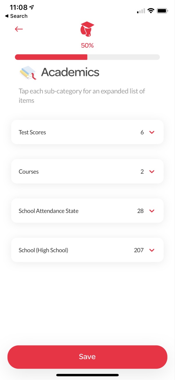
I audited the live product on every surface. Search felt different on the app than on desktop. Rigid category lists slowed students down. And every new screen solved problems that had already been solved somewhere else.

2.0 business goals
Lead generation
Goal 1
Improve product functionality
Goal 2
Drive revenue
Goal 3
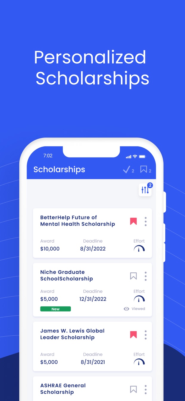
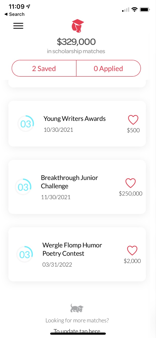
Scholly 1.0 scholarship feed
1.0 · FeedA plain list
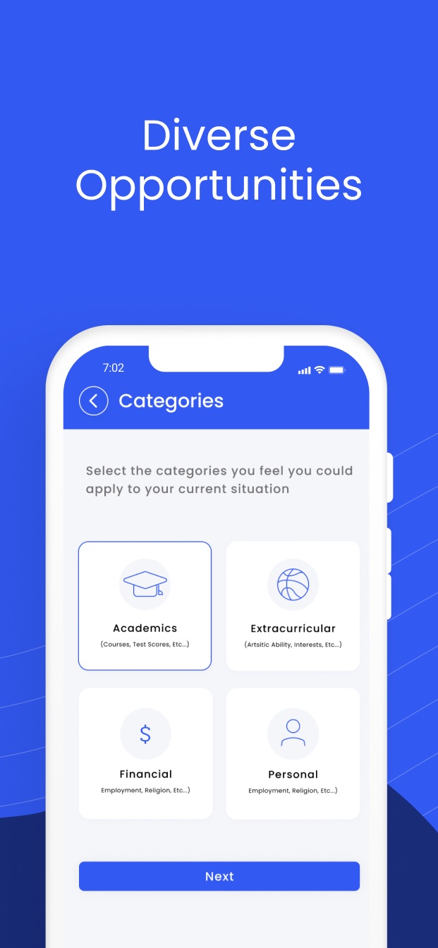
Scholly 1.0 category lists for academics
1.0 · CategoriesLong lists to fill in
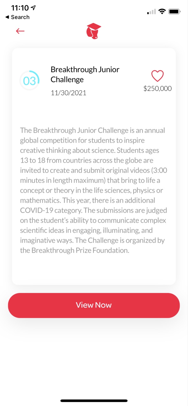
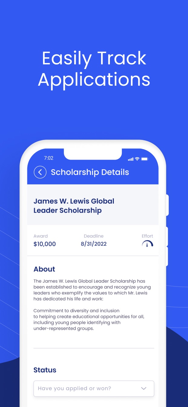
Scholly 1.0 scholarship details
1.0 · DetailsA wall of text
02
Chapter 1 · Scholarship Search

Search first, in two phases

Search is the reason students show up, so it went first. I wrote the redesign plan and led it from start to finish, running the same four steps in each phase.

01

Listen

Gather what we already knew: product data, surveys, ratings and reviews, and the brand audit.

02

Analyze

Profile the audiences, study seven competitors and map the student journey.

03

Design

Flows and wireframes first, then high-fidelity screens and prototypes.

04

Test

Put prototypes in front of real students and fix what confused them.

Why two phases

Smaller pieces, faster yeses

I split the work into Design Phase 1 and Design Phase 2. Each phase had its own finish line, so the team kept a steady pace. And stakeholders got reviews in bites they could actually get through, so feedback came back faster and sharper.

Design Phase 1 · getting in
Registration and sign-in
✓
Onboarding
✓
Paywall
✓
Profile and account settings
✓
Design Phase 2 · finding scholarships
Dashboard
✓
Scholarship feed
✓
Scholarship details
✓
Resources
✓
03

Start with what we already knew

Before drawing anything, we pulled together the data the company already had: the audit from marketing, Offers surveys from design, ratings and reviews from product, and insights from our data analyst.

What we looked at
Who our users are
Demographics
Which scholarship categories perform best
Categories
Which devices people use most
Devices
Where people get frustrated
Pain points
Where people give up
Drop-offs

User Persona

Rising seniors, college students and graduate students, ages 18 to 24

I created profiles for every type of user, covering their interests, habits and needs. Then we narrowed the focus. Phase one of the redesign would serve rising seniors and college students.

Q: Who we designed for?
A: Students looking for scholarships

Primary users · the focus
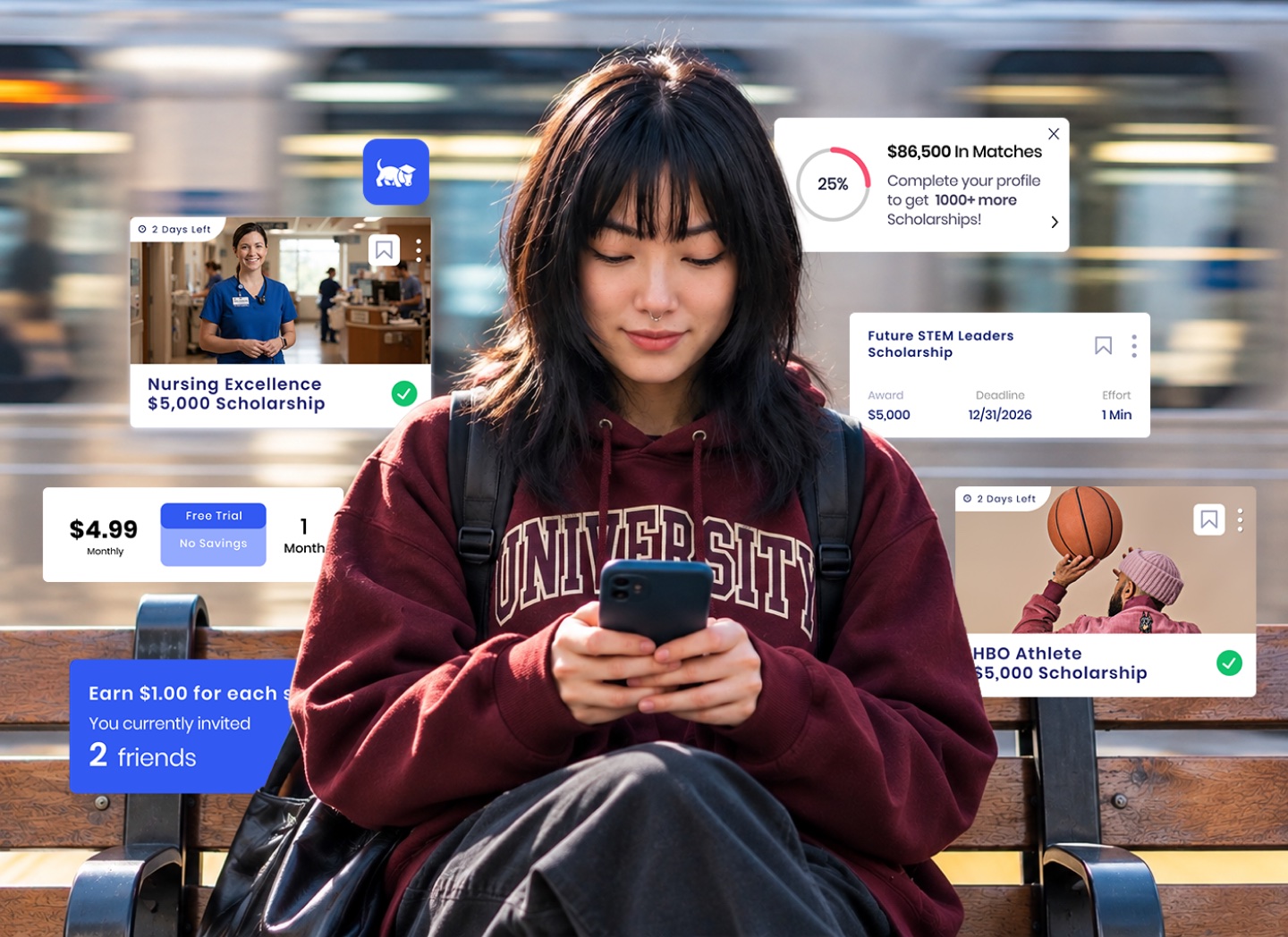
A student on a station bench using her phone, surrounded by Scholly scholarship cardsStephanie, 18
Bio

An 18 year old senior honors student in Austin, TX. She currently works at a local coffee shop part-time but can't wait to graduate, starting college to study nursing to gain her independence.

Frustrations

Choosing the right college far from home (parents want her to stay local) with the right balance of academics and social life that doesn't break the bank or set her up for too much debt in the future. Doesn't want finances to limit her from achieving her goals of helping others. Also concerned about having limited funds for entertainment and staying on trend.

Personality
  • Extrovert
  • Liberal
  • Creative
  • Active
Motivations
  • 25% Incentive
  • 50% Fear
  • 75% Achievement
  • 70% Growth
Hobbies/Interest
  • Dance
  • Volley Ball
Brands
  • Nike
  • Vans
  • F21
  • Starbucks
Influenced
  • Social media
  • Friends
  • Media Ads
Apps
TikTok and Twitter

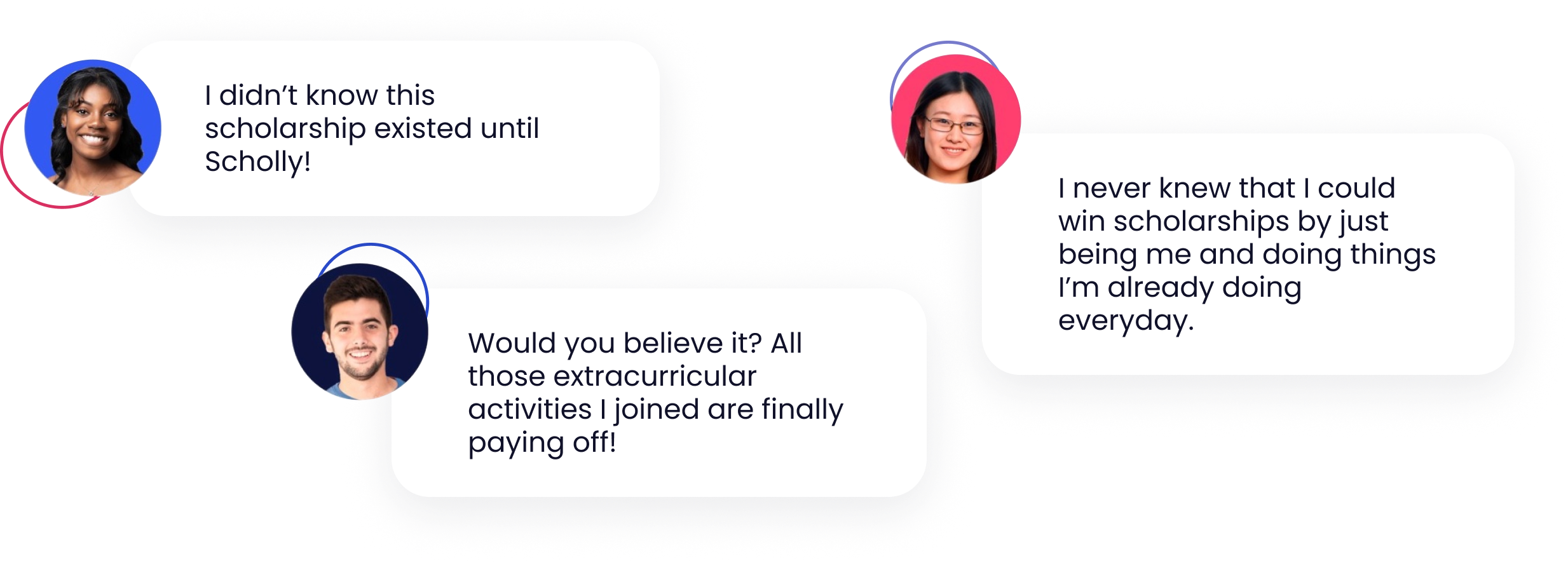
We listened
to what students were saying about Scholly

Three student quotes: I didn't know this scholarship existed until Scholly! I never knew that I could win scholarships by just being me and doing things I'm already doing everyday. Would you believe it? All those extracurricular activities I joined are finally paying off!
Secondary users · later phases

The people who help them

Parents of students, and K-12 and college admissions counselors who support students in finding scholarships.

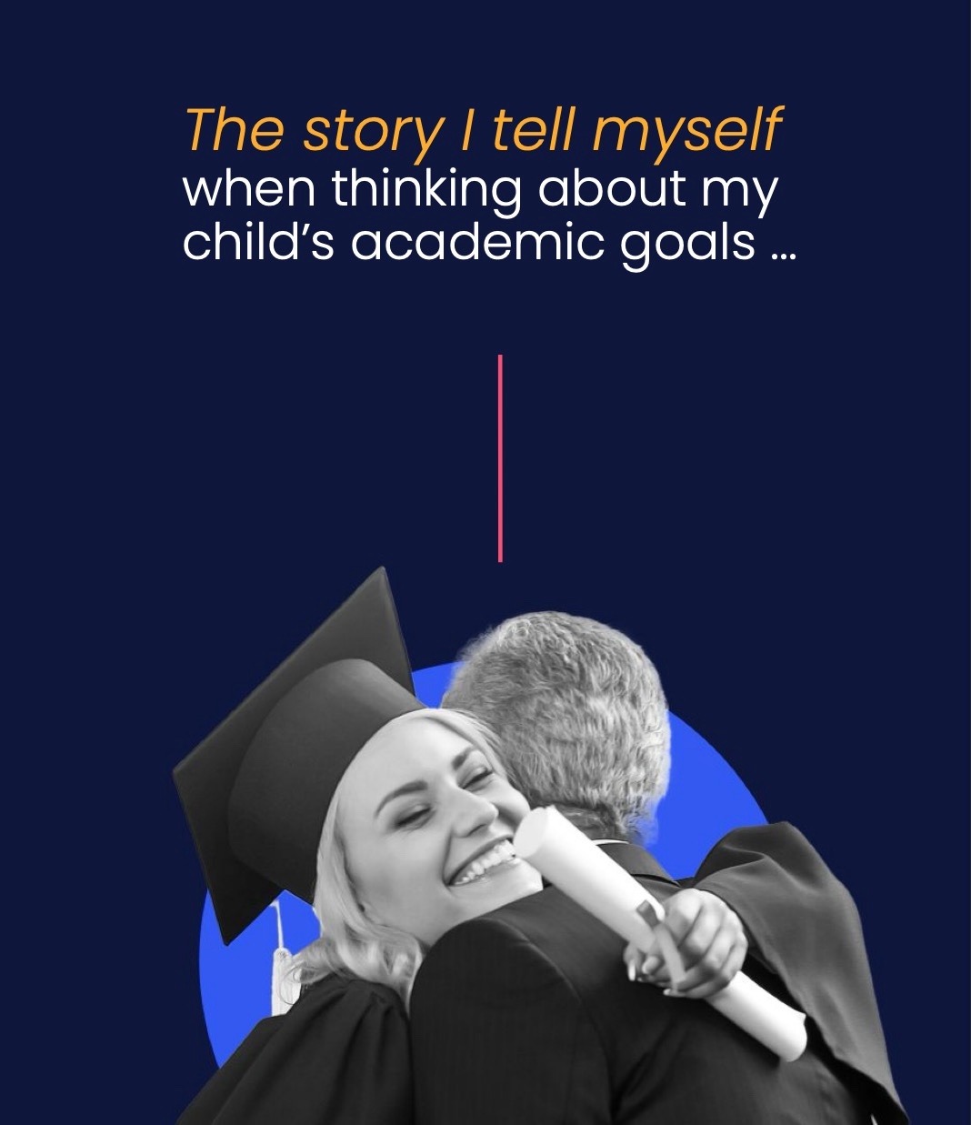
The story I tell myself when thinking about my child's academic goals, over a photo of a graduate hugging a parent

Parents

  • I'm worried my child will drown in debt once they graduate. I don't want to get in the way of their dreams, but I don't know how to help my child alleviate the financial burden of college.
  • Sure, there are some scholarship platforms out there, but they're so outdated, I could never imagine my child actually using their websites to apply.
  • I'm willing to do whatever it takes to help my child achieve their dreams after high school. If only there was a tool designed to help them find financial aid more easily!
Who else was out there

A SWOT with three more questions

A classic SWOT tells you where a competitor is strong and where the market is open. It doesn't tell you what the product is like to use. So I introduced a framework I called S.W.C.D.UX.O. It adds three pillars, Content, Design and UX, between the inside view and the outside view.

I brought every stakeholder in to score seven competitors with it. The ideas they flagged helped shape the new UX.

PillarWhat it stands forWhat we wanted to learn
SStrengthsWhat they do well that students notice
WWeaknessesWhere they fall short or frustrate people
CContentHow clearly they explain scholarships and their own value
DDesignHow the product looks and how consistent it feels
UXUser experienceHow easy it is to sign up, search and apply
OOpportunitiesWhat we could do better, or that nobody was doing

Competitive Analysis

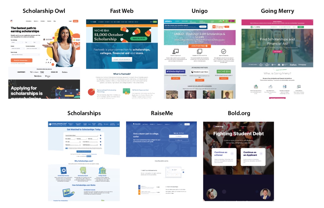
7 Platforms

Homepages of seven scholarship platforms: Scholarship Owl, FastWeb, Unigo, Going Merry, Scholarships.com, RaiseMe and Bold.org
Brand guidelines

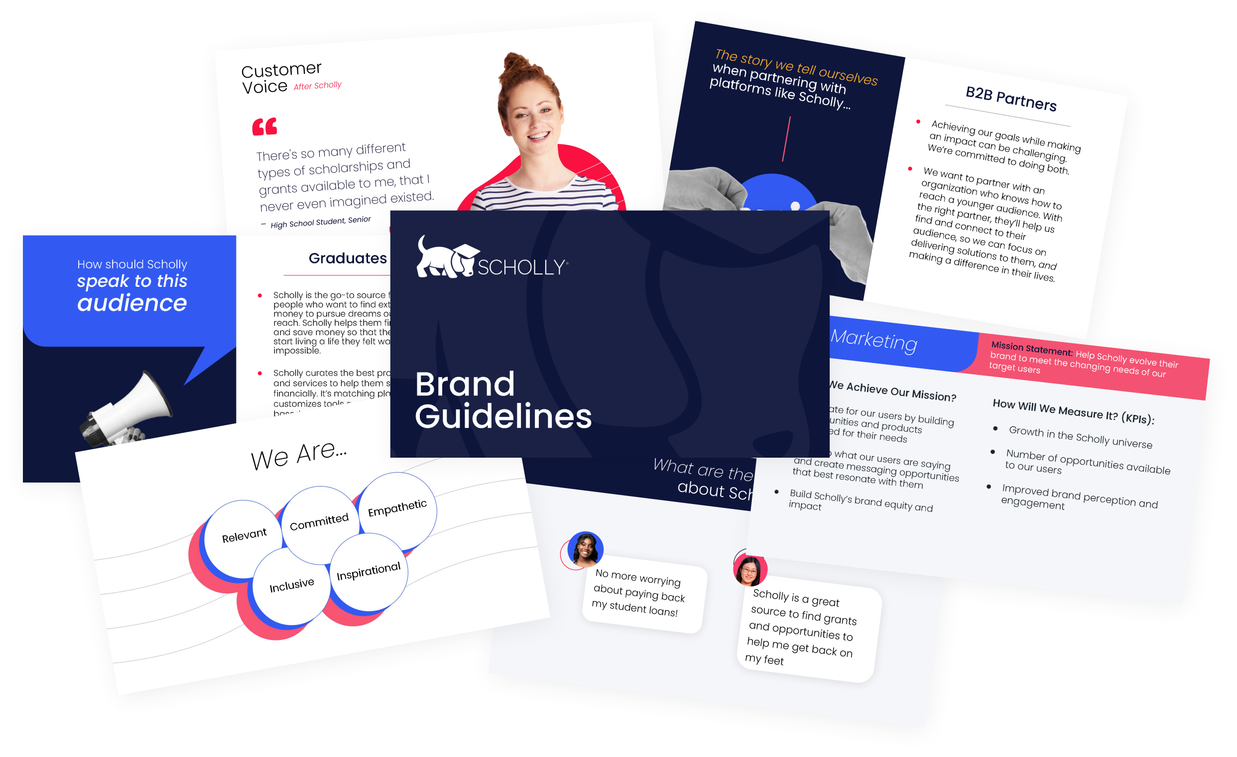
A new brand book, built with marketing

Pages from the Scholly brand book: personas, voice, values and customer quotes

I worked with our junior designer and the marketing team to keep the brand and the product in sync. The brand book came out of the same research that shaped the redesign, and it gave marketing one clear voice.

View Brand GuidelinesPDF · 49 pages · opens in a new tab

Where the journey broke down

Finding the opportunities

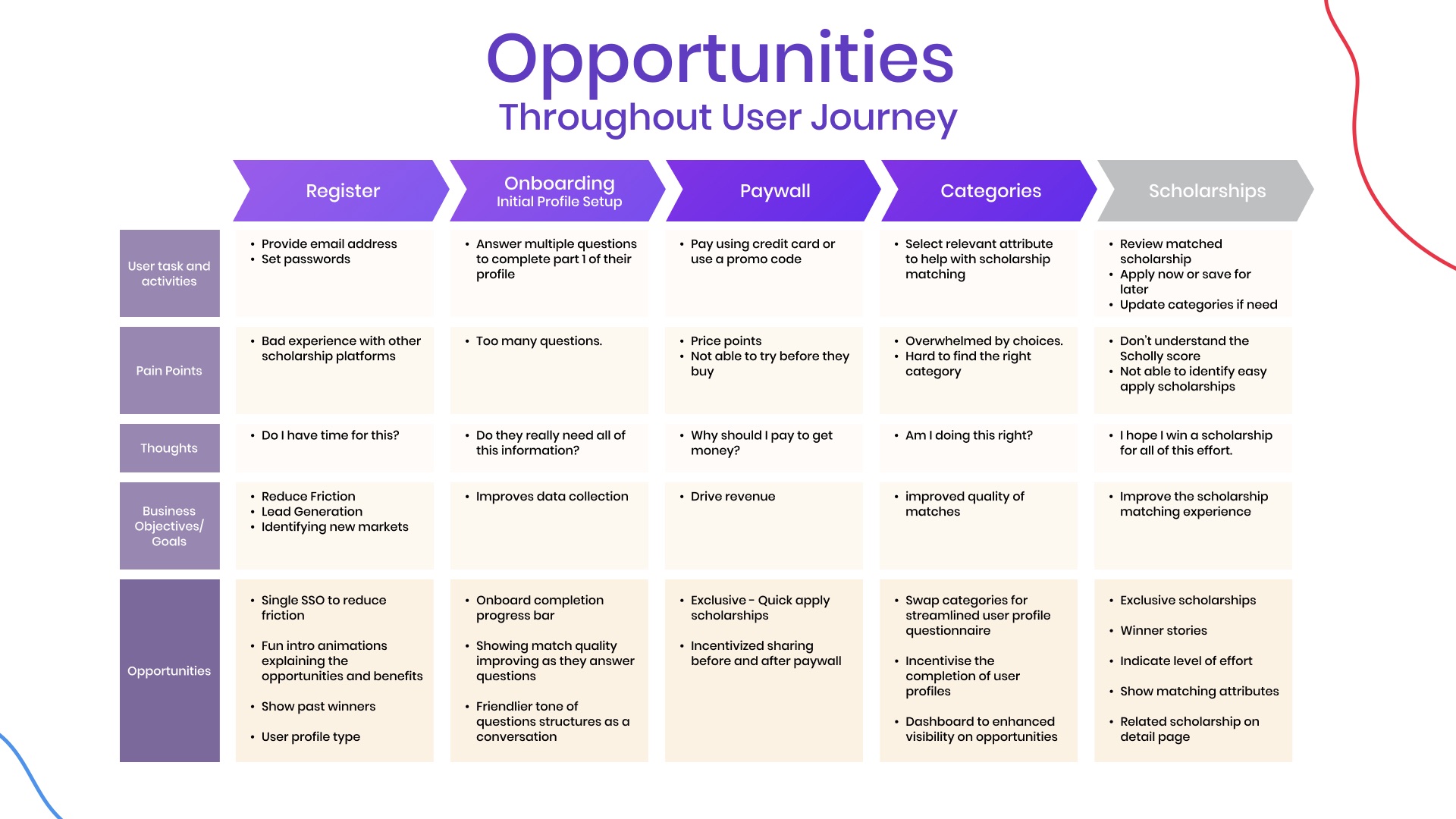
We walked the old product from registration to scholarships and wrote down what students did, what hurt, and what the business needed at each step. Every row of opportunities became a design brief.

Journey map from register to scholarships with pain points and opportunities
Journey mapRegister, onboarding, paywall, categories and scholarships
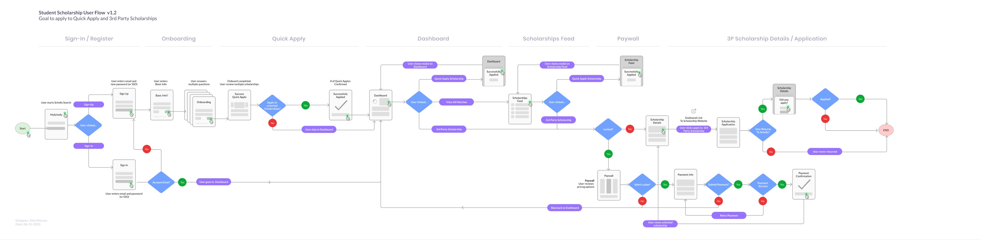
Student scholarship user flow diagram
User flowThe student path, start to finish
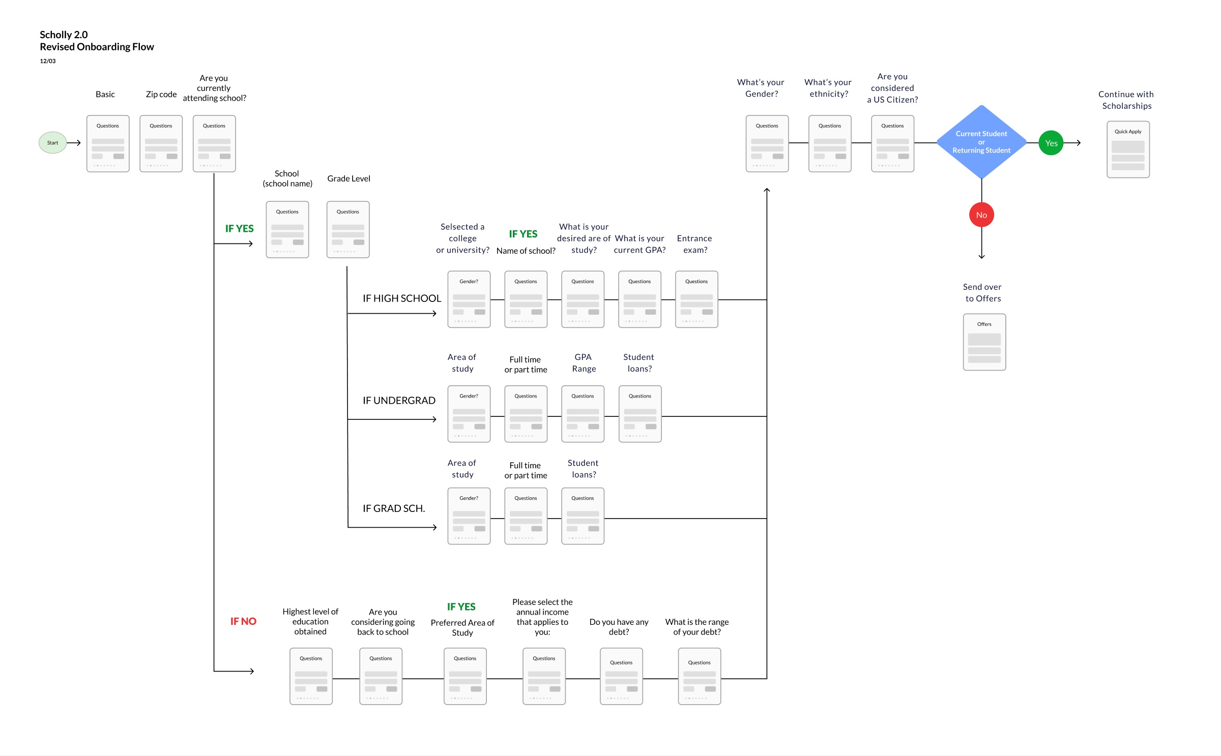
Onboarding flow

One path, branching by student

Onboarding branches by where a student is in school. Each person only sees the questions that apply to them.

Revised onboarding flow diagram with branches by student type
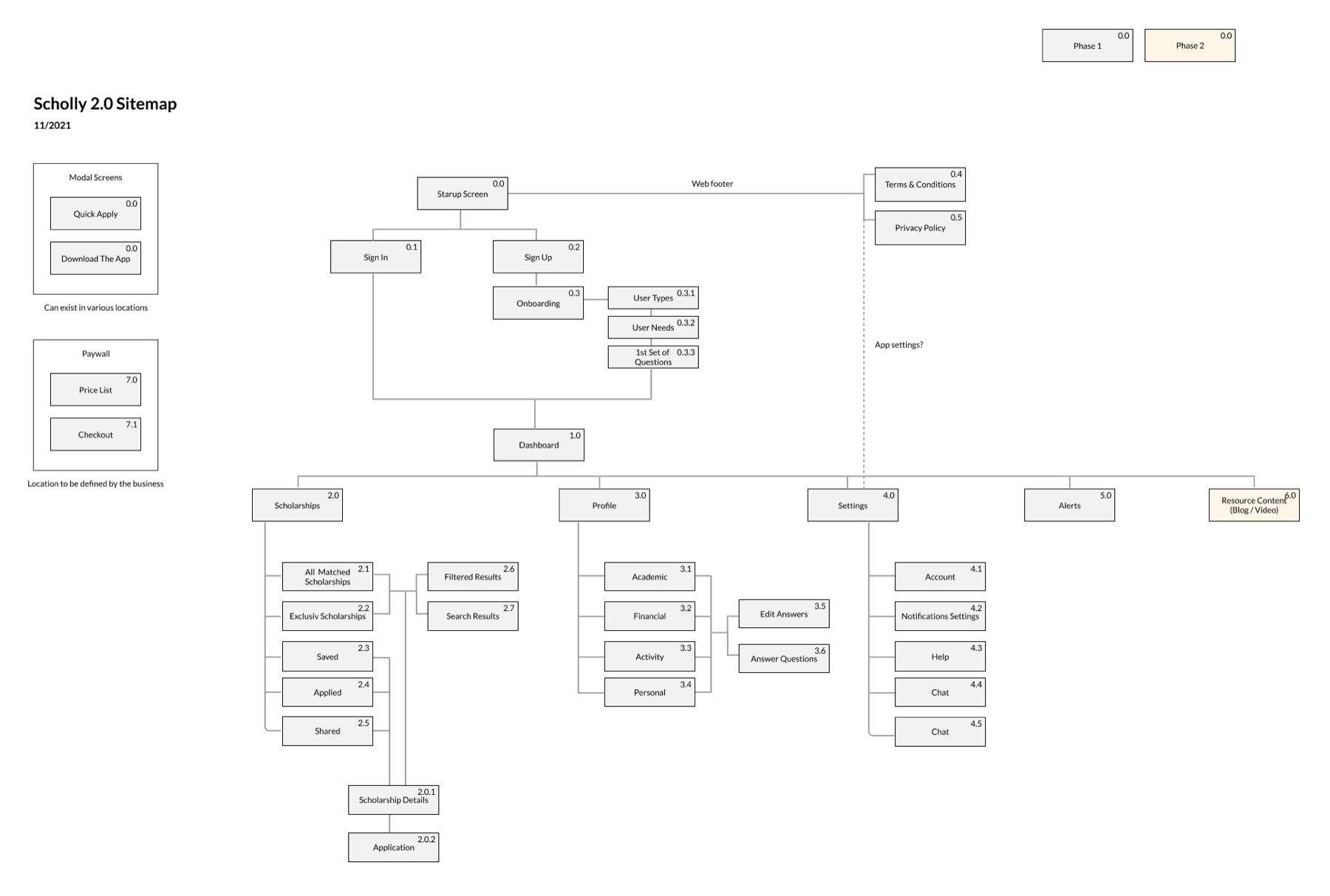
Sitemap

Organized around what students do

The new structure follows how students search, save and apply, not how the company was organized.

Scholly 2.0 sitemap
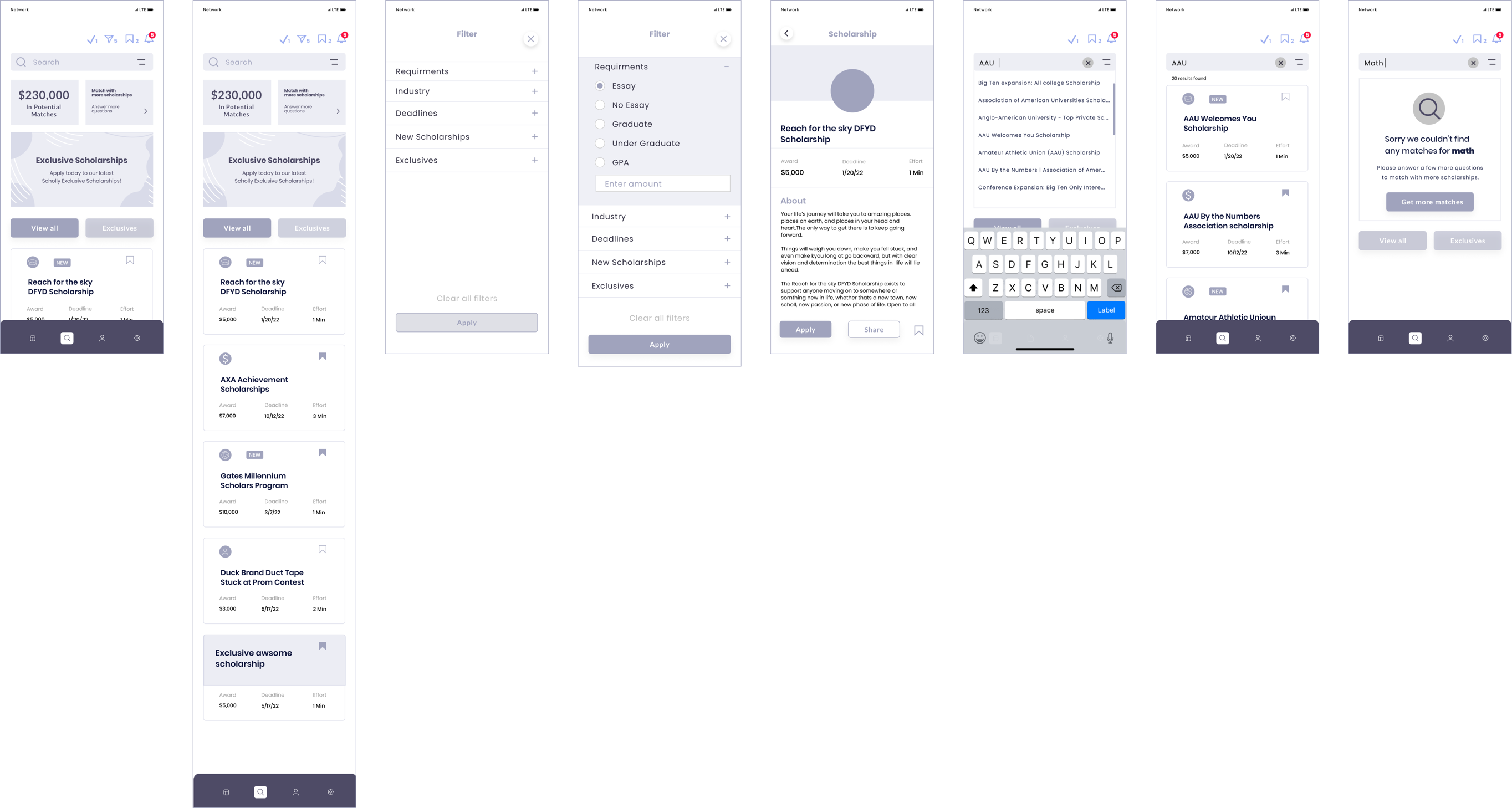
Wireframes

Low fidelity first, for fast approval

Low-fidelity wireframes: dashboard, scholarship feed, filters, scholarship details, search, results and no results
04

Every decision had a reason

The research gave us a short list of things to fix. Here is what I changed, and why.

Decision 1

Mobile first, with cues from social media

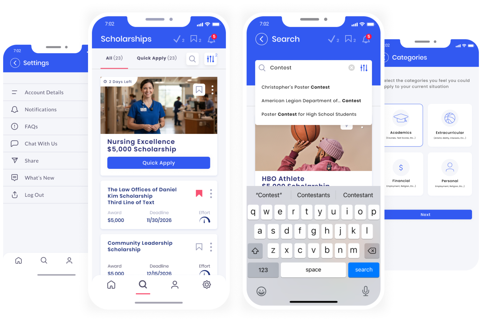
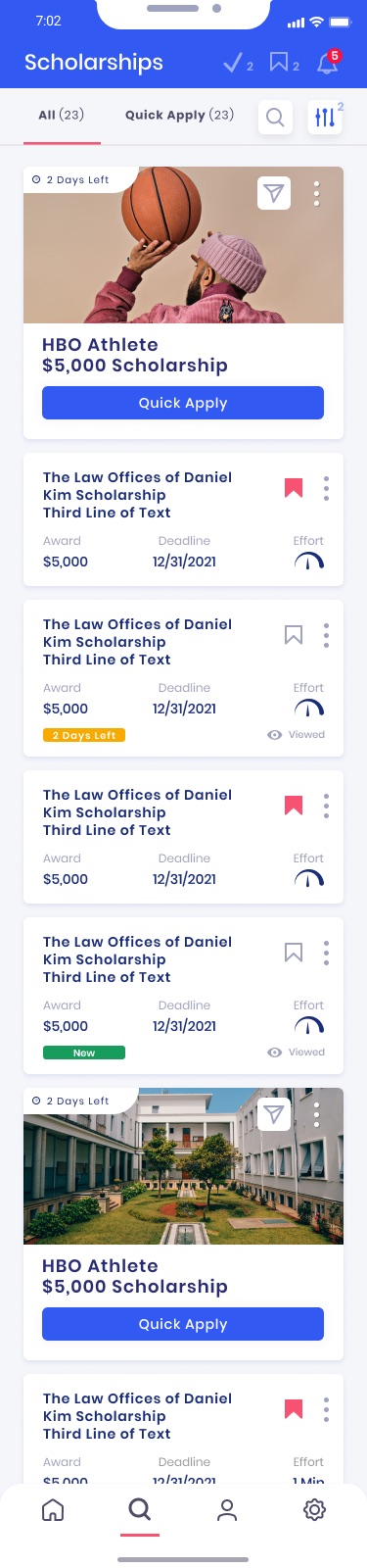
Four Scholly 2.0 phone screens: settings, scholarship feed, search and categories
Why

54% of our users were on mobile, and our students were heavy social media users.

Action

I designed for the phone first and borrowed patterns students already knew from their feeds: big images, cards and quick actions. The app matched their mental model, so there was less to learn.

Try the live prototype Figma · opens here

Decision 2

Sign in with one tap

Why

Registration was the first place people gave up.

Adding single sign-on with Google and Apple cut registration down to a tap. Fewer fields, faster start.

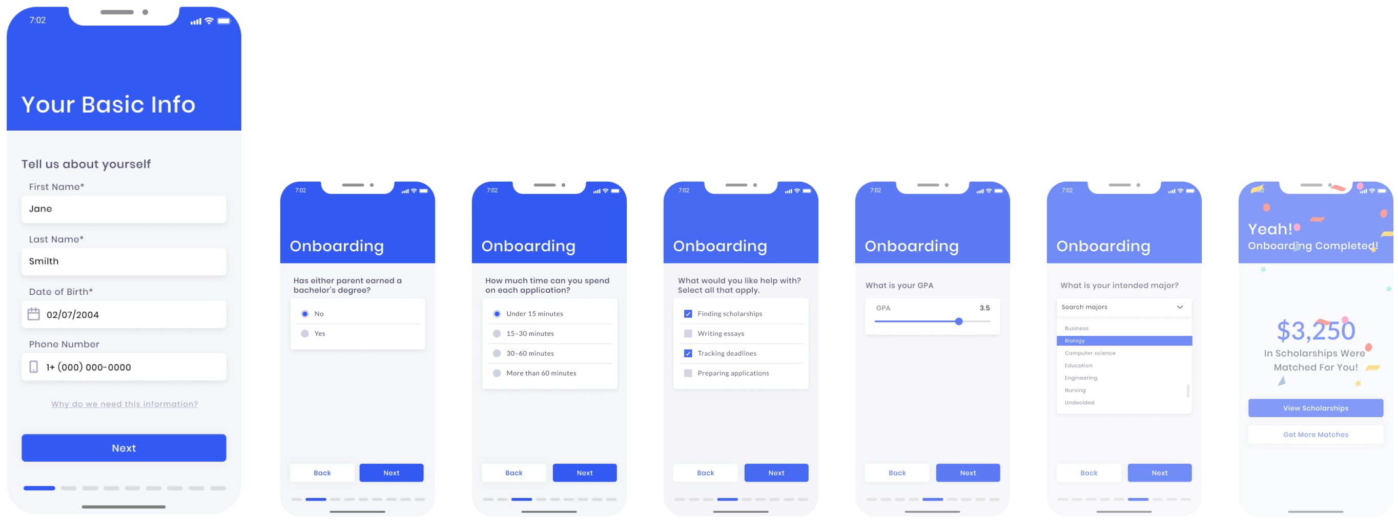
Seven onboarding screens: basic info, parent education, application time, help preferences, GPA, intended major, and the completed screen
Decision 3

Long forms became a friendly survey

Why

Students filled in long forms and category lists before seeing anything useful.

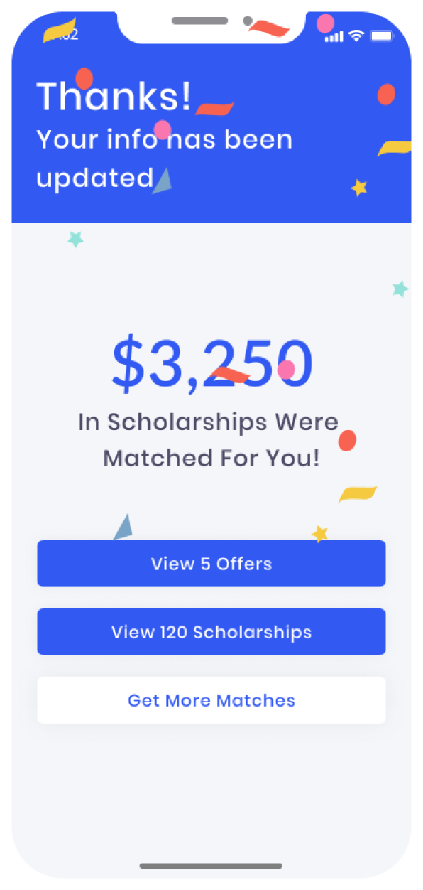
I broke the forms into one question per screen, with a progress bar and a payoff at the end: the dollar amount of scholarships you just matched with.

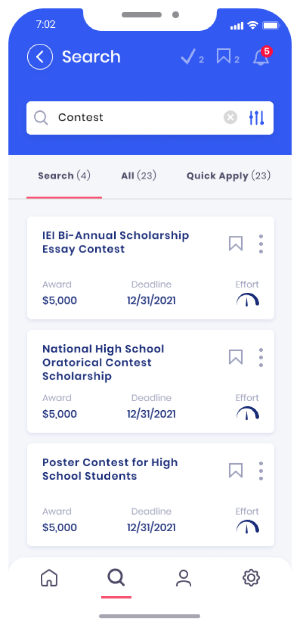
Scholarship search results with matched scholarships
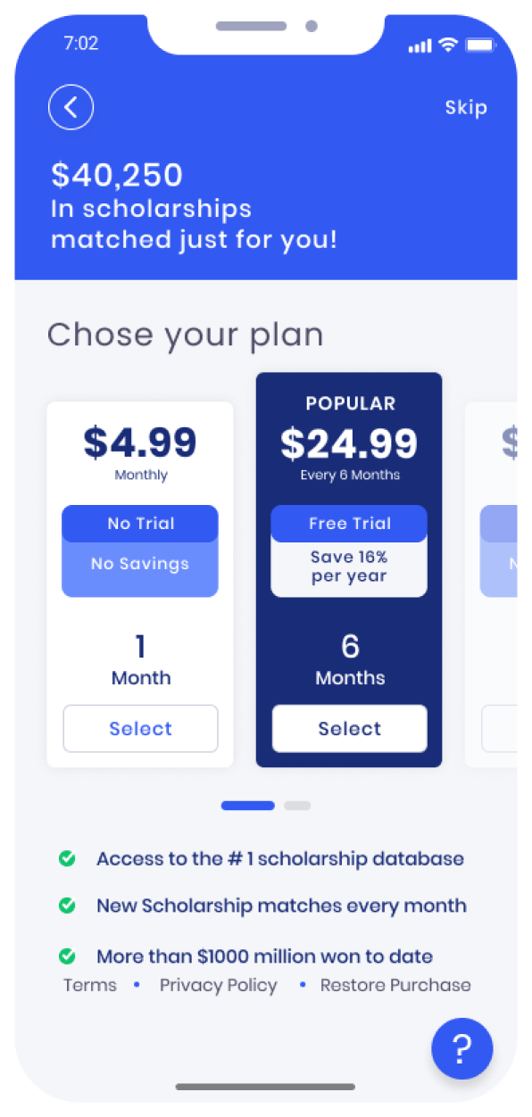
Paywall with plan options and the matched scholarship amount
Decision 4

Try before you buy

Why

The paywall came up before students had seen what they were paying for.

Action

I moved the paywall behind the scholarship feed. Students see their matches first, then choose a plan with the matched amount right at the top.

Decision 5

Better matches, and a reason to trust them

Why

Match quality depended on profile data students had little reason to complete.

Action

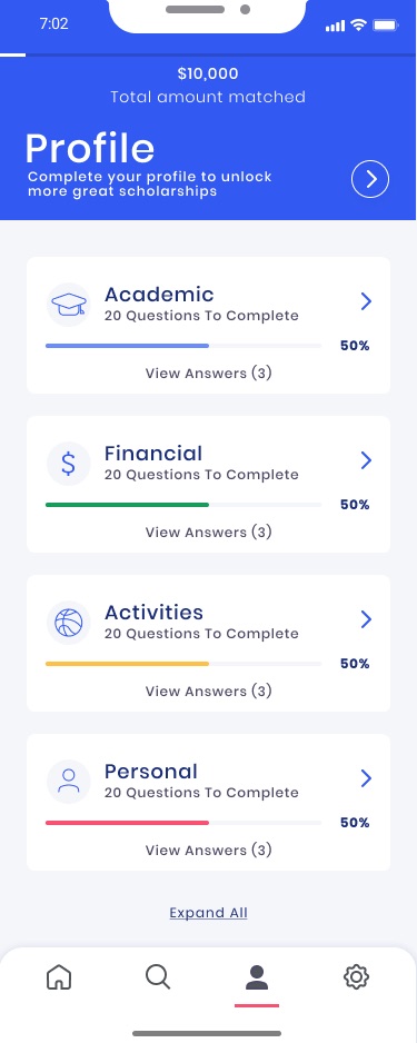
Progress indicators reward finishing your profile. Quick Apply and past winners build trust. And every scholarship now explains what it is, what it takes, and how you were matched.

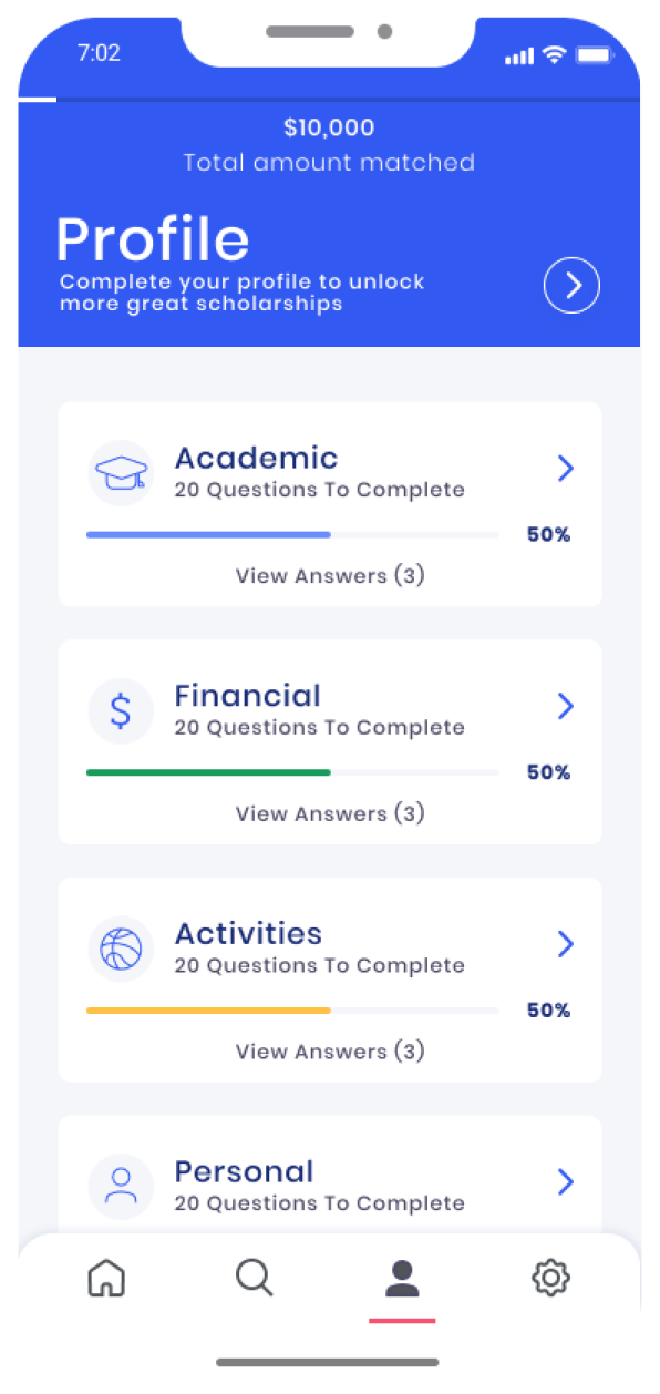
Profile screen with progress per section
Confirmation screen showing $3,250 in matched scholarships
Multi surface

Adaptability across devices

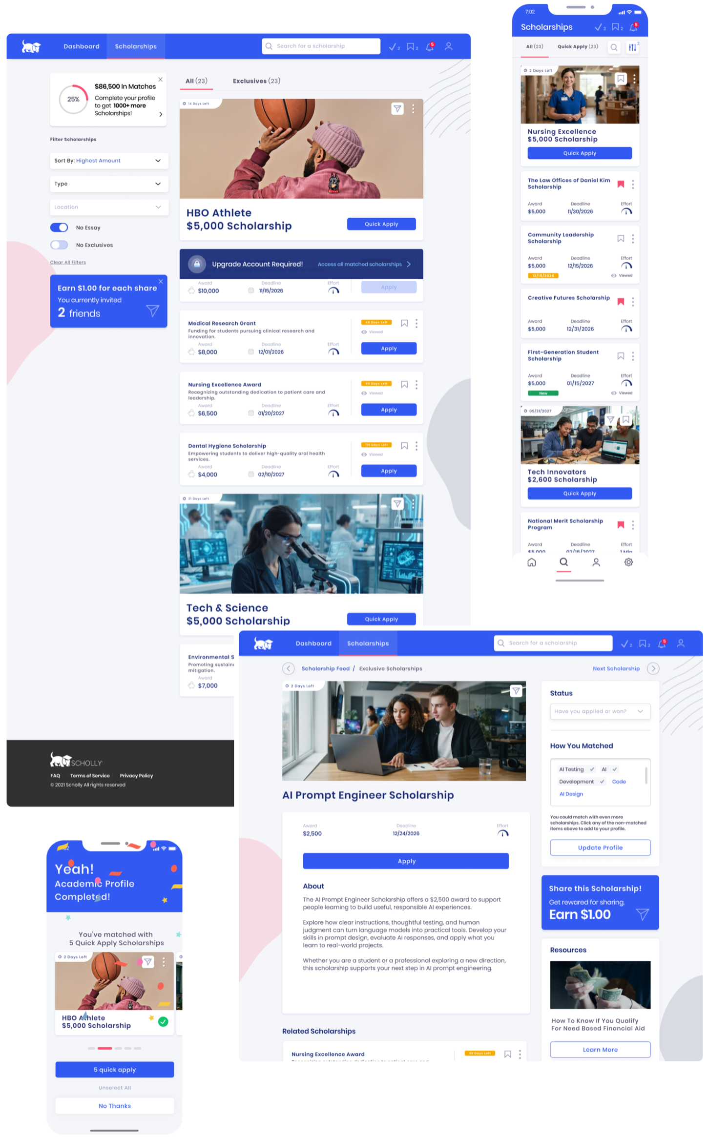
I designed the dashboard, feed and details for desktop, tablet and mobile at the same time. A student could start on a phone and pick up on a laptop without relearning anything.

Scholly 2.0 scholarship feed and exclusive scholarship details on desktop, with the full scholarship list and a completed profile screen on mobile

Mockups were updated for presentation purposes.

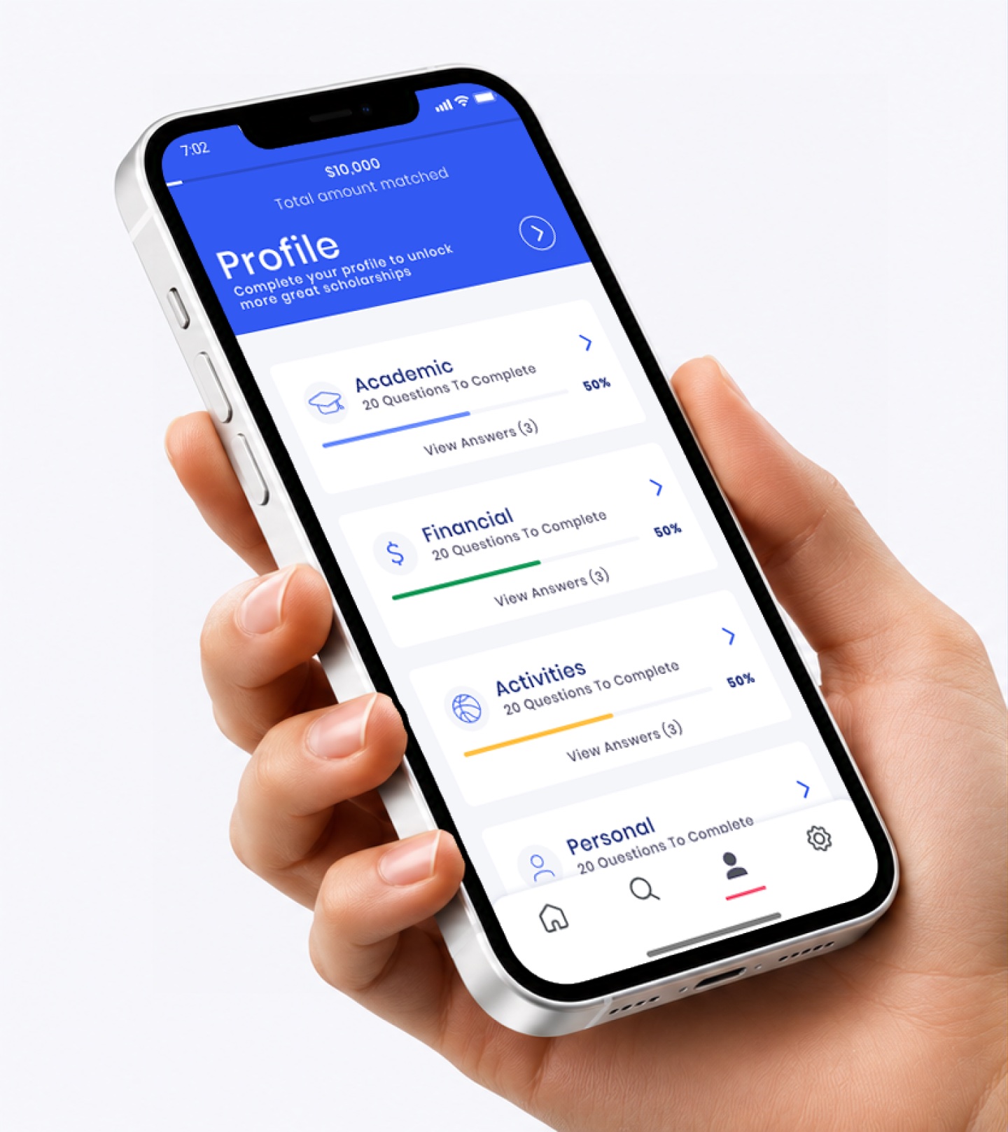
A hand holding an iPhone showing the Scholly profile screen
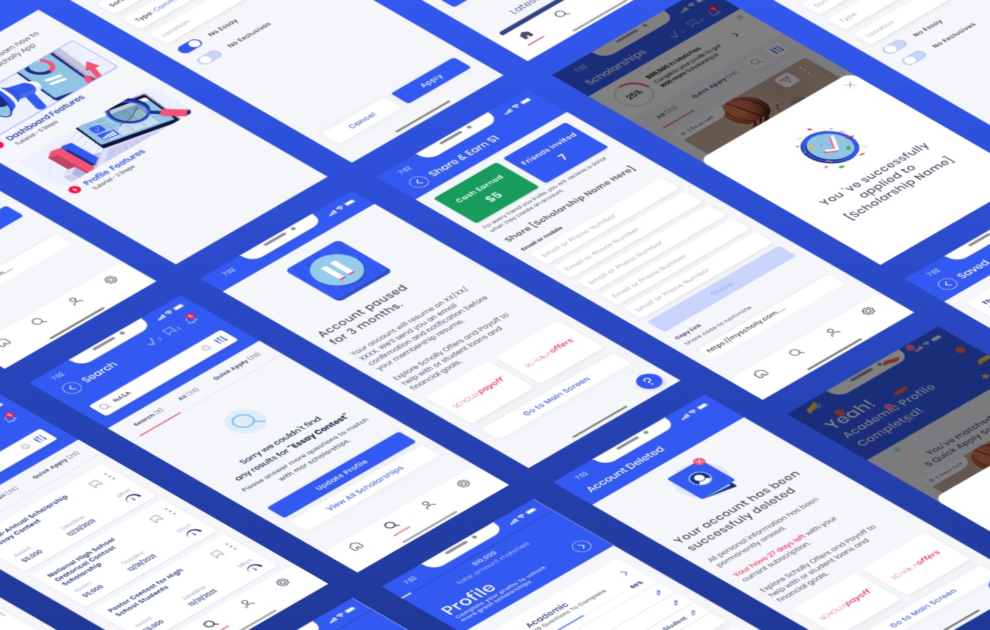
An angled wall of Scholly 2.0 app screens
05

Same scholarships. A very different product.

Scholly 1.0 scholarship feed
1.0
Scholly 2.0 scholarship feed
2.0

FeedFrom a plain list to cards you can act on.

Scholly 1.0 scholarship details
1.0
Scholly 2.0 scholarship details
2.0

DetailsFrom a wall of text to award, deadline and effort up top.

Scholly 1.0 category lists
1.0
Scholly 2.0 profile
2.0

ProfileFrom long lists to short sections with progress.

06
Chapter 2 · Design System

The patterns from Search became the system

I built Scholly's first design system, 1.0, so everyone worked from one source. During the Search redesign, I turned every new UI element into a reusable component. 1.0 grew into 2.0: more than 500 components, synchronized across every layout, so hand-off and QA stayed honest.

Before
  • Scattered Sketch and Figma files
  • Inconsistent components
  • Duplicated patterns
  • A different experience per surface
→
Pedigree
  • Tokens
  • Components
  • Patterns
  • Guidelines
  • Documentation
→
After
  • 500+ synchronized components
  • 4 surfaces in parity
  • One shared design language
  • Engineers pull from one source

Pedigree

Design System 2.0

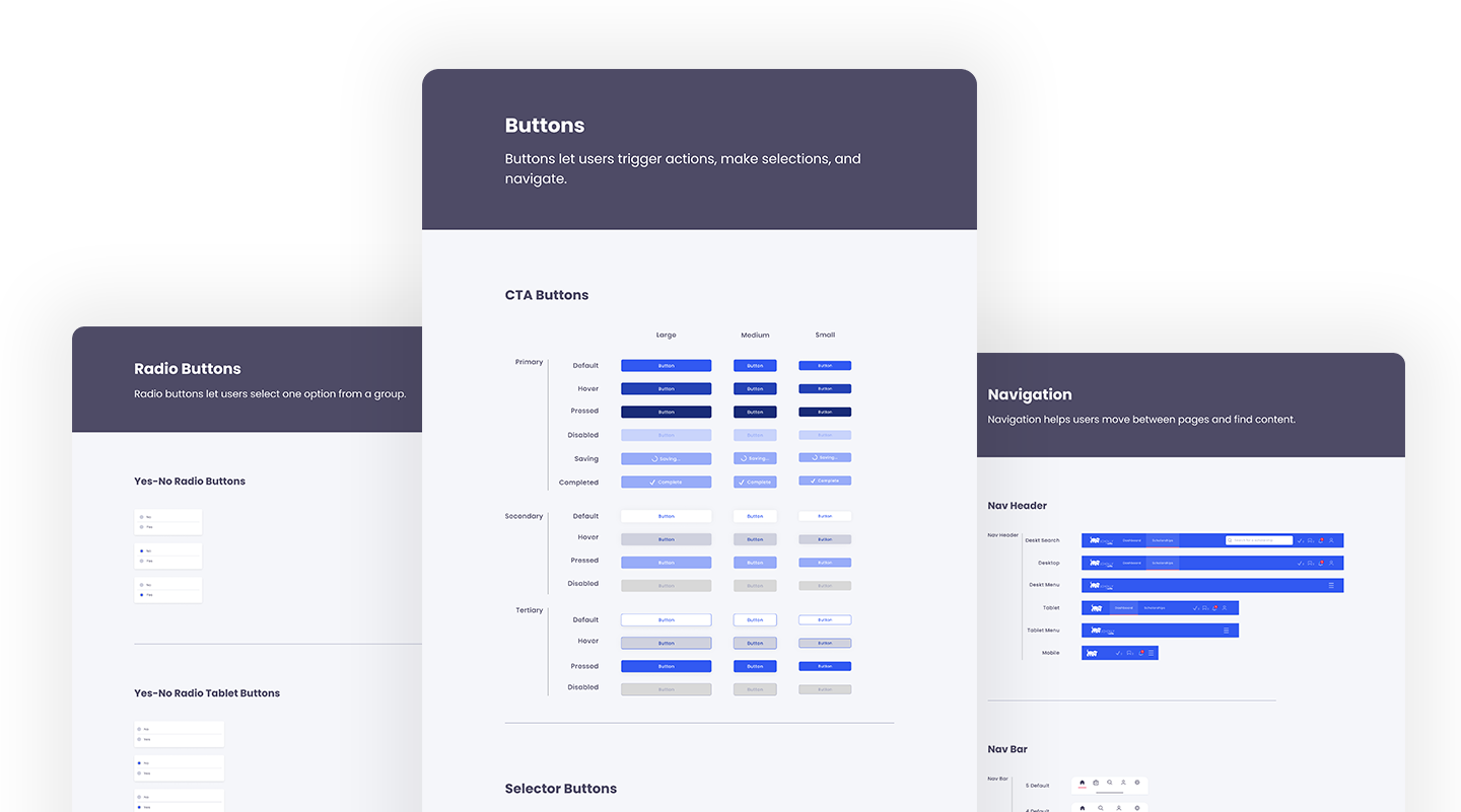
Pedigree design system pages for radio buttons, CTA buttons and navigation
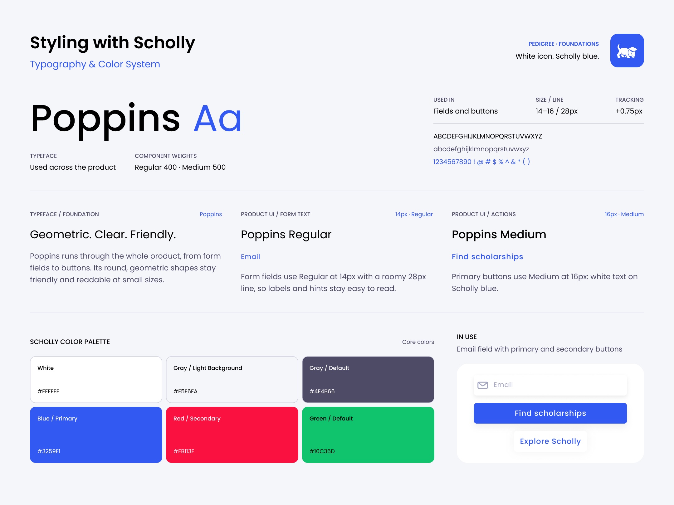
Styling with Scholly: Poppins type specimen, usage for form fields and buttons, and the Scholly color palette
Exclusives card

Anatomy

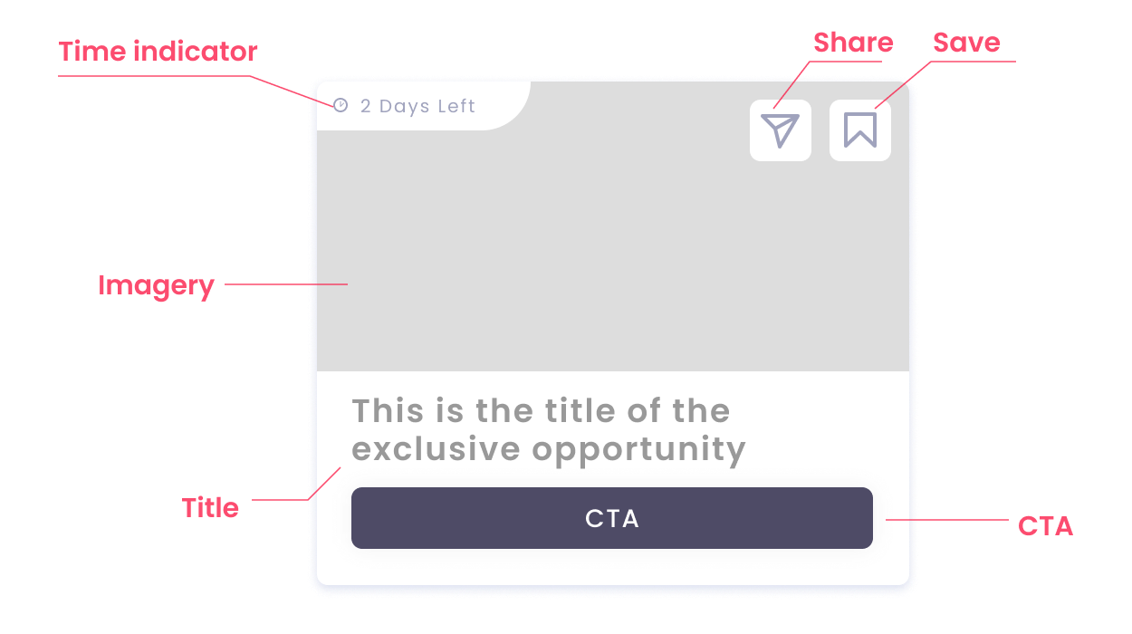
The difference between matched cards and exclusives cards comes down to imagery, a heavier font weight and a time indicator.

Exclusives card anatomy with callouts for time indicator, share, save, imagery, title and CTA
07

Every design decision was a guess until we tested it

I ran unmoderated UserZoom Go studies on the interactive prototypes with real students. A task script walked each person through the whole experience while we recorded screen and voice.

View more detailsHide details
"I enjoyed how visually appealing it was, as well as how user friendly it was."
"Make the important information easier to read."
"It looks modern and is easy to navigate, but it relies a lot on icons that some people may not know to use."
What we asked students to do
Sign up and complete onboarding
Part 1
Find, filter, search and apply
Part 2
Save and manage scholarships
Part 3
Improve match quality through the profile
Part 4
Rate the experience end to end
Wrap-up
What we changed because of it
Added titles to the Dashboard and Feed so the two screens are easy to tell apart
Fix 1
Cleared up the wording around Quick Apply and Exclusives
Fix 2
Added tooltips to introduce new features like share and earn
Fix 3
08
Chapter 3 · The Website

Answering "what is Scholly?" in one screen

The audit said people couldn't explain what Scholly offered. The website was where that had to be fixed. With the design system in place, I rebuilt MyScholly.com to explain Scholly faster, and let real users settle the biggest layout debate.

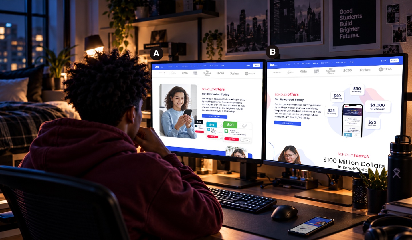
Two monitors showing MyScholly.com homepage Design A and Design B
Tested, not opinion-led

Users picked the clearer story

I tested two directions with 11 users in November 2022. Most picked the more graphic one that explains itself. They said it showed what Scholly offers faster. This is a preference result from a usability test, not a conversion number.

"B is compact and efficient. It clearly explains the system."UserZoom · homepage concept test

Homepage concept test · 11 users
Design B · graphic, explains itself8 / 11
Design A · informational2 / 11
Before & after

The old homepage and the new one

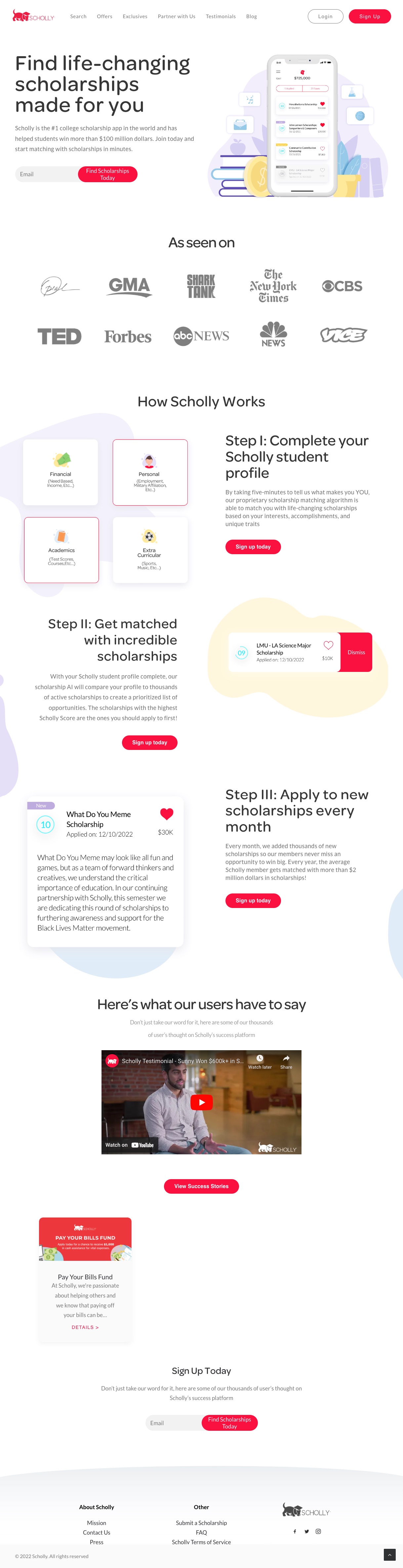
The old MyScholly.com homepage
BeforeA long page that took a while to explain Scholly
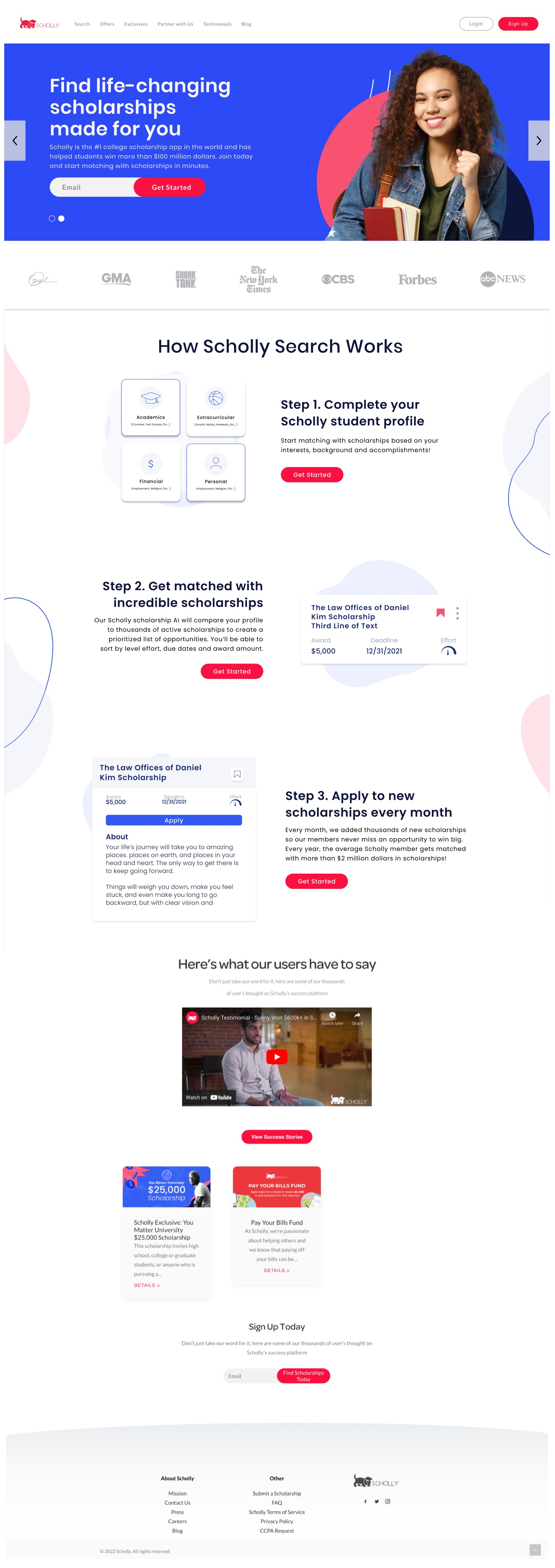
The redesigned MyScholly.com homepage with a blue hero and a three-step explanation
AfterSays what Scholly does in the first screen
09

Into the App Store

The new brand carried through to the store listing, so the first thing a student saw matched the product they were about to open.

App Store cover image: College is expensive, let's help you find free money to pay for it
App Store preview screen 1
App Store preview screen 2
App Store preview screen 3
10

Each chapter made the next one stronger

Search set the patterns. The design system made them reusable. The website told the story. In 2023, Sallie Mae acquired key Scholly assets, including Scholarship Search and scholarship administration technology.

4

Surfaces redesigned in tandem on one system

500+

Synchronized components in Pedigree

3

Changes made to Search because of student testing

8/11

Users preferred the redesigned homepage

Company figures such as $100M+ in scholarships come from Sallie Mae's reporting and describe Scholly's scale, not an individual contribution.
Products don't grow up one feature at a time.

01

Start with what you already know

We had surveys, reviews and product data sitting in four different teams. Pulling them together was faster than new research and pointed straight at the problems.

02

Let the main feature seed the system

The design system grew out of real Search screens, not a blank library. Every component had a proven job before it became a standard.

03

Give every decision a reason

"54% of users are on mobile" ends a debate faster than "I think it looks better." Reasons made approvals quick.