Scholly · UX Lead · Marketplace

Scholly Offers

Get paid for taking action. It started as a sweepstakes and became cash students could count on.

Alex McLean III · Sr. Manager, UX Design, Scholly, Inc.
370+
screens designed across mobile, tablet and desktop
50+
brand partners, one component library
5
rounds of user testing, from internal to UserZoom
407K
visits to partner brands, 2023 to 2024
The product

Find, grow and save money.
Get paid for doing it.

Scholly Offers matched students with trusted financial partners and paid them for taking the first step. Open an account, start investing, check their credit, and earn cash for it. That's the promise the whole product had to keep.
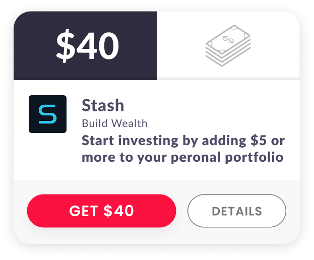
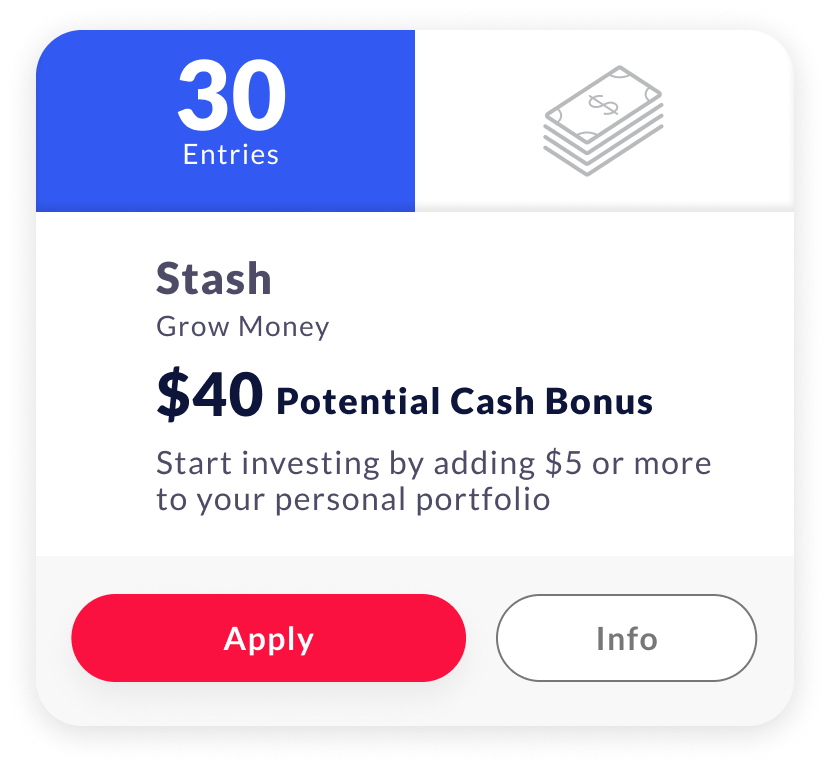
Stash offer card: get $40 for investing $5 or more
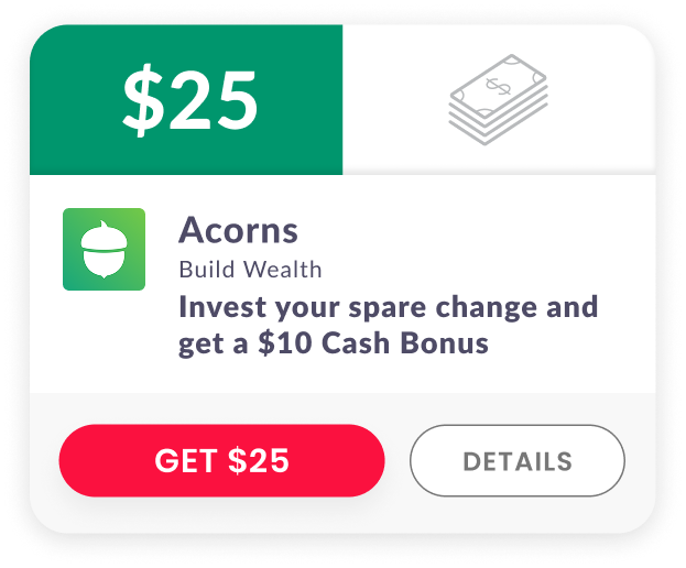
Acorns offer card: get $25 for investing your spare change
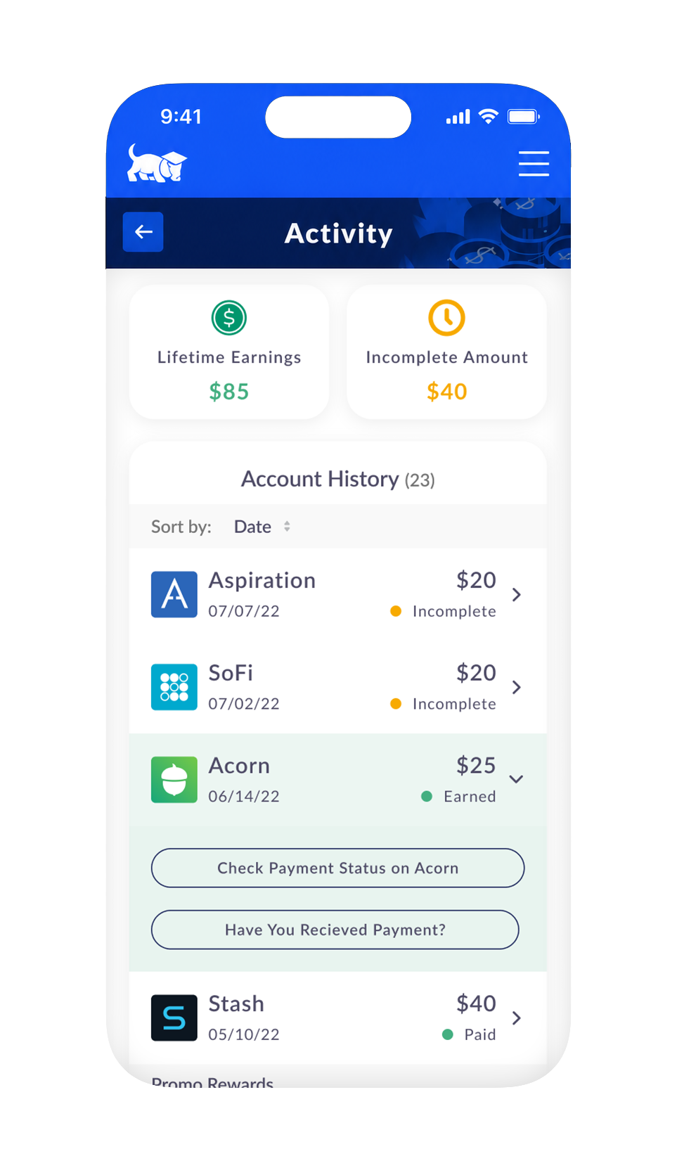
Account activity on iPhone with lifetime earnings, incomplete amounts and offer history
00

Designing for a moving target

Offers lived where the business made its money, so the model kept changing. A sweepstakes, then cash, then both, then gift cards and promo rewards. On top of that, lots of people visited and very few signed up with a partner. In September 2021, only 0.08% of visitors completed a partner action. Every change landed on the same screens.

Problem

The model kept moving.

A generic offer wall, a reward students doubted, and a business that changed the rules every few months.

Solution

A system that bends.

Components built to flex, so a new reward model meant new content, not a new product.

  1. 2021

    Enter to win

    Partner sign-ups earn entries into a sweepstakes.

  2. Jul 2022

    Earn cash

    A set cash amount for a set action.

  3. Aug 2022

    Both, together

    Instant cash beside the weekly $1,000 giveaway.

  4. 2023

    More ways to earn

    Gift cards, promo rewards and a free Scholly Search subscription.

01
July to October 2021

Who earns, and why

We started with a stakeholder interview, a heuristic review of all three Scholly products and a scan of apps that already paid people. Four segments of users came out of it: #1 high school juniors, #2 high school seniors, #3 college students and #4 graduates. All four shared the same three goals: make money, save money and invest money.

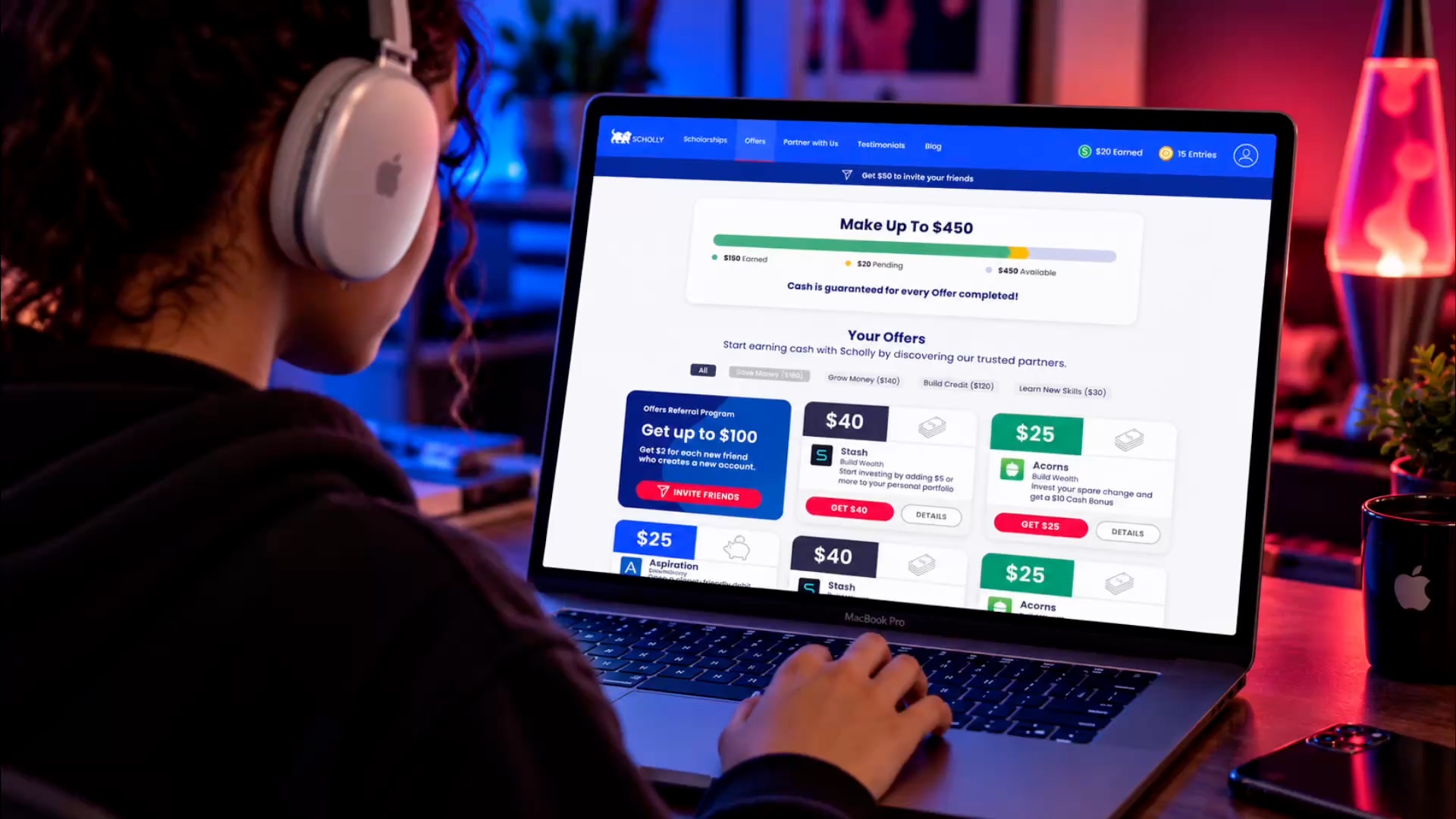
A student with headphones browsing the Scholly Offers dashboard on a laptop at night
Working persona

Target audience

College students and recent grads, ages 18 to 24

Partners only paid out on accounts for people 18 and older, so the high school segments could look but not earn. The people who acted were college students short on money, and the data showed what they reached for first: investing apps.

01Primary User Persona

Jazmine, 20

College Student  |  Part-Time Worker  |  First-Gen

A motivated, budget-conscious student who wants an easy, trustworthy way to find scholarships and earn cash rewards to help pay for college and everyday expenses.

  • Practical
  • Ambitious
  • Social
  • Skeptical
Jazmine, a college student working on her laptop outside in the sun
Goals

Find legitimate scholarships and cash offers to help pay for college, build a small savings cushion, and get ahead financially.

Pain Points

Money is always tight, and many apps feel like a scam. She struggles to find legit opportunities and doesn’t want to waste time on dead ends.

Behavior

Actively searches for scholarships, checks apps regularly, shares opportunities with friends, and looks for simple, mobile-friendly experiences she can use between classes and shifts.

Motivations
  • Cash for everyday expenses
  • Build something for later
  • Sharing a good deal with friends
  • The thrill of winning

“I want to focus on my education and future, but every little bit helps.
I just wish it was easier to find real opportunities I can trust.”

Competitive Research

Through feature score cards and a SWOT analysis

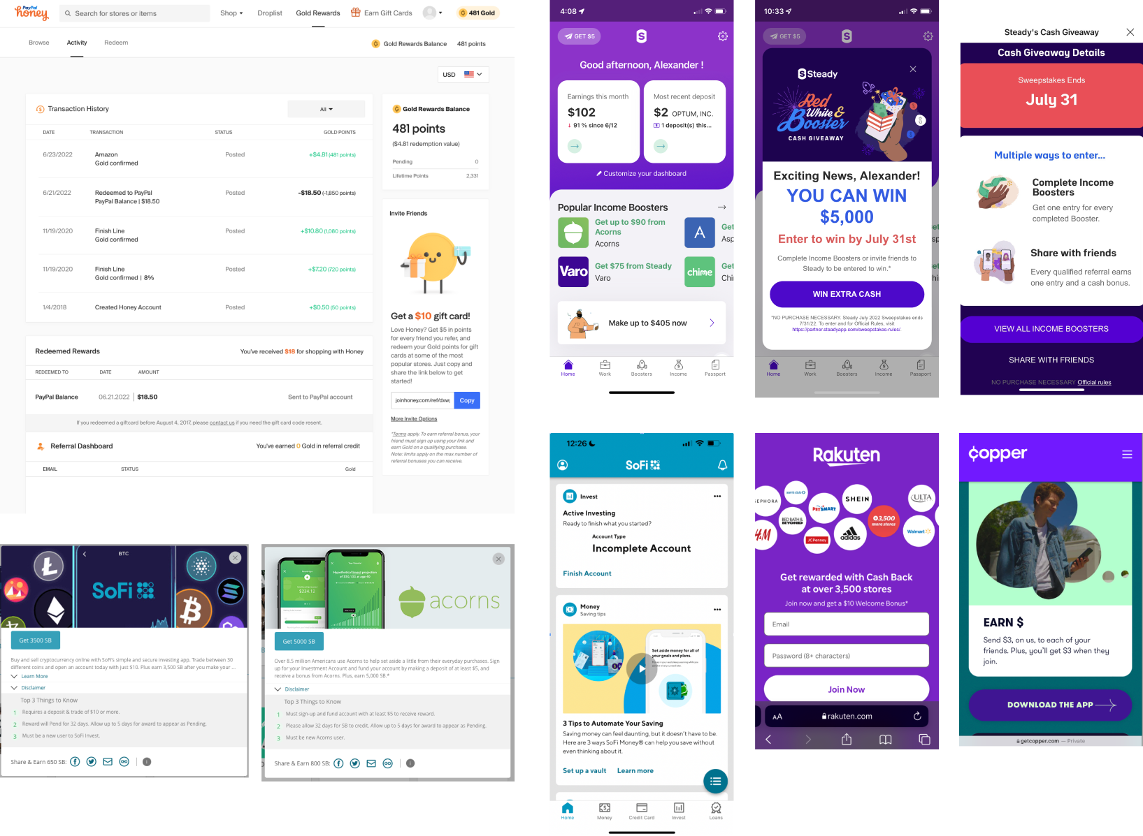
Collage of competitor screens from Swagbucks, Survey Junkie, Steady, SoFi, Acorns, Rakuten and other reward apps
Who else was out there

Learning from apps that pay people

I looked at the reward and cash-back apps students already used. Each one had a pattern worth borrowing.

AppWhat they doWhat we took from it
SwagbucksPoints for surveys and shoppingA clear activity history, with alerts sorted by when an offer expires
Survey JunkieCash for opinionsSay exactly which action earns which amount
SteadyAn income booster pageFrame the money as a boost toward a goal
SoFiFinancial products with rewardsLet a trusted brand vouch for the offer
What it added up to

Six ideas that shaped the new UX

  1. 01

    Rewards that feel like a game

    Points, entries and progress bars give people a reason to come back.

  2. 02

    Partners that fit the student

    Offers matched to real needs, not random ads.

  3. 03

    Clear categories

    Sort offers by goal: save, grow, build credit or learn.

  4. 04

    Nudges along the way

    Reminders that bring people back to finish a step.

  5. 05

    Deadlines that create urgency

    Time-limited offers and countdowns to the next drawing.

  6. 06

    Earnings students can track

    One place to see what they’ve earned and what’s pending.

My role

Leading product strategy, experience design, and execution

As Product Design Lead, I helped shape the evolution of Scholly Offers through product strategy, ideation, research, and hands-on UX/UI design. Working cross-functionally, I translated business objectives and user needs into clearer experiences, guiding concepts from early exploration through design refinement and implementation.

I also elevated the design process by introducing atomic design principles, reusable components, and scalable patterns. This brought greater consistency to the product, improved interactive prototyping, and gave engineering teams clearer, more predictable designs to implement.

Atoms

Partner colors, logos, icons, type, amounts

Molecules

Counters, countdowns, three-point progress

Organisms

Offer cards, partner headers, activity table

Templates

Landing page, dashboard, partner page, emails

Personally designed: Account activity flow · Responsive countdown cards · Three-data-point progress · Eligibility-aware offer cards · Partner page template · Partner asset library

May to June 2022

Offers 1.0: Design launch, then listen

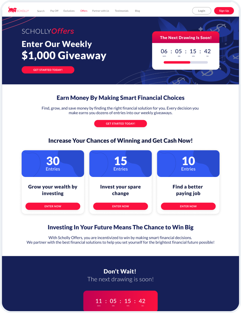
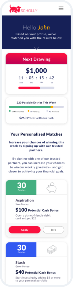
Offer wall with weekly sweepstakes, and a dashboard with partner entry points and cash bonuses

Offers 1.0 desktop landing page: enter the weekly $1,000 giveaway, a countdown and offer cards with entries
Offers 1.0 mobile dashboard with the next drawing countdown, possible entries and personalized matches
The Experience

Offers 1.0 launched in May 2022 as a weekly sweepstakes behind an offer wall. Legal set one firm rule: show everyone every offer, but make clear which ones they qualify for. A month later, a user study told us what wasn’t working.

The outcome

Easy to use. Hard to believe in.

“I would offer some sort of guaranteed incentive for people to participate, because I don’t think people will be interested in entering weekly without ever getting paid if they never win.”Tester, June 2022
June 2022 · 7 testers
Sign-up7 / 7 easy
Understanding entries7 / 7 easy
Dashboard6 / 7 easy
Doubted their odds2 / 7
June to July 2022

The cash pivot

Making the rewards add up

Wireframes

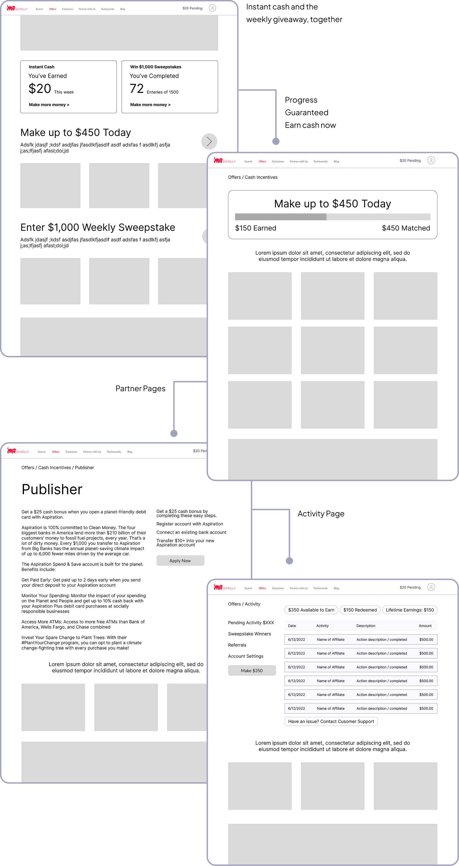
Hybrid offer wall, earnings progress unit, partner pages and offer activity

Wireframes for the hybrid offer wall with instant cash and the weekly giveaway, the cash incentives page with a Make up to $450 Today progress bar, a partner page and the activity page
01 / Find

Offers 2.0 Redesign

Offers matched to you starting with onboarding.

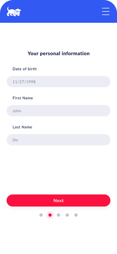
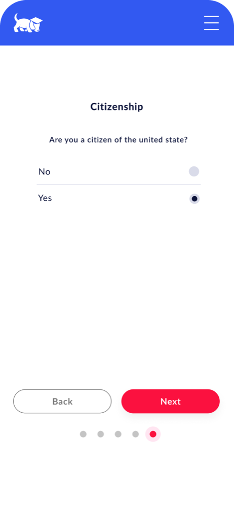
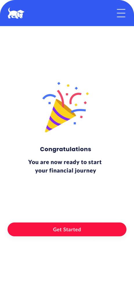
I designed a guided signup that asks one question at a time, shows progress and ends with a small celebration. Students arrive at offers matched to their profile, with a clear reason to finish creating an account.

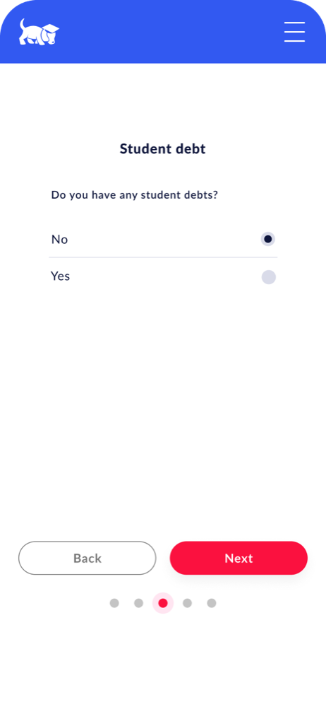
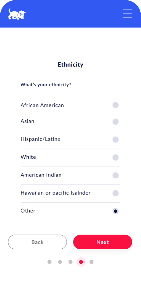
Onboarding step 1: date of birth, first name and last name Onboarding step 2: do you have any student debt, yes or no Onboarding step 3: what is your ethnicity, with seven options Onboarding step 4: are you a citizen of the United States, yes or no Onboarding complete: congratulations, you are now ready to start your financial journey, with a Get Started button

I kept it to one question per screen: personal info, student debt, ethnicity and citizenship. Back and Next on every step, dots to show progress, and a small celebration at the end that sends you straight to your offers.

02 / Earn

Cash Pivot Redesign:
See the real offers. Know the next step.

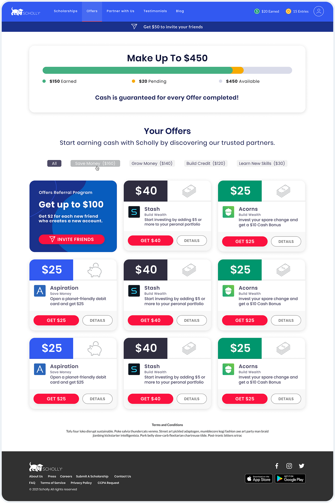
I redesigned the dashboard and offer cards to put the cash reward first. Partner pages explain what students get and what they need to do, while step-by-step messaging guides them toward completing each offer and earning the reward.

Offers 2.0 desktop dashboard with the Make Up To $450 progress bar, a referral card and cash-first offer cards
Offers 2.0 mobile dashboard with progress, filters and offer cards

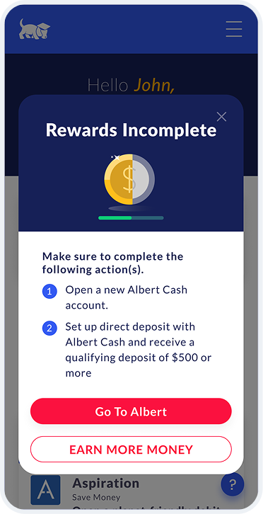
Modal MessagingSome offers paid out only after extra steps, so I designed modals that walked users through each one until their cash was earned.

Rewards Incomplete modal listing the steps left before the cash is earned

Partner details pageI designed one partner page that could carry any brand and still let a student size up the offer in seconds: what they get, what they do, and how long it takes.

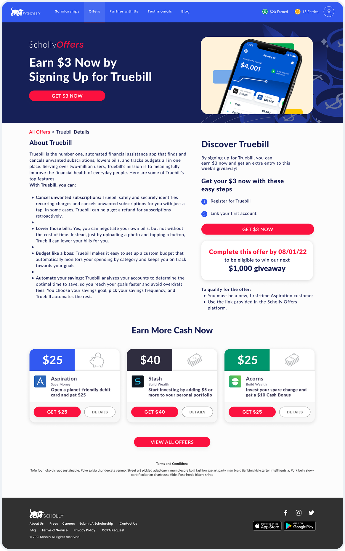
Partner details page for Truebill with the cash amount, steps, a deadline and more cash offers

Overall, Scholly Offers matched students with trusted financial partners and paid them for taking the first step. Open an account, start investing, check their credit, and earn cash for it. That’s the promise the whole product had to keep.
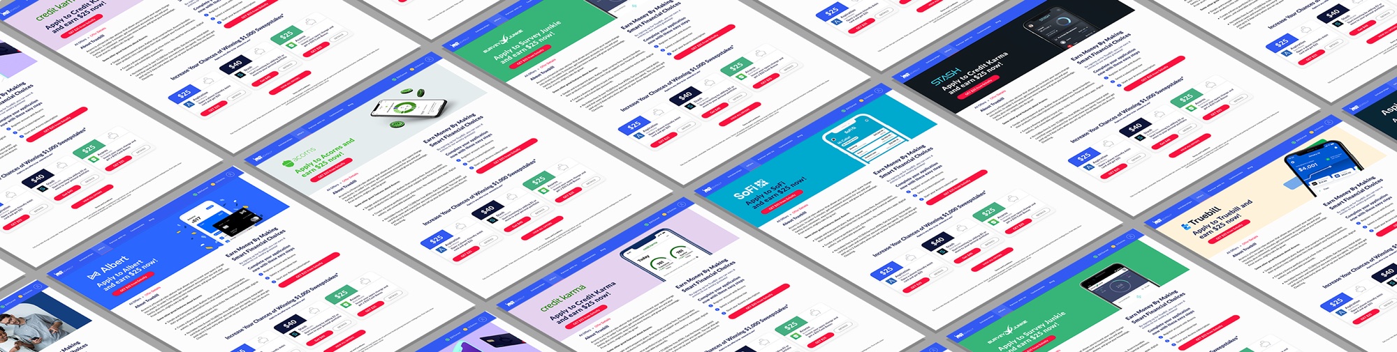
Partner page header banners for Stash, Acorns, Aspiration and other brands
UX design system

Offers Icon System

A visual language for opportunity

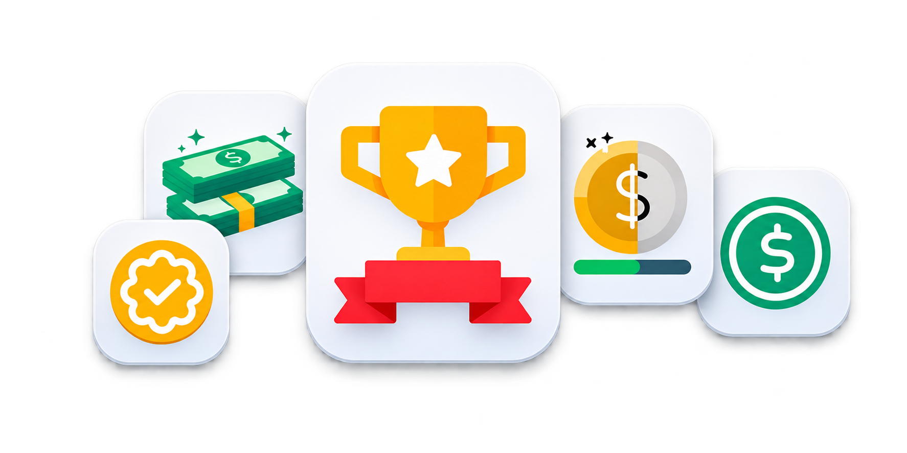
I designed a flexible, consistent icon set to communicate key offer experiences, drive engagement, and scale across web and mobile.

Offer icon tiles: a trophy, cash stack, verified badge, coin with progress and a dollar sign
Trophy icon drawn on its construction grid

Icon design approach

  • Simple & recognizable
  • Consistent geometry
  • Scalable & accessible

Icon set (Offers)

  • Rewards
  • Cash Incentives
  • Eligibility
  • Progress
  • Earnings

Design system

  • Library
  • Components
  • Usage Guidelines
Card states

Every card tells you what to do next

Design isn’t done when the happy path looks good. I designed every state a card could be in, from a featured partner to a reward waiting on one more step, so students always knew where they stood. I documented each one so engineering had nothing to guess at build time.

Default offer card: Stash, 30 entries, $40 potential cash bonus, Apply and Info
Default
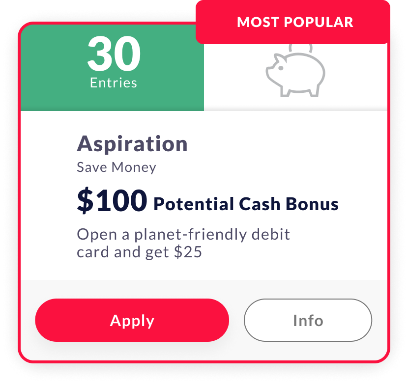
Featured partner card: Aspiration with a Most Popular tag and a $100 potential cash bonus
Featured partner
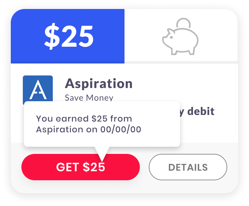
Cash earned card: a tooltip says you earned $25 from Aspiration, with a Get $25 button
Cash earned
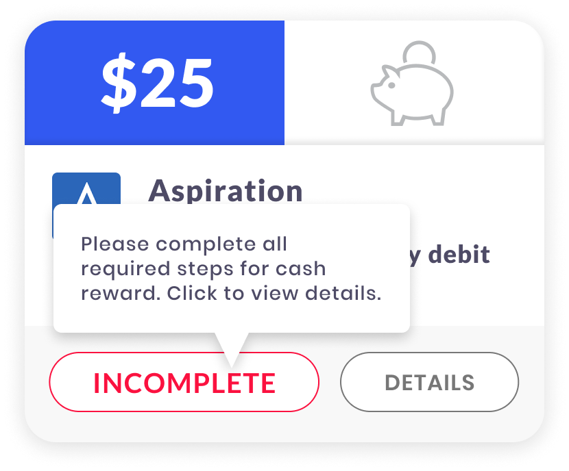
Steps required card: a tooltip asks to complete all required steps, with an Incomplete button
Steps required
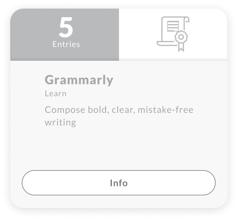
Inactive card: Grammarly greyed out with only an Info button
Inactive
Not a match card: Sorry! You don't qualify for this offer
Not a match
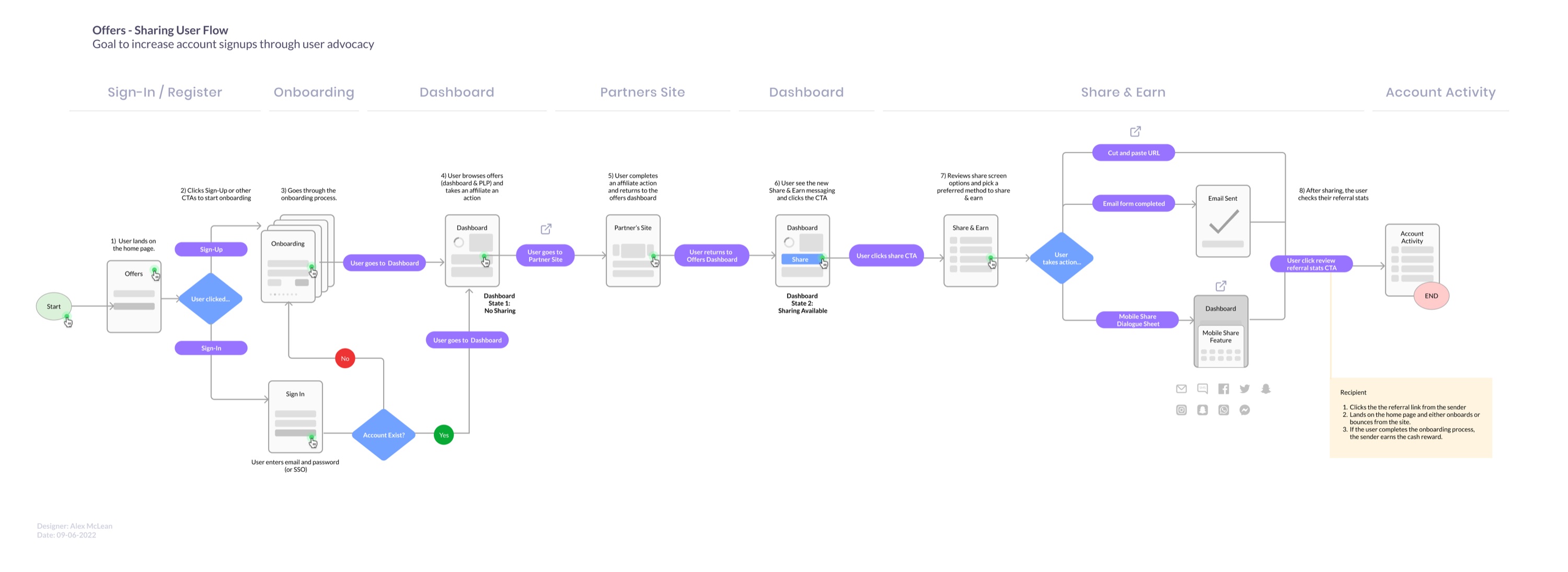
User flow

I mapped the whole journey before designing a screen: how a visitor becomes a member, how a member becomes an advocate, and where they earn cash along the way. Every decision and every branch, down to what happens when a friend clicks their link.

User flow from sign-in and onboarding through the dashboard and partner sites to share and earn and account activity, with decision points
03 / Track Activity

Watch it add up.

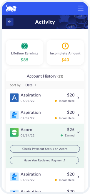
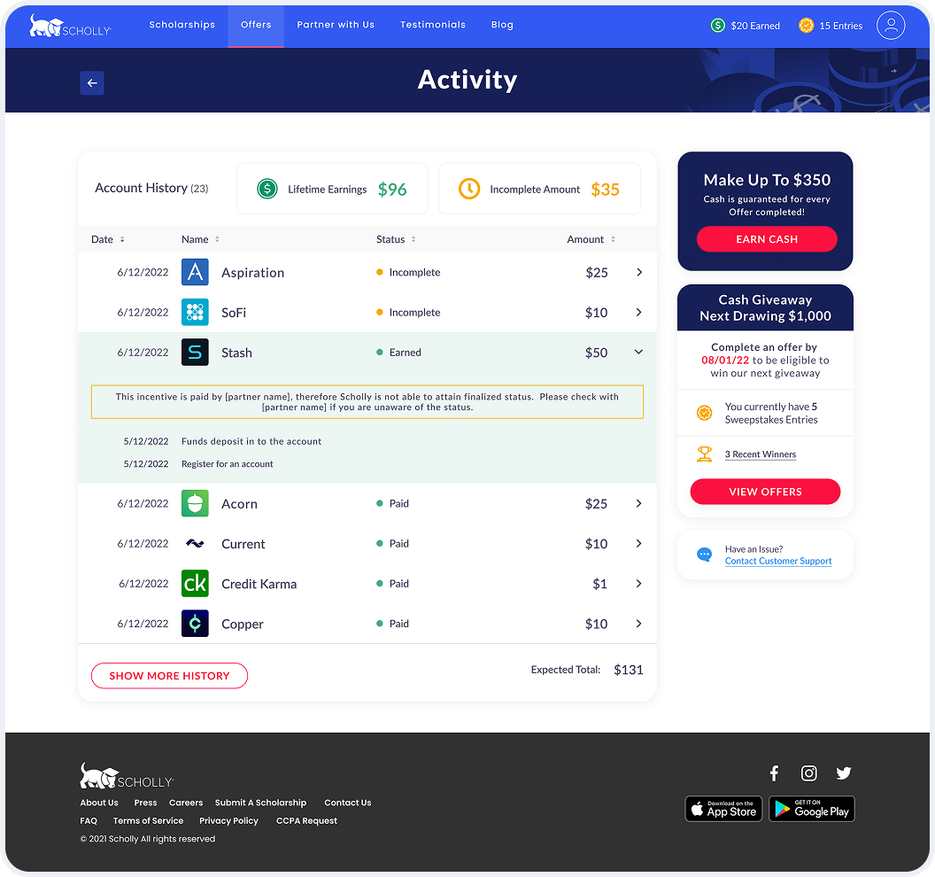
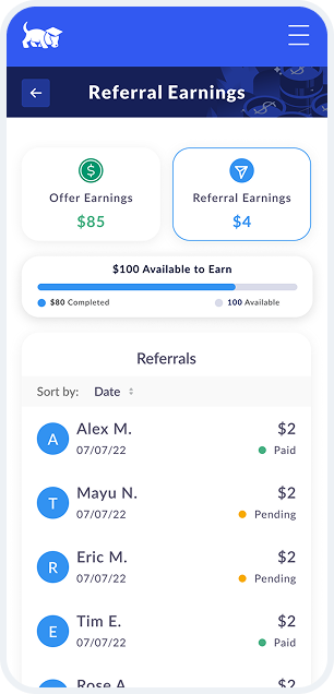
I brought cash offers, sweepstakes entries and referrals into one activity view. Students can see lifetime earnings, track rewards still in progress and find their next step, keeping the value visible beyond the first offer.

Activity on mobile: lifetime earnings, incomplete amount and account history
Desktop activity page with lifetime earnings, incomplete amount, account history by partner and status, and side cards for cash and the giveaway
Referral earnings on mobile: offer and referral earnings, $100 available to earn, and a list of friends with paid and pending status

Header nav bar:Earnings, always in view

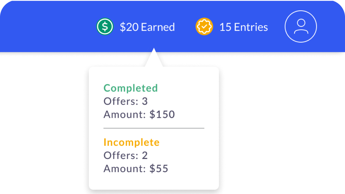
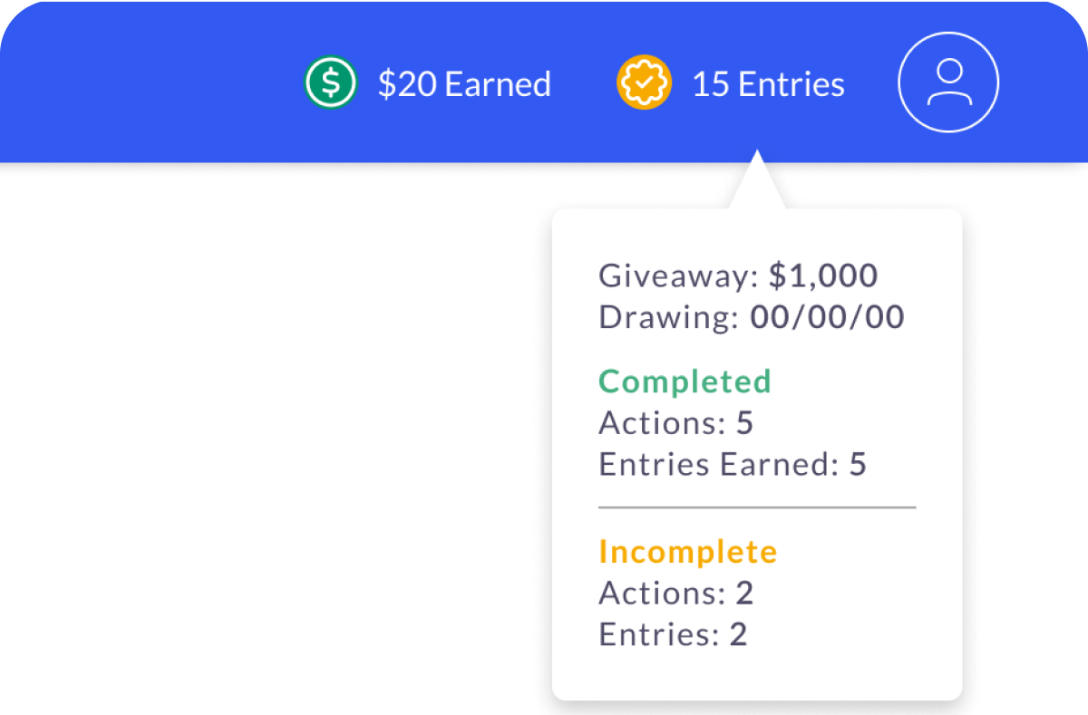
Nav bar with $20 earned and 15 entries; the earned tooltip shows completed and incomplete offers and amounts Nav bar entries tooltip with the giveaway amount, drawing date, and completed and incomplete actions

I put a running total in the nav bar on every page: cash earned and sweepstakes entries. Open either one for the full breakdown, what’s done, what’s still pending and when the next drawing is, without leaving the page you’re on.

In their words

What members said
Offers meant to them

Source: Scholly engagement survey, September 2022

User testing · November 2022

One account, two products

Let the testing pick the path

Scholly products (Search and Offers) shared one login, and people kept landing in the wrong product. I tested two login screens with 11 users. The banner selector won 8 to 2 over the radio buttons.

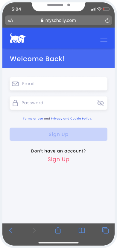
OriginalPlain login, no destination choice
Original login on iPhone: email, password and Sign Up, with no destination choice

0 of 11 testers chose it

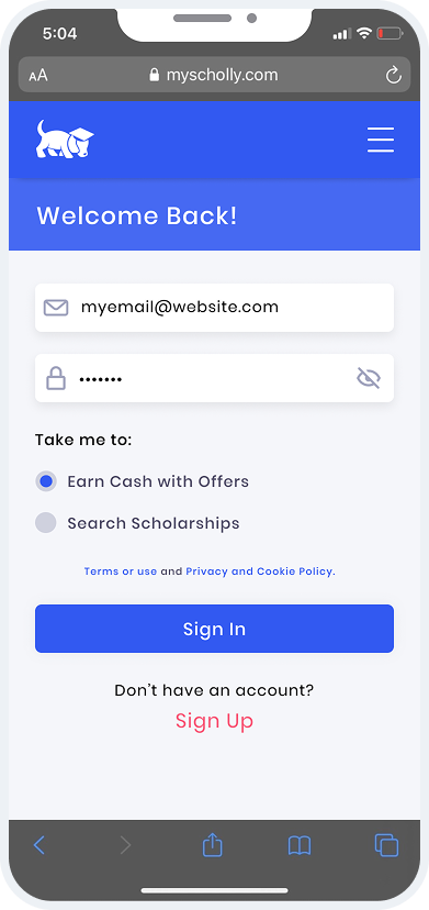
Flow ARadio buttons under “Take me to”
Flow A login on iPhone: radio buttons to choose Earn Cash with Offers or Search Scholarships

2 of 11 testers chose it

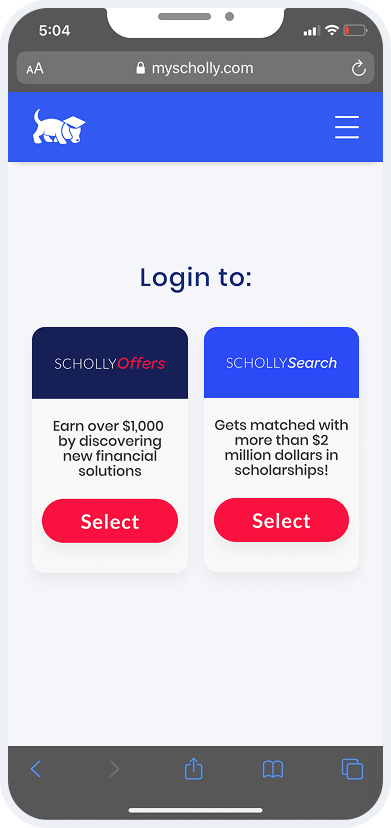
Flow BA banner for each product
Flow B login on iPhone: two banners, Scholly Offers and Scholly Search, each with a Select button

8 of 11 testers chose it

“It is easier to know what you are doing by selecting the banner to get to the section you want.”

Tester, November 2022

Routing

The Search redesign sent non-students to Offers.

Cross-promotion

Offers gave members a free Scholly Search subscription.

Test results8 / 11Flow B
Which login did testers prefer?
Flow B: banner selector8 / 11
Flow A: radio buttons2 / 11
Flow B shipped

8 of 11 testers chose it, four times as many as Flow A.

January 2023 to May 2024

What students chose

They came to start investing

From January 2023 to May 2024, students made 406,561 visits to more than 50 partners. Three investing apps drew almost four out of five. That’s why the partner page and cards had to let investing brands shine without crowding out everyone else.

Partner visits, top 8
  1. Stash164,843
  2. Robinhood98,130
  3. Acorns53,460
  4. Survey Junkie18,710
  5. CreditWise18,361
  6. SoFi12,248
  7. Rocket Money8,510
  8. MoneyLion3,909

Source: Scholly Offers Partner Overview, partner data from Impact.

78%

Investing

Stash, Robinhood and Acorns lead.

11%

Credit and banking

CreditWise, SoFi, MoneyLion

7%

Side income

Survey Junkie and gig apps

3%

Budgeting

Rocket Money, Albert

Business context

Over the same period, Offers brought in about $648K in partner earnings for Scholly. That’s the business running, not a design metric. Some smaller partners, like SoFi, earned about four times more per visit, which is why every card had to sell its offer clearly.

Outcome

A product that kept up with the business

The model changed four times. The component system meant each change was a content update, not a rebuild. In 2023, Sallie Mae acquired key Scholly assets, including Scholarship Search and Scholly Offers.

4

Reward models, one design system

407K

Partner visits, 2023 to 2024

8/11

Chose the login path we shipped

50+

Partners, one page template

Learnings

Build for the change you can’t see yet.

  1. 01

    Components beat screens

    When the business moves every few months, a system you can re-skin is worth more than a perfect page.

  2. 02

    Let users settle the debate

    The login test ended an argument that opinions couldn’t, and we shipped what users chose.

  3. 03

    A sure thing beats a big maybe

    Students acted on a small amount they knew they’d get, not a big prize they might win.

  4. 04

    People trust what they can see

    Students doubted the rewards until they could watch them add up. A running total, pending states and clear next steps did more for trust than any promise.