Passion Project · Built entirely with AI

FitfulMind

A faith & fitness app taken from concept to a fully deployed, database-backed product, designed and built by one person, using AI at every stage.

Alex McLean III · Solo Product Designer & Builder
Role
Solo designer & builder, concept → production
Tools
ChatGPT · Claude · Figma · Figma Make · GitHub
Stack
HTML · PHP · MySQL · SSH deploy
1
person: design, build & deploy
365
days of scripture, dual commentary tracks
5
phases from research to rebrand
4
badge tiers, Bronze → Diamond
Live
real product, real users, in production
01

A name at the intersection of discipline and training

I started with competitor research across the faith & fitness space, then used ChatGPT for initial concepts and branding, landing on a name that felt modern and not preachy. I validated directions with fitness-minded and spiritually curious users, which shaped the name and the two-tone FITFUL / MIND wordmark.

Competitors Research

Starting with the Bible app and top fitness apps during the discovery phase.
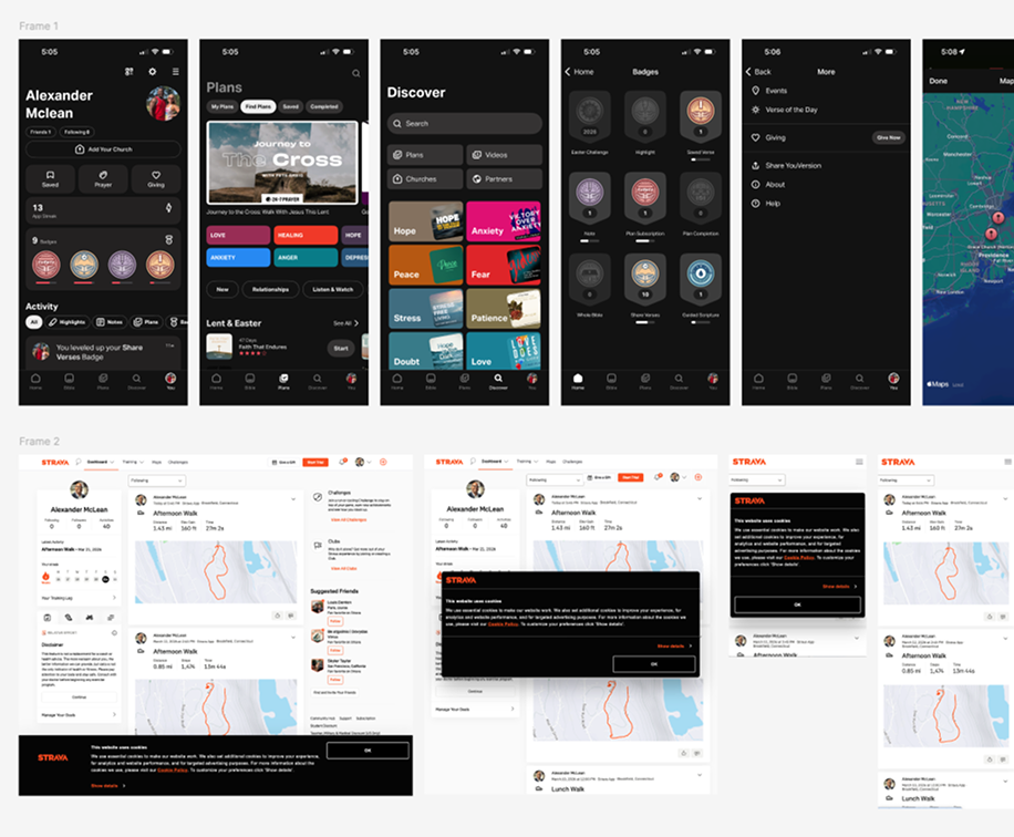
Collage of competitor faith and fitness apps reviewed during discovery, including the Bible app and Strava

Initial Concepts

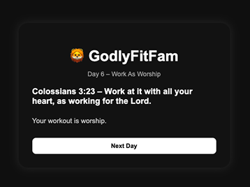
1stGodlyFitFam first concept, daily scripture card
→
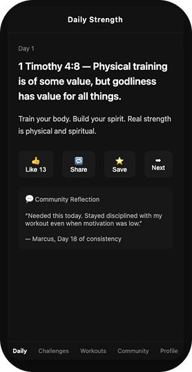
2ndSecond concept, Daily Strength screen with reactions and community reflection
→
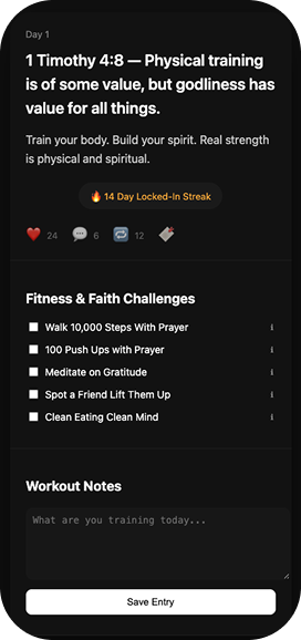
3rd…Third concept, with a locked-in streak, fitness and faith challenges, and workout notes

Brand Identity

Early concepts used the lion and the working name GodlyFitFam to represent faith, strength, and community. Based on user feedback, I simplified the identity and shifted to the crown as a symbol of purpose, inner strength, and achievement. The result felt more modern, versatile, and better suited for the product.

GodlyFitFam lion logo on a white card → FitfulMind lion logo on a black card → Simplified lion head symbol → Crown symbol → FitfulMind wordmark with a gold crown

Target audience

Who FitfulMind is built for

The core user skews female, so directionally I’m starting to roadmap more features that cater to the primary users, then widening the brand through tone and theme options to welcome the secondary audience.

Nia, 31 The Devoted Athlete Primary ▾
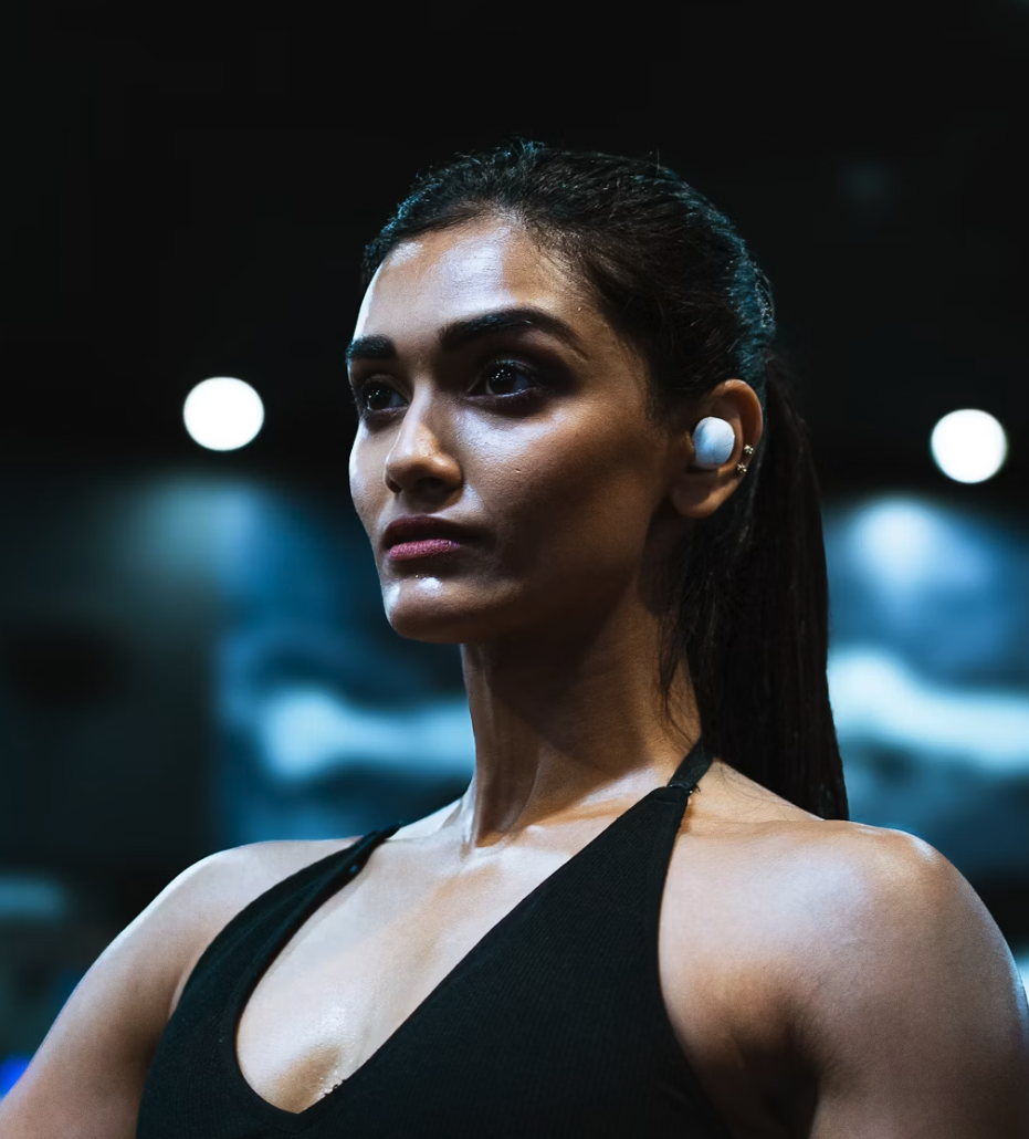
Nia, the Devoted Athlete

Trains 4 to 5 times a week · prays daily · reads scripture and self help books most days

Goal
One daily rhythm that unites movement, scripture, and reflection, with streaks to stay consistent.
Needs
Scripture in a translation she trusts, an encouraging tone, and a calmer, softer aesthetic instead of gym-bro branding.
Friction
Faith and fitness live in separate apps, and most fitness branding feels aggressive and masculine.
What version of the Bible are you using?

Why she is the core user: women are about 60% of fitness app users, buy about 74% of self help books, and are likelier to pray daily (50% versus 37% of men).

Bryan, 28 The Grounded Warrior Secondary ▾
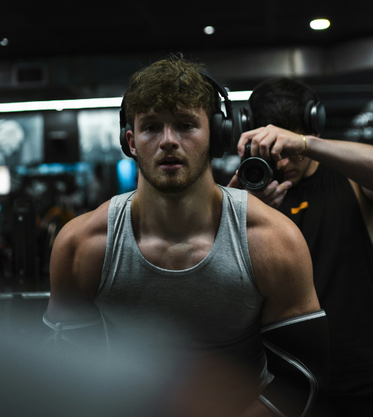
Bryan, the Grounded Warrior

Gym warrior · leans on spirituality to stay grounded · the gym is his safe space

Goal
Balance work, fitness, and relationships into a healthier way of life, not just chasing numbers in the gym.
Needs
A grounding tone that respects spirituality without preaching, plus an edgier look that feels like his.
Friction
The gym is his safe space and his mental health outlet, and he knows he leans on it to avoid working on the rest of his life.
I'm not really religious, so the old name was a turn-off.

Why he matters: 78% of people who exercise train mainly for mental well-being, so his way in is the “Mind,” not the faith.

Research Insights ▾
  • Women make up about 60% of fitness app users, and 64% of women use health apps versus 46.8% of men. Fitness App Stats
  • Women buy about 74% of all self help books. WordsRated
  • Half of U.S. women pray daily, compared with 37% of men. Pew Research
  • 78% of people who exercise say mental or emotional well-being is their top reason, ahead of physical results. Mindbody
  • U.S. gym membership reached a record 81 million people, led by Gen Z and Millennials seeking purpose driven fitness. ABC Fitness
02

Designing in the medium, not in specs

I started with ChatGPT to explore the concept, define the core experience, and work through early product thinking. From there I used Figma Make to build out the interface, refine the visual system, and work through key user flows. That gave me a polished prototype I could evaluate as a real experience rather than a collection of static screens.

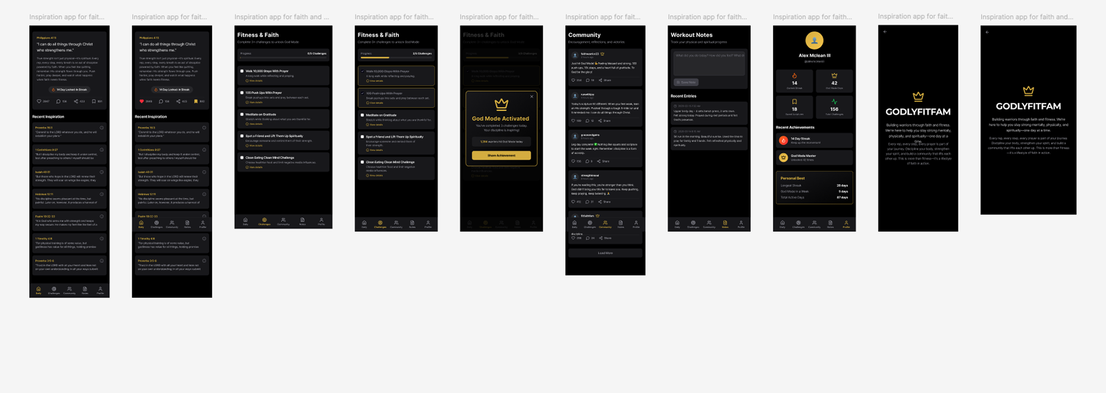
FitfulMind prototype working screens, opens the prototype in Figma
▶ Figma Make Prototype ↗

Once the foundation was in place, I moved into Claude Code where I could push the product further. Instead of treating AI as a one-time generator, I used it as part of an ongoing design and development loop. I could build, review what was actually working, make decisions, and refine the experience in real time.

03

From prototype to a real, database-backed product

Once the concept proved itself, I moved beyond prototyping and built FitfulMind as a working product with a production server and MySQL database, a GitHub workflow, and an SSH based deployment process. The result was more than an AI generated prototype. It became an exercise in how AI can connect product thinking, design, development, and deployment into one continuous workflow.

A person holding an iPhone running FitfulMind
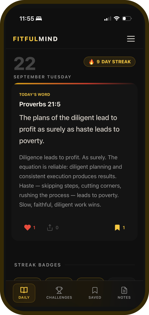
Daily Scripture screen in the production app
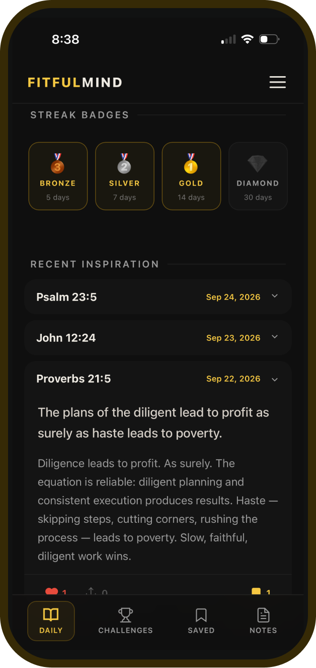
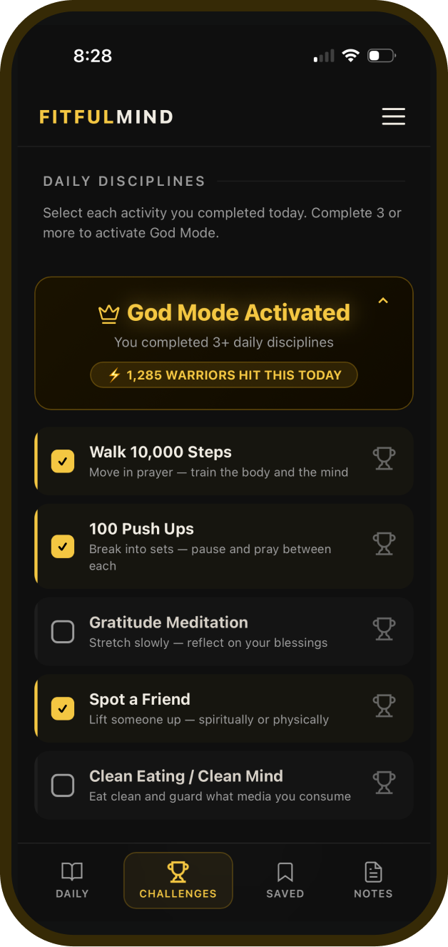
Streak badges screenGod Mode challenge screen

Visual rewards and feedback

Users can track their performance

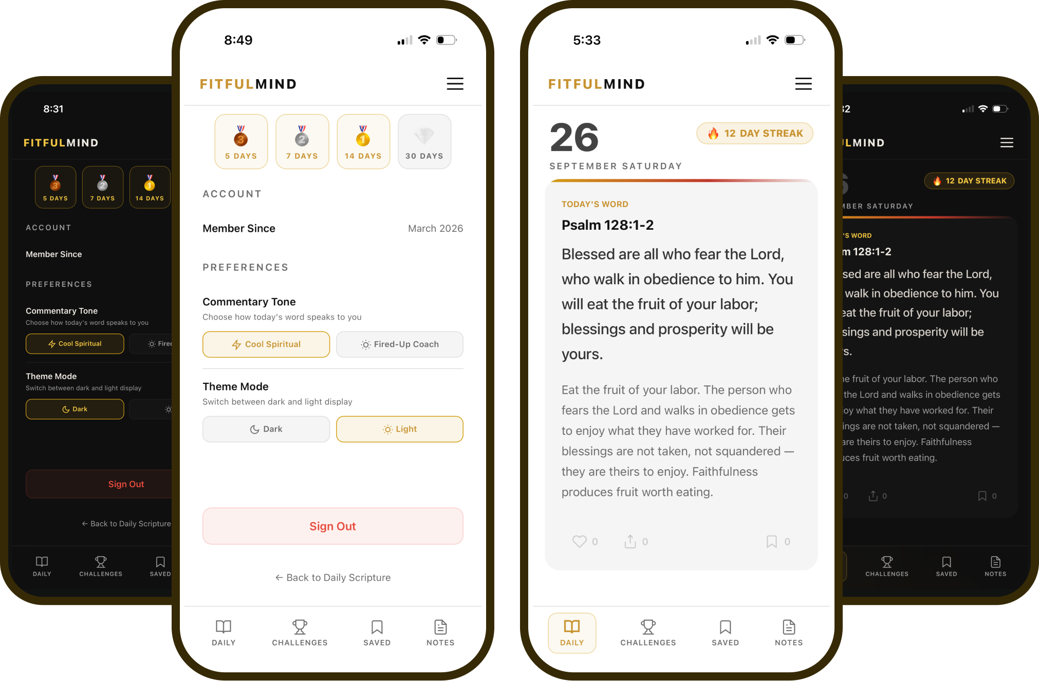
Streaks & badges. Daily visit tracking and persistent Bronze, Silver, Gold, and Diamond badges that survive streak resets. God Mode. A daily challenge system that unlocks when users complete three or more disciplines.

Reflection & recall

Allow them to save what matters

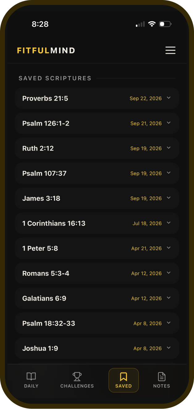
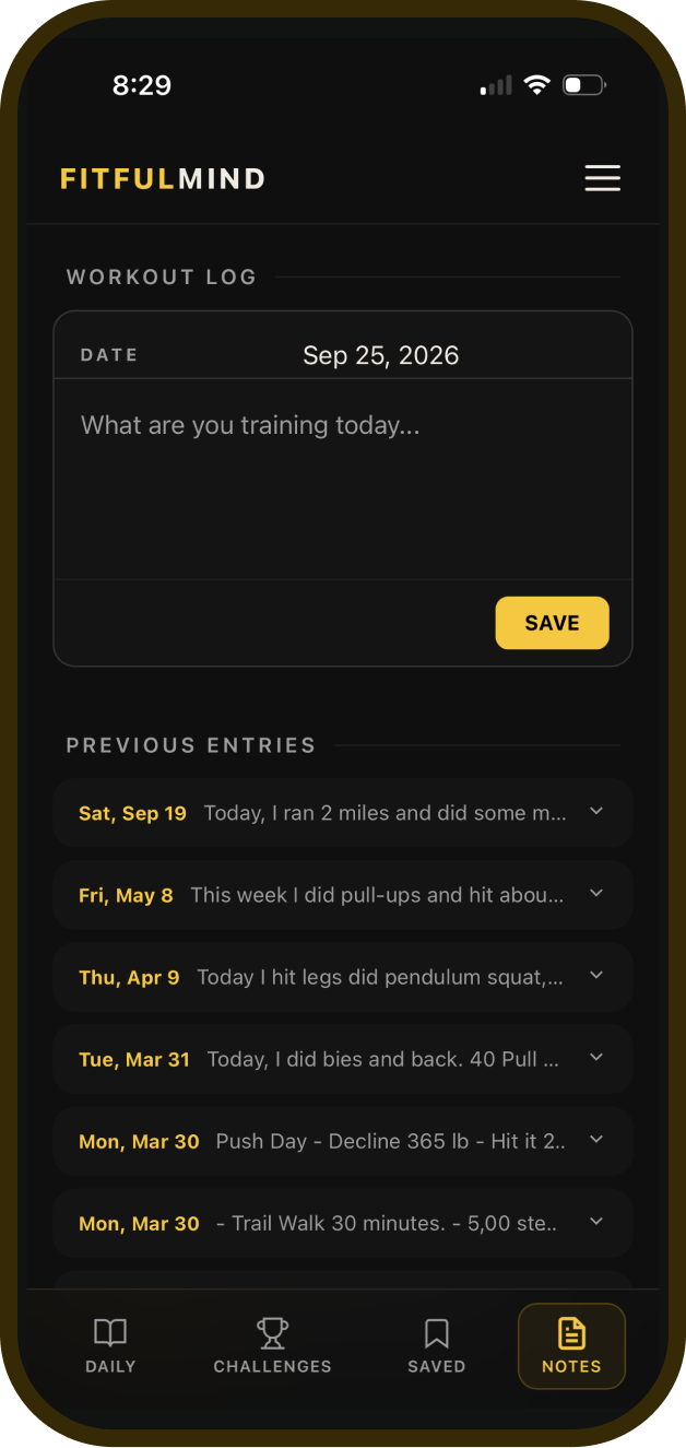
Saved Scriptures. Users can bookmark meaningful scriptures and build a personal collection to revisit for encouragement, reflection, or inspiration. Daily Notes. A simple space to capture thoughts, prayers, gratitude, and reflections alongside their daily faith and fitness routine.

Saved verses screenWorkout notes screen

Personalized preferences

Make the experience their own

Commentary Tone plus Light & Dark themes. Choose how daily insights are delivered, from Cool Spiritual for calm reflection to Fired-Up Coach. Switch between light and dark modes to create a visual experience that fits your preference.

Personalization and preference screens
Try the FitfulMind app ↗

The live web app, ready on any phone or desktop browser.

Marketing site

Welcome new users and get them in fast

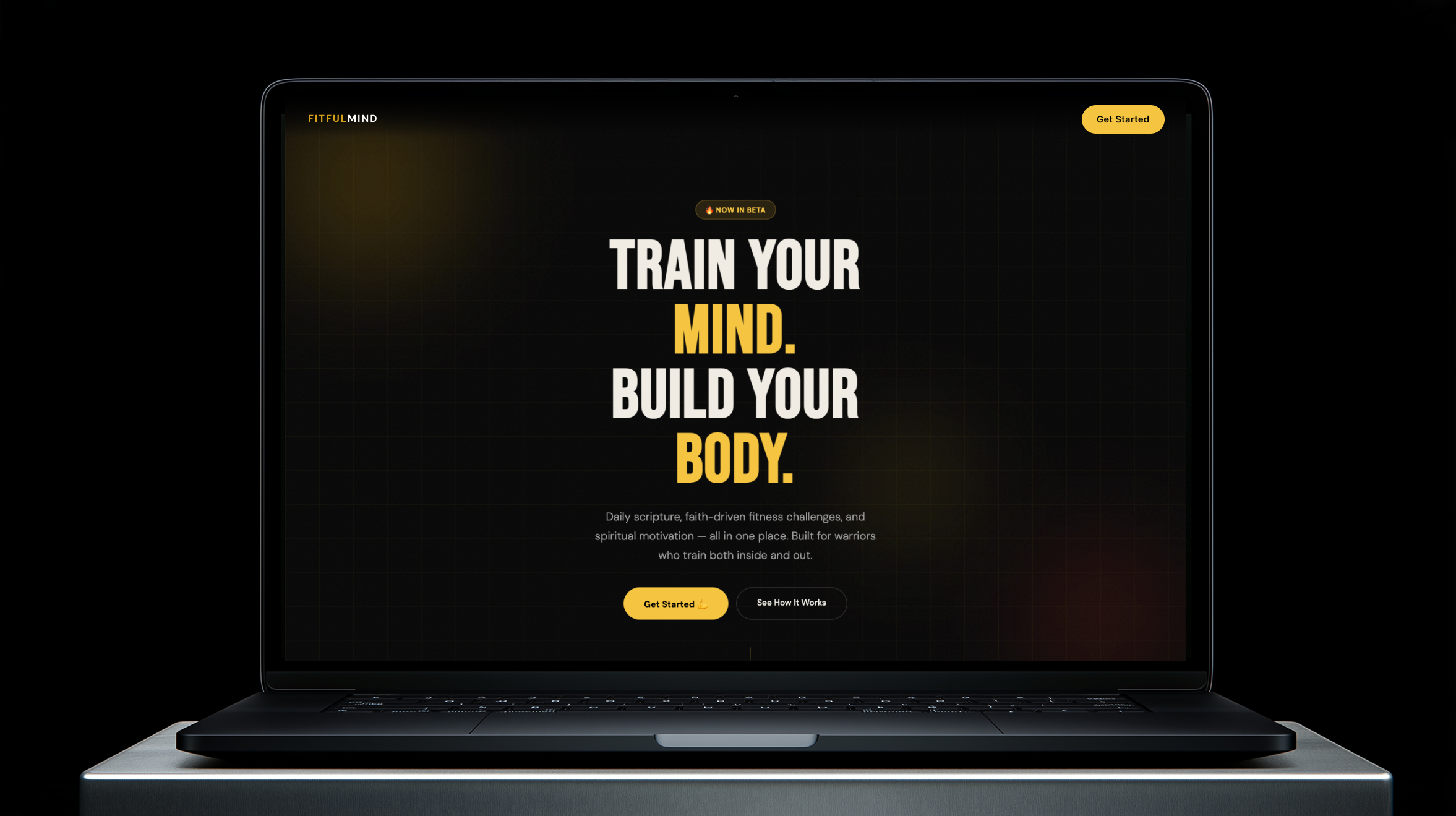
The public site introduces FitfulMind to people who have never heard of it. It frames the product around training the mind and building the body, explains the daily scripture and the two coaching tones, and moves visitors into a quick onboarding and straight to their first daily verse.

Visit FitfulMind.com ↗

The live landing page, built to educate first-time visitors and turn them into users.

Admin dashboard

A dashboard to run the whole product

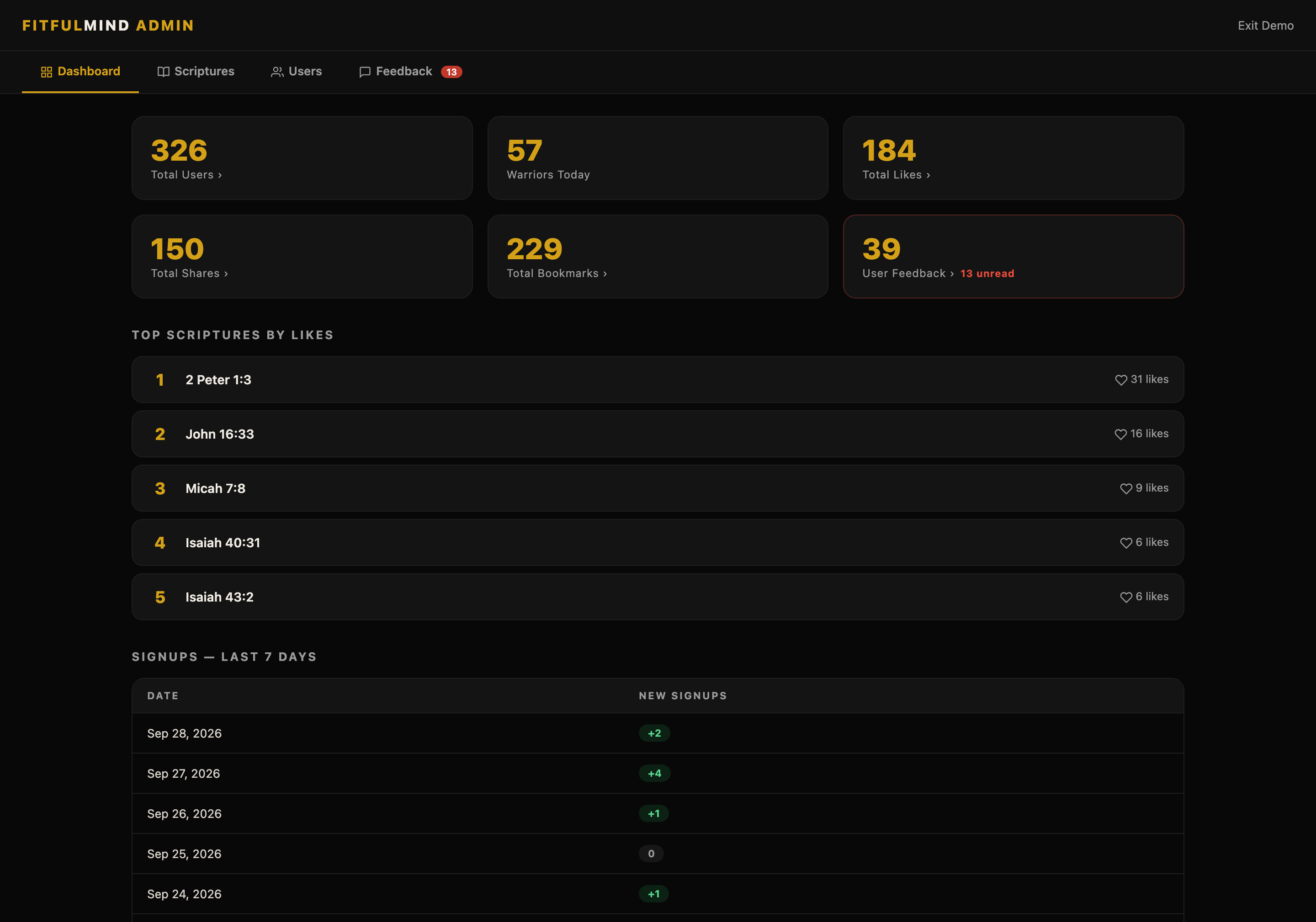
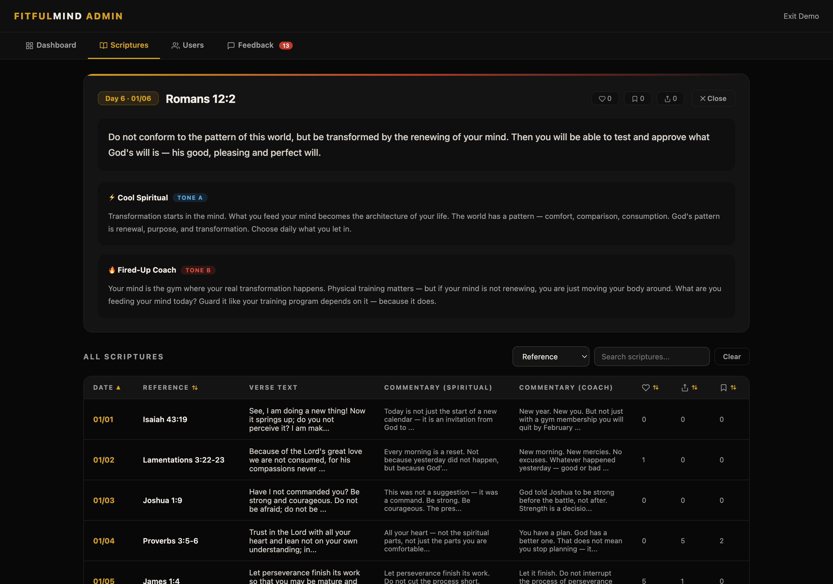
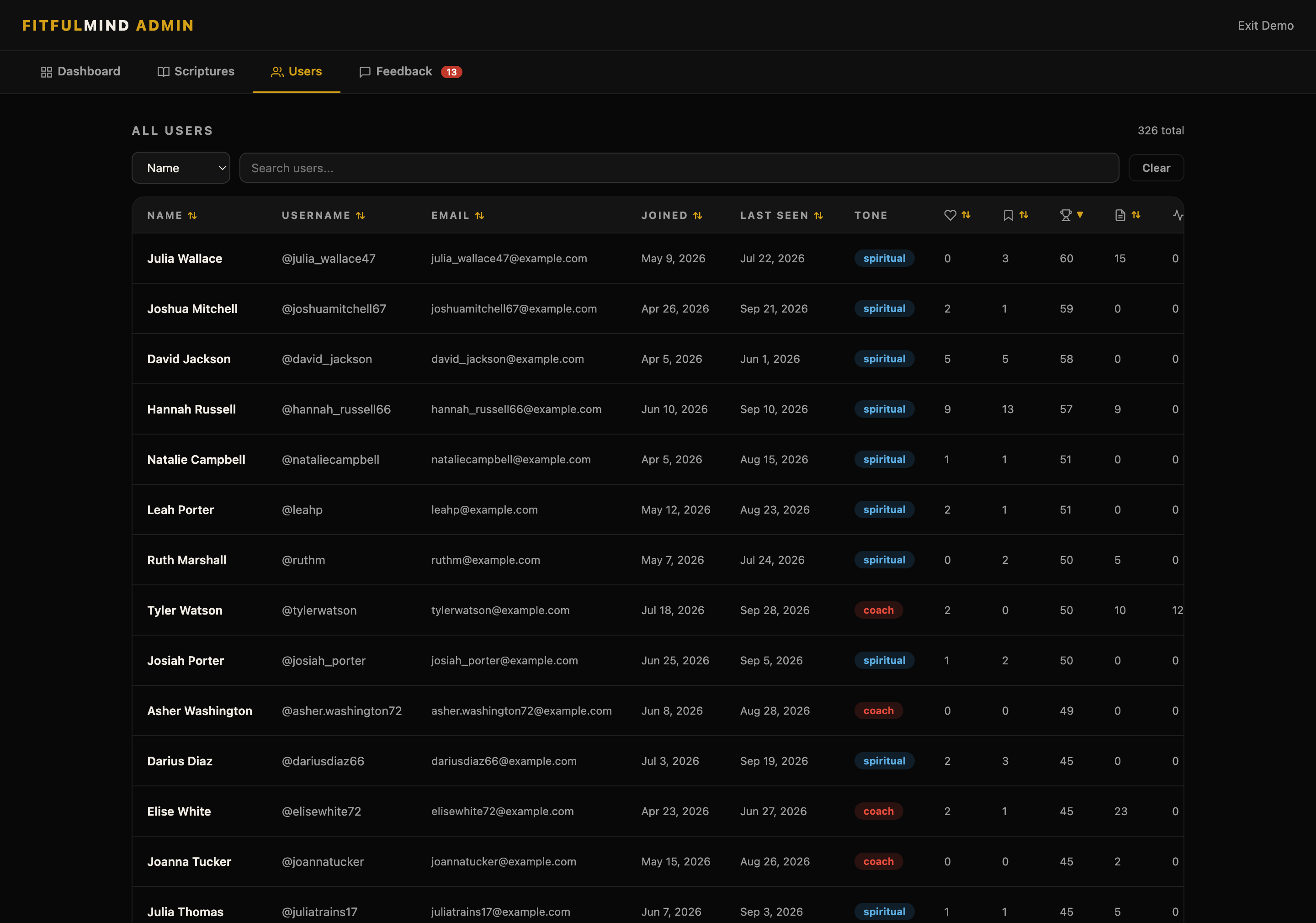
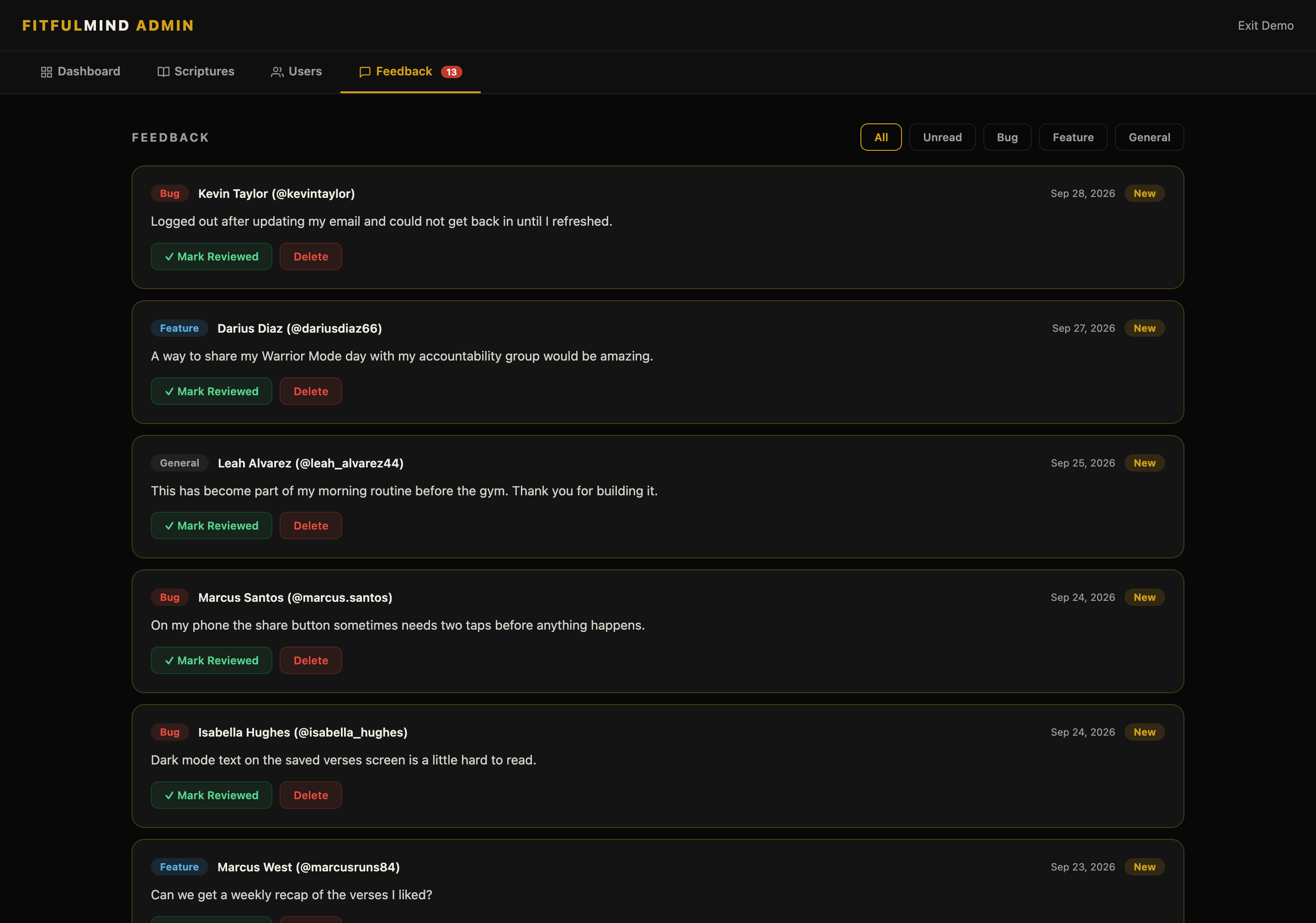
Behind the app sits an admin dashboard for managing users, editing scripture and commentary, reviewing feedback, watching analytics, and testing badges and streaks. It is how one person operates everything.

fitfulmind.com/admin
Admin dashboard with user, engagement, and feedback totals, top scriptures by likes, and signups for the last seven days Scriptures page with Romans 12:2 open, showing the verse and both commentary tones above the full scripture library Users page listing members with tone, likes, bookmarks, Warrior days, and workout log counts Feedback page with unread bug reports and feature requests ready to review
Explore the admin demo ↗

Password-protected interactive demo with sample users and feedback. Ask me for access.

04

A system that references the real codebase

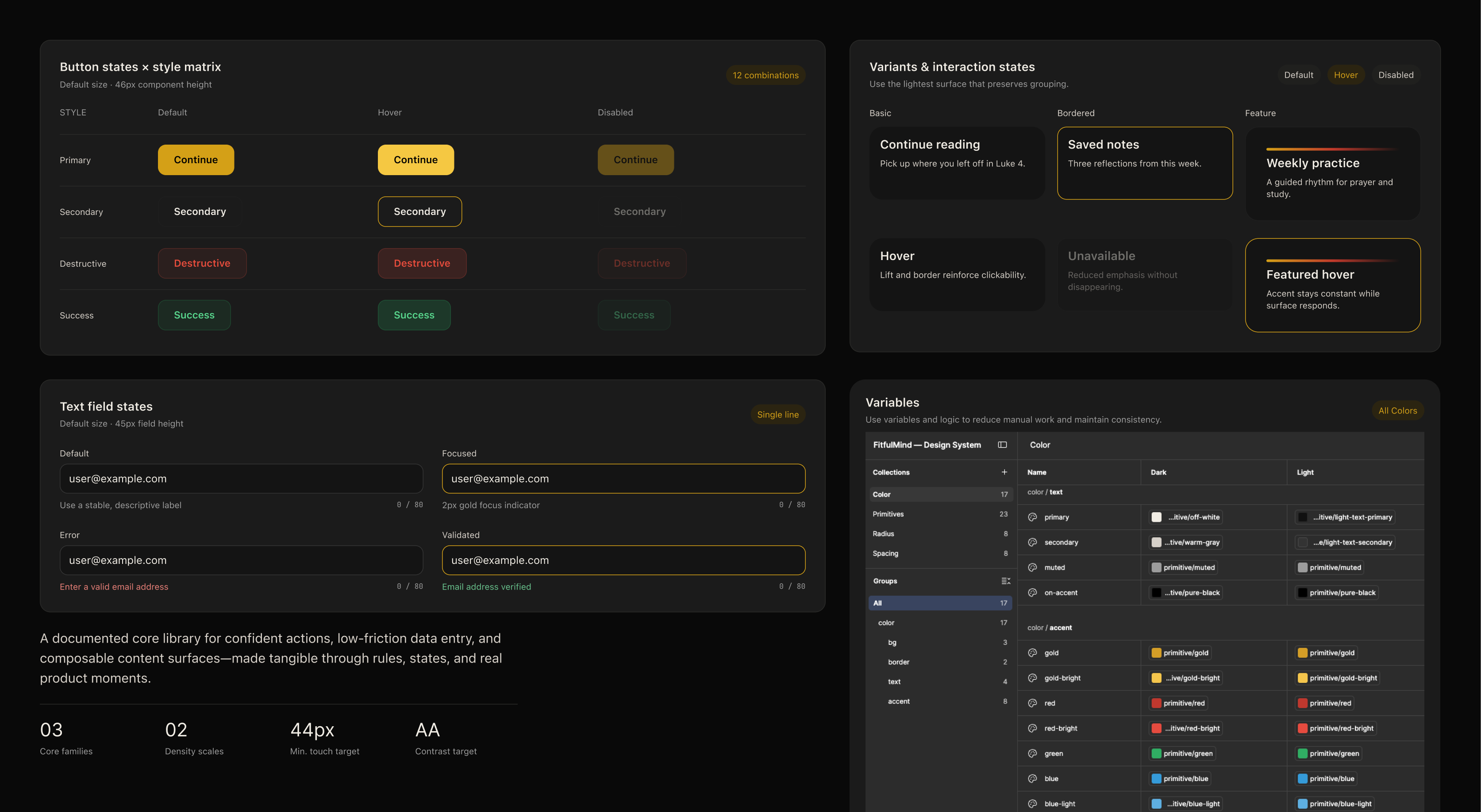
Using Claude connected to Figma, I built a full design system that references the production codebase, with tokens, components, and interaction states that reflect what's actually live, not a theoretical spec. Then I used the Figma Agent to clean it up and align it to production.

FitfulMind foundational design system: button states by style, card variants and interaction states, text field states, and the Figma color variables for dark and light modes
Foundations in Figma: button and card states, text fields, and color variables mapped to dark and light modes. Click to zoom.

Styling with Experience

Typography & Color System

Foundations v1.0
SF Pro Display

Primary typeface for system and UI. Weights: Light · Regular · Medium · Semibold · Bold.   A B C D E F G H I J K L M N O P Q R S T U V W X Y Z   1 2 3 4 5 6 7 8 9 0

Marketing / Headings80–26px

BEBAS NEUE DISPLAY

A high-impact condensed sans-serif used for bold marketing statements, hero banners, and section highlights. It delivers editorial presence and strong hierarchy.

Marketing / Prose18–12px

DM Sans Geometric

Chosen to balance the condensed Bebas Neue. Warm, geometric, and highly readable, it governs brand storytelling, body copy, and secondary callouts.

Product UI / Interface52–11px

SF Pro Functional

The workhorse system font for the product UI and operational interfaces. Pixel-perfect readability, dense layouts, and clean structure across components.

Color System (Dark Mode)
Accent Hierarchy
Primary
Signal Gold#D4A017
The signature. Wordmark MIND, primary buttons, active states, and key highlights.
Secondary
Ember Red#C0392B
Energy and intensity. The Fired-Up Coach tone, streak fire, and moments of emphasis.
Tertiary
Grow Green#27AE60
Progress and completion. Earned badges, finished disciplines, and positive feedback.
Primary Tints & Text
Gold / Bright
MIND Accent#F5C542
Lighter gold for the MIND half of the wordmark and hover glows.
Gold / Deep
Pressed Gold#C99700
Darker gold for pressed states and gold text on light surfaces.
Text / Primary
On-dark Text#FFFFFF
Primary text and the FITFUL half of the wordmark.
Text / Muted
Secondary Text#9A9A9A
Supporting copy, captions, and metadata.
Surfaces
Base
Base Bg#080808
App background, the deepest layer.
Surface
Surface#0F0F0F
Raised sections and sheets above the base.
Card
Card Bg#141414
Cards, verse blocks, and input fields.
Line
Hairline#262626
Borders and dividers between elements.
05

Shipping is the start of the next research loop

With a real product live, testing kept going. Feedback from gym-goers and spiritually minded users continued to shape the tone options, the scripture translations on the roadmap, and the themeable UI. It is the same loop that first drove the rebrand from GodlyFitFam to FitfulMind.

“

I'm not really a religious person, so “GodlyFitFam” is kind of a turn-off.

◆ Drove a change
“

What version(s) of the Bible are you using?

◆ Drove a change
“

Nice and clean and easy to understand.

✓ Validated
“

Nice that there are options for the tones of the motivation coach commentary.

✓ Validated

What changed because of it

Immediately
Renamed GodlyFitFam → FitfulMind, a name that opens the door to the spiritually curious, not just the devout.
On the roadmap
Multiple scripture translations, and a themeable UI. A softer look for a female audience, a more intense theme for men.
Reinforced
Keep the interface clean, and treat adjustable coaching tone as a core differentiator, not a nice-to-have.
06

The broader brand opportunity

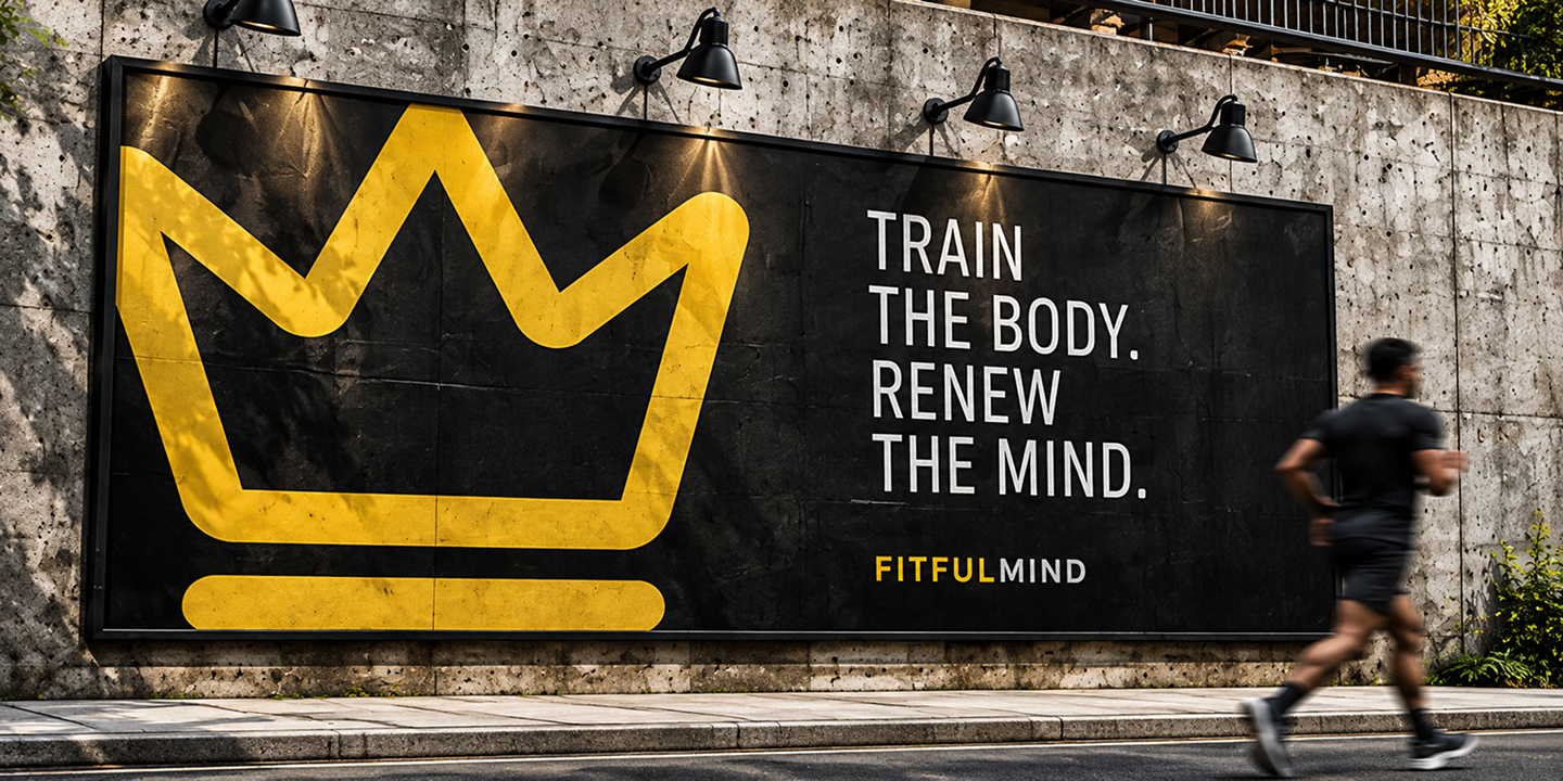
The next step is packaging FitfulMind as native iOS and Android apps and launching on the App Store and Google Play. Beyond the app, there are opportunities to extend the brand through community, content, apparel, and real-world experiences. These early concepts explore what that broader activation could become.

Coming soonApp Store
Coming soonGoogle Play
FitfulMind billboard with a large gold crown and the line Train the body. Renew the mind.
The crown at billboard scale. Train the body. Renew the mind.
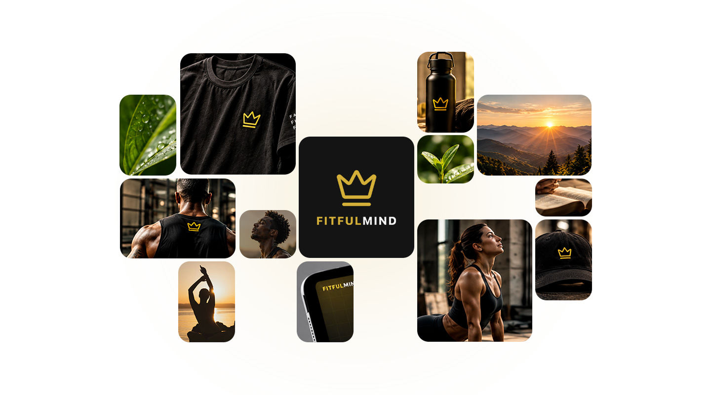
FitfulMind brand moodboard with the crown on apparel, a water bottle, and a cap, alongside training, nature, and scripture photography
Bringing it to life. One simple mark that holds up on apparel, gear, and the app itself.

AI is a power tool, not an autopilot.

01

An AI workflow needs its own guardrails

Working across Claude Chat and Claude Code, I learned to run AI like a real project. Every change was versioned in build snapshots, one staging folder stayed the single source of truth, and I always had a history to roll back to. Markdown handoff files kept context and decisions in writing, which cut down on hallucinations. Starting fresh sessions from those files kept the work fast and saved tokens.

02

Every meaningful decision still required designer judgment

Knowing when the output was right, when it needed redirecting, and when to override it entirely. The prompting craft is itself a design skill.

03

Speed makes iteration cheap

Work that would take weeks or months took days. When the cost of a change drops, you test more ideas, kill bad ones faster, and arrive at better solutions than a fixed-scope build allows.