Redesigning a dialer, call tracking and compliance platform for insurance enrollment agencies, turning a congested, data-dense product into a calm system agents live in all day.
Stakeholders described it as congested, hard to label and heavy on scrolling, with key details buried three drill-downs deep. EnrollHere is a powerful SaaS dialer suite for insurance enrollment call centers, with agent performance analytics, call compliance scoring and lead management in one web app. Powerful, but dense.
When I joined in December 2024, EnrollHere was a fast-scaling startup with no product designer. Developers were building the interface on top of a borrowed component library, daisyUI. I came in as the first product designer: turn that borrowed base into an owned design system, then redesign the core product on top of it.
The goal was a platform redesign focused on usability, visual clarity and business alignment, delivered as high-fidelity designs, interactive prototypes and a design system covering components, type, color and icons.
Bring the product back to EnrollHere's own brand value: simplify, and optimize for scalability. Agencies should be able to manage their entire business in one ecosystem, from lead distribution to commission tracking, without fighting the interface to do it.
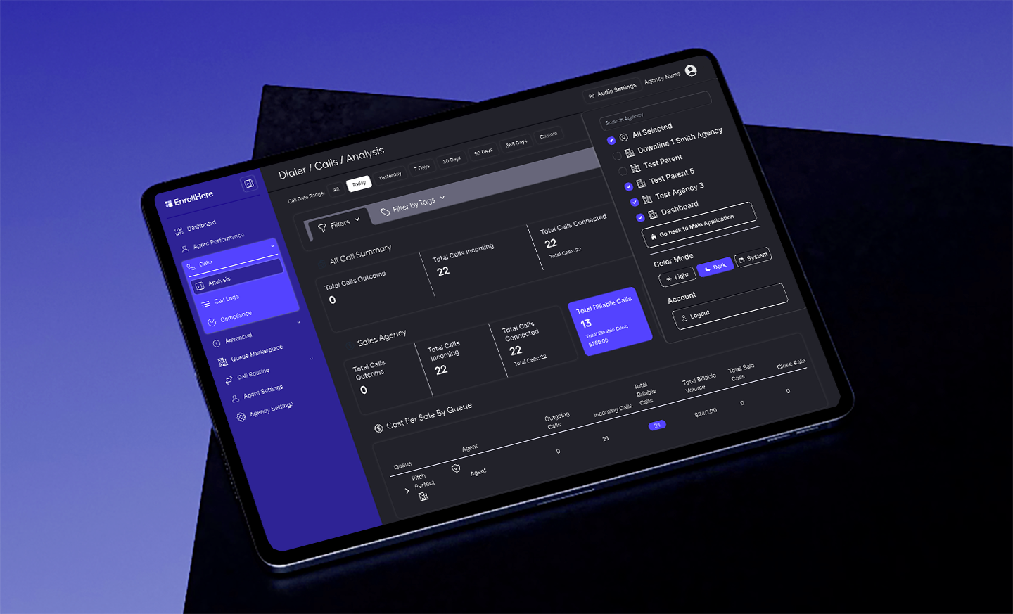
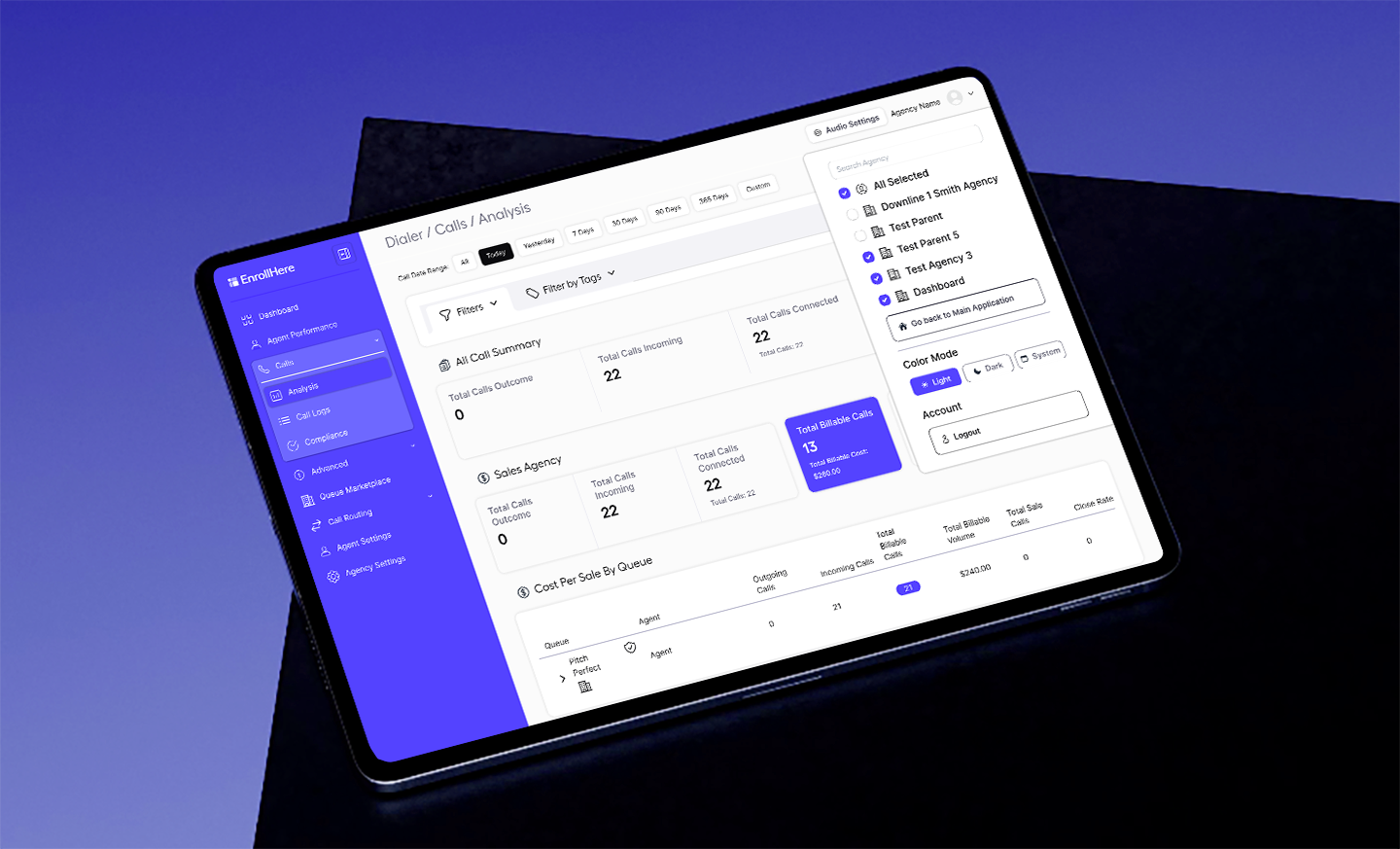
This is where the redesign landed: one calm workspace that works day or night. Drag the handle or flip the switch to try it. Then scroll below to get into the research, design evolution and results.
LightDark

I interviewed stakeholders, audited every screen and studied incumbent dialers like Five9 and Dialpad. Then I mapped how agents actually move through a shift, so the new wayfinding could follow their journey instead of the original nav hierarchy.
Agents did get an alert, but it was easy to miss in a busy screen. On a sales floor, a missed call is the most expensive miss there is.
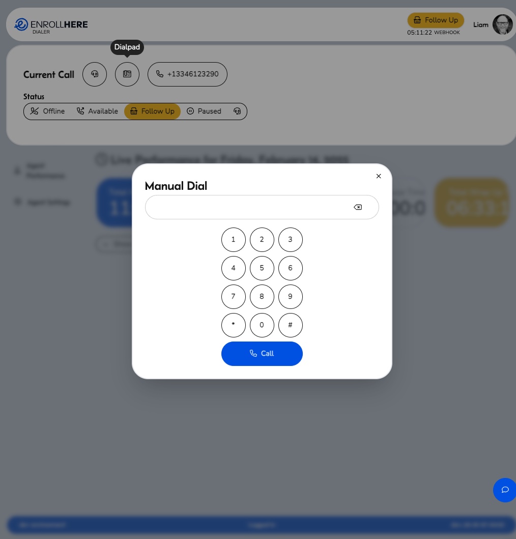
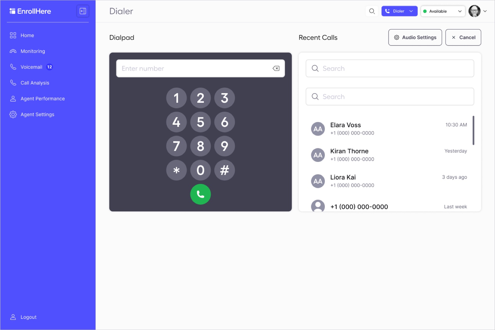
It was wedged into another screen. The redesign gives it a dedicated workspace with its own call history and a focused overlay that removes the clutter.
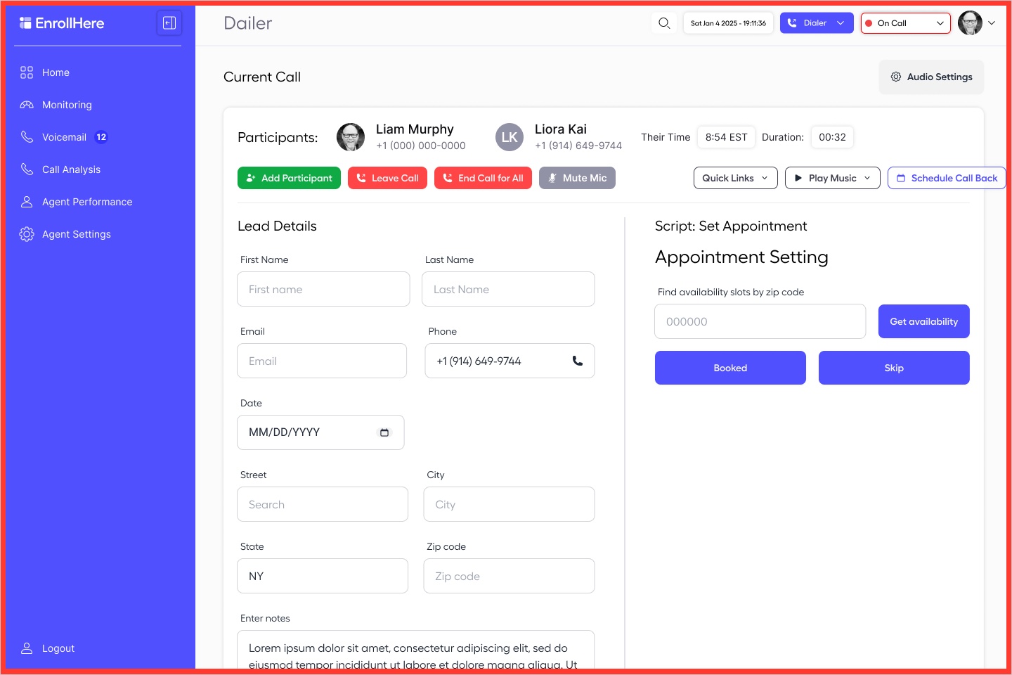
Key lead details sat several clicks deep inside profiles, and navigation felt congested. Grouping and clearer labels shortened the path.
Research combined EnrollHere's market study, stakeholder discovery and a screen-by-screen audit. One user stood out: the licensed enrollment agent who works the dialer call after call, all shift long.
"If I miss the next call, I miss the sale. I need to see who's calling and get back to dialing fast."
Composite from discovery pain points
Monitors the live floor, coaches on compliance and manages members, routing and call caps.
Invites agencies, manages numbers and oversees performance across accounts.
Sources: EnrollHere Market Research (2024) · stakeholder discovery · UX audit Dec 2024 to Jan 2025. Persona is a composite.
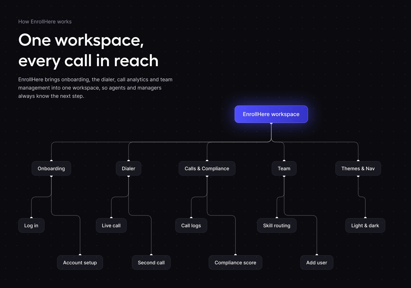
The core loop an agent runs all day: sign in, check the dashboard, dial, handle the call and wrap it up. Each step was redesigned to cut clicks and keep the next action obvious.

Micro-interactions do the quiet work: states that respond instantly, transitions that show where something came from, and feedback that confirms an action landed.
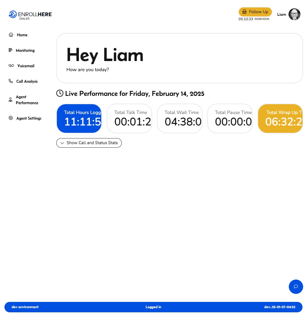
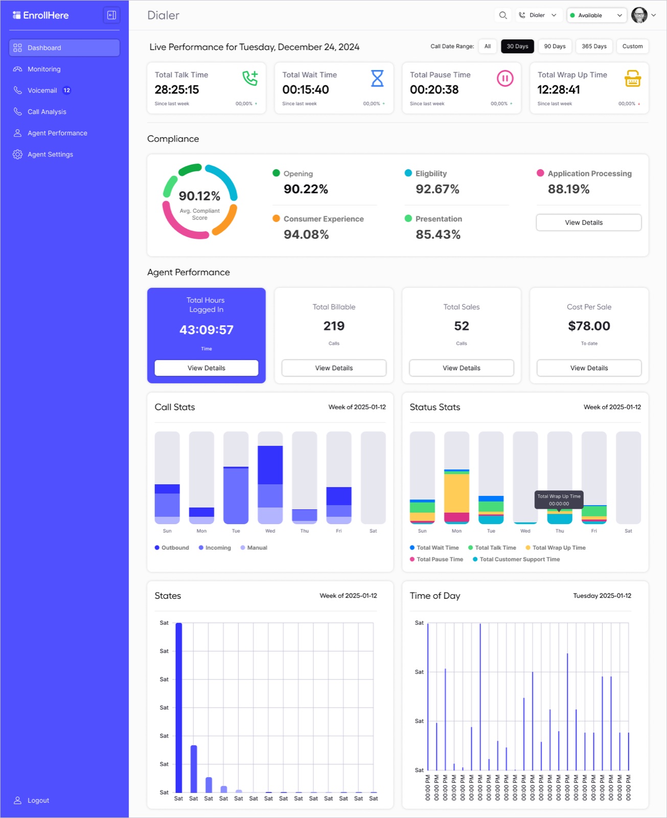
Same product, same data, very different experience. Drag each handle below to wipe between the old screen and the new one.
BeforeAfter
Drag the handle to compare before and after
Before: a giant greeting, live stats cut off mid-number, and everything else hidden behind a toggle.
BeforeAfter
Drag the handle to compare before and after
Before: a small modal over a blurred dashboard, and status pills that failed silently.
BeforeAfter
Drag the handle to compare before and after
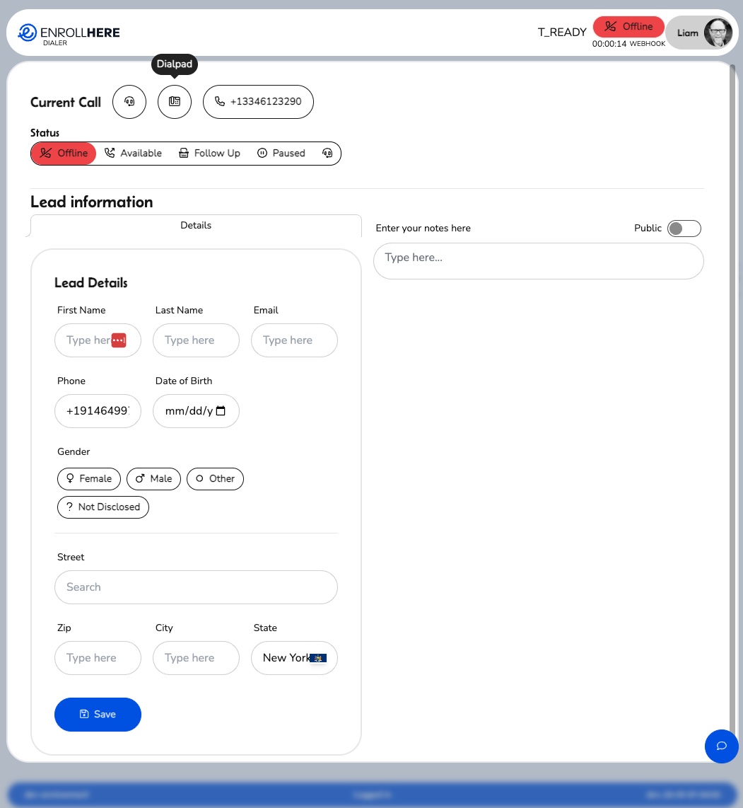
Before: a long blank lead form and a notes box, with lead details somewhere else entirely.
The same thinking carried through the rest of the product. Click any screen to open it.
Early in the project I built prototypes by hand, wiring screens together one interaction at a time. As requirements grew more complex, with flows like lead management covering lists, duplicates, bulk actions, payment types and state and zip configuration, Figma released Figma Make. I shifted my workflow quickly, using it to turn those requirements into working prototypes in hours instead of days.
From there I went back into each prototype to fine-tune the data and interactions, so labels matched what users expected and information was collected progressively, one step at a time, instead of all at once.
Early flows were prototyped screen by screen to learn the product and test core interactions.
As complexity grew, Figma Make produced a clickable first pass of an entire flow, branches included.
I adjusted the data, labels and step order until each screen asked only for what it needed next.
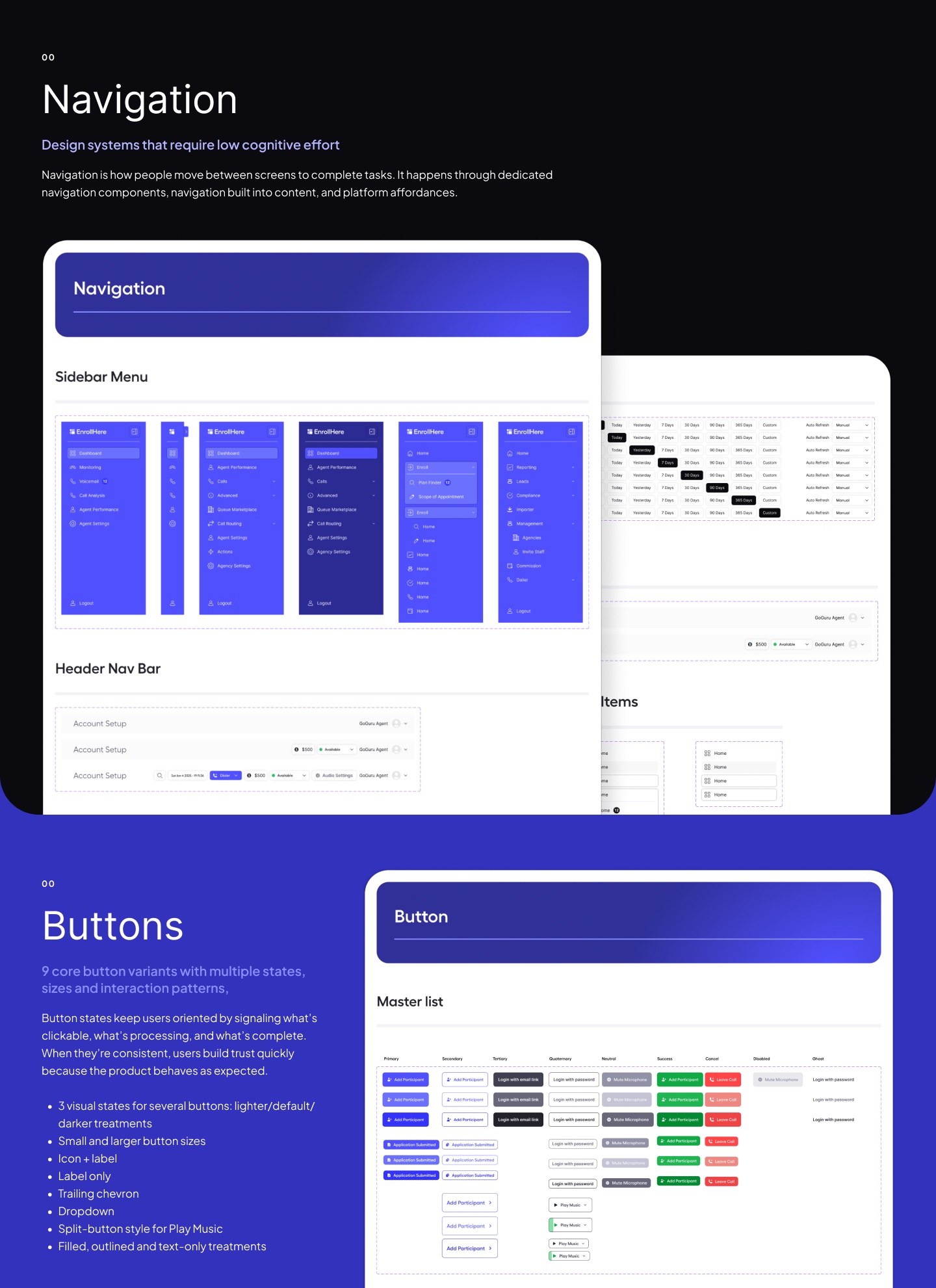
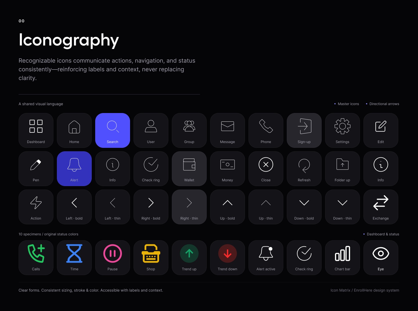
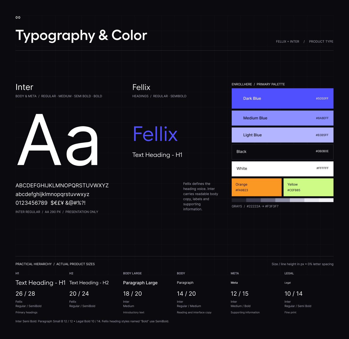
Design System 2.0.1 replaced daisyUI defaults with EnrollHere's own foundations: navigation, buttons with clear states, an icon set, type and color, and theme tokens for light and dark. Engineering built from the same names I designed with, which kept every screen consistent.


EnrollHere now runs on one owned design language, from onboarding to compliance, built to simplify today and scale as the platform grows into a full product suite.
Core flows redesigned around the call, from login to wrap-up
Owned design system replacing a borrowed component library
Theme modes, light and dark, from the same 24 tokens
Agent states in one scannable color system
Under the redesign sits the technology that sets EnrollHere apart. In their words, the AI-powered system "transcribes and analyzes calls in real-time, ensuring CMS adherence and identifying potential issues instantly," while intelligent call routing connects each lead with the right agent.
Every call is tied to its source, campaign and publisher, with one identity that follows it across transfers.
Smart automation matches callers to agents by skill, licensing and availability.
Calls are transcribed live and after the call, so every score links back to the words spoken.
Calls are analyzed for CMS adherence, with potential issues flagged for coaching.
publishers whose leads are connected with the right agents, "driving higher conversions and lower acquisition costs"
lower cost per acquisition reported by EnrollHere, from $250 to $125 per sale
saved for partners, as reported on enrollhere.com
Platform capabilities, quotes and figures as published by EnrollHere on enrollhere.com (2026). They describe the company's platform, not my individual design impact. Screens shown with sample data.
Power users want their data. The win was giving every number a home: consistent clusters, tabs and color rules, so the same density reads as organized instead of overwhelming.
Once the dialer stopped being a widget inside another screen, agents had a focused workspace and the rest of the product got simpler too.
Moving from hand-built prototypes to Figma Make mid-project let me test complex flows early, then spend my time fine-tuning instead of wiring.
Seven agent states and six compliance dimensions read without a legend because each color means the same thing everywhere.